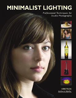
 Today's post comes from the book Minimalist Lighting- Professional Techniques for Studio Photography by Kirk Tuck. This book is available from Amazon.com and other fine retailers.
The One-Light Portrait
Let’s start with a scenario that we’ll all face: the one-light portrait. Here, we build it one step at a time. Let’s start by looking at our model in front of a gray background using just the available light that’s coming through the windows. The light is soft and directionless and gives no modeling to our subject’s face. As the light bounces throughout the room, and the light bouncing from the white walls and the ceiling lower the contrast of the scene.
Now, let’s add a single light. In this example, I’ve set up an Alien Bees strobe with a standard reflector. I placed the light directly in front of my model, then moved it in an arc until it was about 45 degrees to camera left. As I did this, I looked for a little triangle of light surrounded by shadow to appear under the eye on the opposite side of her face from my light. This is my standard method for positioning my main light for most portraiture. With the light set at the right position (see images below), we can see that the light is hard and specular. It brings out a lot of surface texture, which is rarely welcome in a portrait, and creates a harsh transition from highlight to shadow.
Next, let’s switch to umbrellas. We’ll start with a small (32-inch) umbrella with black backing for the main light (see image below, first). The resulting light is softened and the transition from light to dark is more pleasing. I think the 32-inch umbrella is too small for a flattering portrait, so let’s exchange it for a 45-inch Photek umbrella. The lighting is softer but not dramatically so (see image below, second). Finally, let’s exchange the 45-inch unit for a 60-inch umbrella. Now the transitions from highlight to shadow are very graceful. The wrap-around quality of the larger modifier helps to smooth the skin texture and it does a better job spreading to the background (see image below, third).
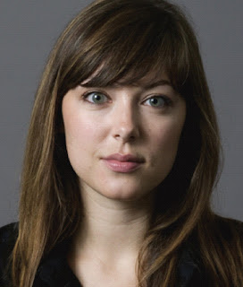 We used a small 32-inch umbrella as our main light. Notice how the light spill illuminates the background.
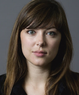
A 45-inch umbrella offers little discernable effect (versus the 32-inch umbrella).
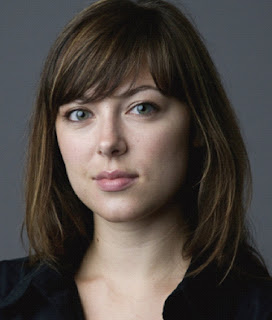
Large umbrellas with very little fill are my favorite tools for lighting faces. Here, I’ve switched to a different brand of 60-inch umbrella than was seen in the previous shot and used it with no fill.
Let’s further modify the image by adding some fill reflection to the other side of the subject. We’ll just use a chunk of white foamcore. The result is a reduction in total image contrast, a filling-in of skin texture, and an even softer transition from highlight to shadow. Additionally, the shadow areas show more detail.
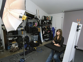 Here’s the overview of our 60-inch umbrella shot with the foamcore reflector just to the right of the camera.
 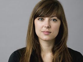 Adding a fill card to the shot opens up the shadows and bounces more light around the room and onto the background.
The only real issue with this one-light image is a background that may be on the dark side. We can cure this by letting more light strike the background and reducing the amount of light that is striking our model. For our final example, I placed a translucent diffuser in front of part of the light from the umbrella, then turned the umbrella so that more light spilled on to the background (see image below). This technique works well with all one-light setups, whether you use plain reflectors, umbrellas, or softboxes.
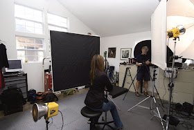 I love using light blockers and diffusers to change the distribution of light instead of having to use more lighting instruments. Here, a diffuser blocks some of the light on Heidi while unobstructed light hits the background.
Adding a Second Light
Given a second light source, many beginners press it into service by adding it as a fill light. Indeed, photographers used to depend on a second light for fill, but large flat panels or big pop-up reflectors create a more natural look and require less equipment, fewer power cords, and less setup.
With this in mind, the most important use of a second light is to illuminate the background and help separate the subject from it. In this example, we use our second light (with its supplied metal reflector) as a background light. In comparing our image with and without a real background light, you will instantly see that the second light source, used in this way, adds a sense of depth to the image.
Using a second light for the background will also allow you to position your main light without having to rely on its spill or power to help illuminate the background. This means that you are free to move your subject as far forward from the background as you would like. The benefit? The further you move the subject and your camera from the background, the more out-of-focus the background becomes. Diminished focus on the background eliminates random details that attract the viewer’s eye and take away attention from your main subject. When using a second
light to light the background you can also control the size and shape of the light on the background and how quickly it falls off from its center.
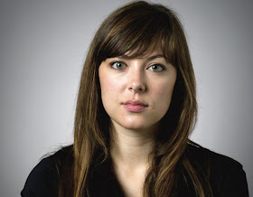
Our final permutation of the shot we started building on page 85 includes both a fill reflector to camera right and a gridded background light.
Adding a Third Light
Adding a third light is always interesting. The role of the third light should be that of an accent light.
Rim Light. This can be positioned directly behind the model and pointed back toward camera position. The model will block the direct light and be subtly rimmed by highlight.
Hair Light. Alternately, the third light can be used as a hair light. In this application, the light must be carefully positioned so that it lights only the subject’s hair. It should not be so far forward that it casts light on the subject’s forehead. If I use a hair light, I adjust it to a very low power setting; it is just there to offer a bit more separation from a dark background.
Glancing Backlight. The third use of a third light is as a glancing backlight. This is placed behind the subject on the side opposite the main light. Rather than allowing the subject to block the light, however, it directly strikes the subject’s cheek on the shadow side of the frame, adding a bit of fill and a specular highlight. This look is currently cropping up more and more in fashion photos. It’s also used to provide a bit more separation when using a dark background.
*excerpted from the book Minimalist Lighting- Professional Techniques for Studio Photography
BUY THIS BOOK FROM AMAZON


thanks for a beautifully illustrated post.
ReplyDeleteHowever, I am curious -- wouldn't a darker, say brown skin require some modification of these 'rules' just because of the reduced reflectivity of the skin? After all we wouldn't want a brown skin to look either too dark or excessively bleached and that would need some balanced lighting which would surely be different from that for white skin....