Mothers with Children from Birth to Eleven Months


Today's post comes from the book Mother and Child Portraits: Techniques for Professional Digital Portraits by Norman Phillips. It is available from Amazon.com and other fine retailers.

When posing children under one year of age, we must consider comfort and safety more than is required with any other group. In this chapter, we will see a variety of excellent posing options that will help you meet these important objectives when photographing your own subjects.

In the first image (photo by Sarah Johnston), the closeness of the subjects depicts the special relationship they share. The fact that the baby’s hand is beautifully placed on the mother’s shoulder makes the posing that much more special. Add this to the three-quarter view of the mom, and we have a delightful portrait.


The baby appears wrapped in a soft, white blanket. The fabric adds texture in the image and nicely sets off the infant’s skin tones. Because the blanket was white, it supported the high-key concept of the image. It is these little things that make the difference. The high-key vignette makes this black & white impression very appealing. See the diagram below.


Next (photo by Jody Coss) is a high-impact image that employs the split lighting technique to perfection. Most interesting is that it holds our attention even though we cannot see the baby’s face or the mom’s eyes. The contrast is much greater than we would normally expect to see in this type of portrait.


To create this image, Jody used a small softbox, positioned with the bottom edge at the mother’s chin and tilted downward. The front edge of the light was positioned level with the baby’s head. Reflected light from the right of the camera gently separated the subjects from the background.

Note the delicate diagonal line that runs through the mother’s hand and up toward her brightly lit hair. This is the result of carefully considered posing of the two subjects. Jody digitally created a black mat for the image and added a lovely sentiment to enhance the portrait. It is an excellent example of the steps that can be taken to increase the impact of your images.

The next sequence of images (photos by Norman Phillips) illustrates how we can use window light in portraiture. In the first, the mother and her baby are posed almost in the window frame so that the bright white wall creates a split lighting set and virtually blows out the highlights on her left cheek. The pose allowed the mom and her baby to respond to the camera.


Here, the baby turned her head toward camera left. The change in position caused the light ratio on her face to be reduced. This is better for the baby, but it does not improve the lighting on the mother.


To create the image shown in the next photo, I moved the subjects away from the window to reduce the contrast and more evenly illuminate them. This eliminated the bright white wall near the window and made for a more acceptable set. There is a 21/2:1 light ratio in the portrait.


In this photo, the subjects were moved farther into the room, and the result was more even lighting. We now have a 2:1 ratio.


For the last photo, the subjects were moved once more. The mother was positioned on the bright side of the set, and the subjects’ angle to the light was more oblique. This caused the light to be feathered across the subjects. With the change in position and the mom’s head partially blocking the light from falling on the baby’s face, we achieved the desired 3:1 light ratio.


The posing in these portraits is conventional, with the mother and infant cheek to cheek but with the baby’s head at a lower position in the composition, thereby creating a diagonal line between the subjects.

This photo (by Jeff and Kathleen Hawkins) shows a profile pose of the mother and her naked baby. When we present this pose, we demonstrate the relative size of the baby because the mother’s hands are cradling her. Having the baby lifted close to the mom’s head further emphasizes her small size.


A softbox was placed at 30 degrees off the subjects, with another softbox illuminating the back of the mother’s head. This produced a relatively even lighting pattern with a ratio of a little over 2:1. By placing the subjects against a low-key backdrop, Jeff and Kathleen produced a dramatic contrast between the subjects and the background. The impact is strong yet soft and flatters both subjects. The diagram for this photo is below.


Mark Laurie is well known for his glamour style portraiture—a subgenre in which female subjects are typically less than fully clothed. In this photo, the mom appears without any evidence of clothing. The image emphasizes the physical contact that is so crucial in the nurturing of an infant. The portrait is simply delightful. It shows the happiness that the two share, even if the baby is unable to express it at such an early age. It is the impression that we should seek to create when photographing a mom and her infant.


Mark used a large 40x60-inch softbox at 45 degrees from the camera and subjects (at camera right) in a brightly lit set, where the ambient light provided fill. The overall lighting produced a beautiful rendering of the subjects’ skin tones.

The photo below is another Mark Laurie portrait that depicts the natural, nurturing bond between a mother and her baby. It is beautifully feminine and evokes the tenderness associated with motherhood.


A 40x60-inch softbox was placed at camera right, and a large reflector at the left of the subjects provided a fill source equal to 1/2 f-stop less than the main light. The overall lighting cast an even illumination across both figures and beautifully rendered the skin tones. The pose shown here is natural and needed only a little refinement from Mark to ensure the subjects’ best-possible presentation to the camera.

BUY THIS BOOK FROM AMAZON

Creating Studio Lighting at Home

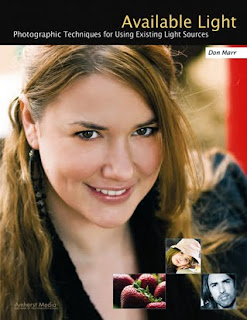
Today's post comes from the book Available Light: Photographic Techniques for Using Exisitng Light Sources by Don Marr. It is available from Amazon.com and other fine retailers.

The number-one question I get asked when teaching lighting workshops is, “How much is all of this lighting equipment going to cost me?” It’s true that I am a recovering strobe nerd who has spent thousands of dollars on big power packs and several strobe heads. I still love the power that my strobe packs give me when I need to light a big area or am shooting in a very dark area. But I have been using them less and less these days. I prefer the freedom of working without strobes—the freedom to move quickly, the freedom to change lighting setups more quickly, and the relaxed feeling my subjects get when there isn’t a ton of gear surrounding them. If it makes you feel better or more professional to shoot a portrait with three power packs and ten strobe heads then go ahead and do it. Just don’t call me to haul your gear.

So the answer to the question above is, “You don’t need lighting equipment to take good portraits.” You can get a lot of shots to look like they were done with strobes just by using the lights and windows you have around your house or by buying some inexpensive lights from the hardware store.

Your Thumb, Your Friend
When it comes to photographing someone in your home, you will probable ask the question: Where should I put him or her?My answer is: Let the light guide you. Use an area that has pleasing light to your eye. If you are not sure where that might be or you don’t want to move your subject from sofa, to dining room, to barstool, to family room just to find the right light, then use this ancient photographer’s secret. Hold your thumb out at arm’s length at the position your subject will be at. Observe how the light is hitting your thumb. Your thumb is like a little face. It’s round and has a pointy front. Look at the lighting contrast from side to side. Is it frontal or side lighting? Is there enough fill light on the shadow side? Is light from the rear wrapping around the sides of your thumb? Does your thumb look like it’s in a good mood today? Take your thumb on a walk from room to room to find the good light.

Positioning the Subject
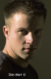
The first image was taken in a living room. Sunlight came through a window and created a very high-contrast situation. I actually prefer more contrast when I’m photographing men because I think it gives them a stronger appearance. Although this shot is interesting, it has a bit too much contrast. The interior of the room acts like a big cave and hardly reflects any sunlight back onto the dark side of the subject’s face. And there are hot spots on the highlight side of his face. So, in essence, the bright side is too bright and the dark side is too dark. Also the wall in the background is flat and uninteresting. You get the idea.


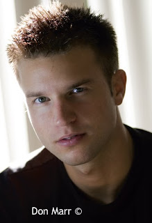
A quick solution to this high-contrast situation is to turn the subject away from the sunlight so that the sun hits their hair and shoulder, as with the image below. Now the sun acts like a hair light. In this case, a simple lamp (with a daylight-balanced low energy fluorescent bulb) was added at camera left to light his face. You can see the catchlight from this lamp reflected in his eyes. This is a simple reading lamp with a movable lamp head that can be pointed in any direction.

Window blinds form the background for this shot, and by playing around with these a bit I was able to position “the hair light” (the sunlight) exactly where I wanted it to hit the subject. Comparing the first and second images, you can see that the blinds also are a better looking background than the wall since they create some shape and texture. For a shot like this, it’s also helpful to shoot with a telephoto lens and a narrow depth of field. The telephoto lens and shallow depth of field help throw the background out of focus and keep the attention on the subject’s face, especially their eyes.


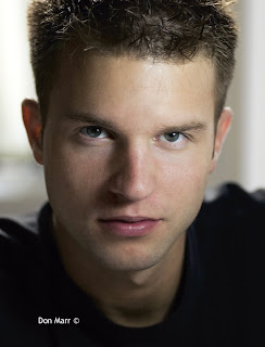
To create the next image, the lamp was moved to camera right and placed a bit higher. This is a classic light placement called loop lighting. The lamp is placed about 45 degrees to the side of the subject and about 45 degrees up from the subject. It’s called a loop light because of the loop-shaped shadow formed by the subject’s nose. The sun still acted as hair light on the back of his head and shoulders, although it was toned down a bit by closing the blinds further.


The Living Room Studio
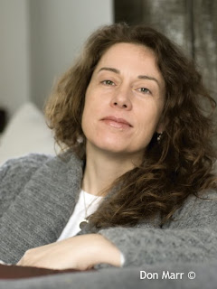
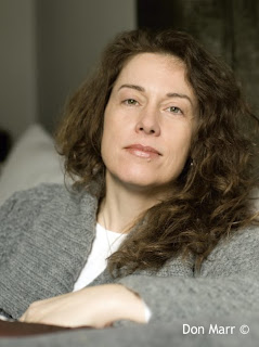
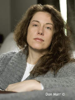
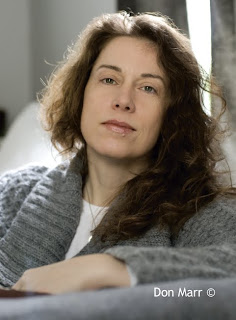
The next sequence illustrates a technique you can use to produce a variety of studioesque (is that a word?) looks right in your own living room. The following sequence of shots were taken on a cloudy day in a living room with windows on three walls, but they could have been done in a room with windows on two walls, as well. The subject faced a north-facing window. North light is always soft, especially on a cloudy day, so this was a good choice for our portrait. There were also translucent white curtains on this window, which gave more options for controlling the quality of light. It wasn’t very bright, so a slower shutter speed was used—along with a tripod.

In the first shot, the translucent curtains were pulled closed behind the camera. This diffused the northern light even more, creating a very soft main light. The window at the back wall let some light in to light the subject’s right shoulder and hair. The dark green curtain over her left shoulder was closed to block virtually all of the light from that window.


In the next shot, the translucent curtain behind the camera position was opened up to allow the overcast daylight to light the subject’s face fully. Of course, this let a lot more light into the room but mostly just in the area of the subject. This affected the exposure, so a faster shutter speed was used to keep a correct exposure on the subject’s face. Notice that the background has gone darker now, relative to the subject. The quality of light has changed slightly, as well. It is a bit higher in contrast due to the fact that the diffusing curtain was not used.


For this next shot, the dark green curtains directly behind the subject were opened slightly. You can see them clearly in the shot. This created a hair light on the subject. Be careful about letting too much light in from this “hair light,” though; it could cause lens flare. Not that there’s anything wrong with that! Just be aware of it.


For the final shot, the translucent white curtains behind the camera were closed once again. This reduced the light on the subject, so the exposure was changed back to what it had been in the first shot. Now the background has gone lighter since the overall exposure has increased. And we are back to our softer quality of light on the subject’s face. I think this is the best shot of the bunch!


BUY THIS BOOK NOW

Commercial Photo Techniques

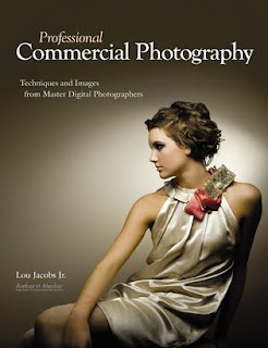
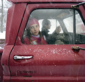
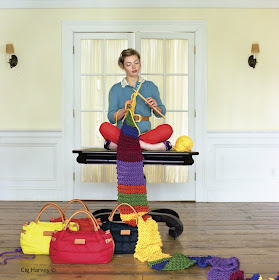
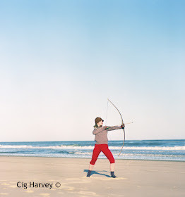
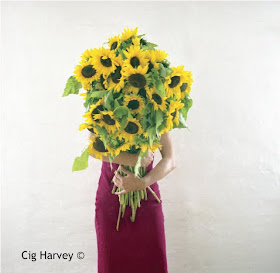
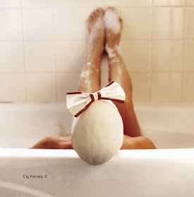
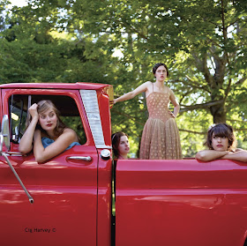
Today's post comes from the book Professional Commercial Photography: Techniques and Images from Master Photographers by Lou Jacbos Jr. In this book Jacobs profiles 10 of the leading commercial photographers working today. It is available from Amazon.com and other fine retailers. This is an excerpt from his profile of photographer Cig Harvey.

BACKGROUND
When I was twelve years old and living in England, I read The Independent, which featured powerful black & white documentary portfolios on Sundays. I was inspired to become a volunteer in a community darkroom in southwest England. Since then photography has remained my only constant. In my twenties, I shifted from documentary photography and photojournalism to an involvement with personal fine art. While working for Mark Emmerson, an amazing platinum printer in Bermuda, I received theMaineMedia Workshops’ annual catalogs, and when Mark retired I enrolled in the Maine MFA program. Arriving there, I felt I had died and gone to photo heaven.

I was the perfect nerdy student, and I completely immersed myself in the photographic world, every genre, from historical to contemporary. I feel you have to be in photography a lifetime to do more than scratch the surface, and I am constantly amazed by the possibilities. When I graduated I had five black & white portfolios that dealt with a personal autobiographical story. I took the portfolios to New York and was lucky enough to get my first representation at the Robin Rice Gallery, where I still am today. I made a lot of valuable connections at the workshops, and each time I went to New York I met with people in all aspects of the industry, from fine art to commercial. Through these initial meetings, and by showing my fine art based portfolios, I found my way into the commercial world.

STARTING IN COMMERCIAL PHOTOGRAPHY
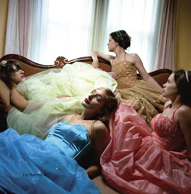
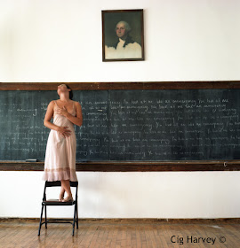
Coming into commercial photography via the fine art route is pretty unusual. My emphasis was and always will be on the ideas behind the pictures. I gave myself the gift of time during my master’s studies, having saved up enough money working three jobs prior. I spent two years committing only to personal work, which allowed me to develop a strong style. Initially, the only work in my commercial portfolio was my personal work, and fortunately people in the industry felt the work could have a commercial application in addition to fine art.


Christopher James was a mentor during my MFA era. He always questioned and pushed me to make the most conceptually powerful images possible. At the end of the day, a successful commercial photograph must contain all the same conceptual and visual elements as a fine art photograph. A good photograph transcends genres. I promoted myself by going to as many business meetings as possible, making really special one-of–a-kind leave behinds, and always sending handwritten thank-you notes.

APPROACHES TO THE WORK
My specialty is definitely conceptual. I love being given a story or a basic concept and brainstorming and mind-mapping it to explore different metaphors, symbols, and iconography. A good photograph is about something, not of something. I am interested in the ideas behind the images. A photograph is a visual manifestation of an idea, and I am trying to make the unseen, seen.

I very much think of myself as a photographic illustrator. I think I also specialize in color. Most of my assignments are very color driven and are normally a little quirky. I have a varied assortment of clients, ranging from high fashion with Kate Spade, to book publishers, to The Royal Shakespeare Company.

A HOME STUDIO
My business is a much smaller operation than most people imagine. I am a full-time associate professor at the Art Institute of Boston, so I use their C-printing facilities and run the business side of things out of my home in Boston. Last year my husband and I bought our first house in Rockport, ME. I have a specific room there that I consider my studio. It’s an attic room with sloping ceilings and walls, a blue wooden floor, papier-mâché birds and pigs, old typewriters, and a thousand inspiring things Scotch-taped to the walls. It is a real gift to finally have a space to spread out that I don’t have to clean up regularly.


EQUIPMENT AND PROPS
On assignment-based jobs, I typically work with a film crew rather than using a traditional photo setup. We use HMIs to augment daylight and grip equipment (reflectors, flags, screens) to control, bend, and shape the light. This equipment is the same for studio and location assignments, and it comes from my back-ground in fine art, making autobiographical pictures, when I could choose the time of day (the right light and weather) to make pictures. You don’t have that luxury with commercial work since so many people are typically involved. I really like to see the effects of light, which is why strobes feel alien to my work.

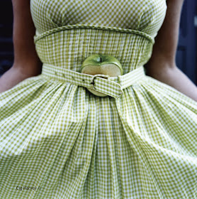
My favorite thing to do on a day off is to go treasure shopping. I hunt for unusual props and clothes of certain colors and patina that will eventually appear in my pictures. I work on the sets myself or work very closely with the set designer/prop stylist. Set design is a major factor in my photographs. People sometimes think that it is the type of film I use that creates the intense color in my pictures, but often it is the styling that gives my images their intensity.


LOCATIONS
I am constantly searching for locations that inspire the imagination. I have a virtual scrapbook in my head filled with different spaces that could potentially work in a picture. I like to get to know these spaces well and see them in different kinds of light and weather to get a true sense of their potential.My favorite type of light to work in is overcast daylight. I love even, beautiful light with a full tonal range that allows my subjects to glow and offers me the possibility of adding a little sparkle here and there with reflectors. I work in color negative film and like to overexpose it a few stops, so contrasty light situations are tricky for me.


Weather can be an issue on location. During a snowstorm, my crew built a tent for me to shoot from to keep the camera dry. There is never a dull moment. We laugh a lot on the set. When we are laughing, we are being creative. We love constantly trying out new ideas.My assistants are all visual artists whom I greatly admire, and I welcome their ideas. I usually work with the same core group of hardworking people, and I also like hanging out with them after we have wrapped up.

In regards to settings and sets, I like to give the illusion of simplicity. I think a strong photograph should feel like it was made effortlessly, though this can oftentimes be opposite of the truth. I don’t like to show my hand.

EDITORIAL AND PERSONAL WORK
When I photograph people on assignment, it is always for editorial or advertising work. I like the challenge of this work; I enjoy thinking fast to find the best environment, atmosphere, and the most conducive light to convey the person or story I am photographing. I also make pictures every week purely for myself with the goal of using them in the current fine art portfolio—there is always one I am working on. It is very important to me to maintain a balance between work I am doing for others and for myself.


REFLECTIVE SUBJECTS
I have no special setup for photographing glass or reflective materials other than being very aware of what is being reflected and moving things for corrections. Often when I am working, I will hear the art directors on the set talking about how they fix things in postproduction. I hate that idea. I love to get the image just right in-camera. I guess I am just an old-school type of girl.

CLIENTS ON THE SET
I leave the clients’ presence on a shoot totally up to them. I can work with or without them. In any case, I try to create a fun set with laughter and intelligent conversation. What I love the most about commercial work is the opportunity to meet, work with, and spend time with creative people, from the art directors, to the subjects, to the set stylists, to hair and makeup
artists.


I like slow sets, and because I use a slow film and no strobes, it limits how fast things can move. I always sit down with the models or subjects before I start shooting and talk about the nature of the shoot and my expectations. I also let crew and/or clients know that we are going to do the safe shots and then play, get creative, and see what happens. Often the best images come during this time.

MODELS
I do hire models. I like to work with high-end models and actors, but I also like to photograph normal people such as friends, people I meet on the street, or friends of friends. The sort of in-between area in posing tends to get strange for me. When models try too hard or are concerned with how they look, it makes for awkward pictures.

POSTPRODUCTION WORK
I typically handle almost everything myself, but I employ a couple of amazing people on a freelance basis to help me with some postproduction operations. I have no full-time studio manager. I send clients the contact sheets and prints that I make in the darkroom.


CONTRACTS, PRICING, AND COPYRIGHT PROTECTION
I am lucky enough to have an amazing agent,Marilyn Cadenbach, who takes care of all the contracts, invoicing, and legal issues. The contracts stipulate usage rights and terms. I typically work for a creative fee rather than a day rate.

WORKING WITH AN ACCOUNTANT
I meet with my accountant once a year, and I now have a bookkeeper who works on a regular basis, so at the end of year the work doesn’t seem so overwhelming. I am dyslexic with numbers and dislike doing the financial side of business, so a bookkeeper is a wise investment in terms of time and my personal happiness. I need to concentrate on making pictures rather than doing paperwork.


IMPORTANCE OF PERSONALITY
A photographer’s personality is absolutely an essential part of his or her success. I try to meet with potential and existing clients all the time, and I would much prefer to go with my portfolio than to send it by messenger. Clients like to know that the photographer they are going to be working with is cool. Nobody likes to work with difficult people or drama queens.

For me, finding the balance between commercial, fine art, and teaching is often difficult. Yet all three are fundamental to my happiness. These disciplines feed off of each other, and I feel so very lucky to be involved in them all. The best advice I could give anyone going into commercial photography is to make your work first and foremost. Find your voice in the process and then find the niche in which to market it. No matter which photographic specialty you choose, your work has to come first.


BUY THIS BOOK FROM AMAZON