 Today's post comes from the book Corrective Lighting, Posing & Retouching for Digital Portrait Photographers, 3rd Edition by Jeff Smith. It is available from Amazon.com and other fine retailers.
The scene or setting can often be one of the most effective tools you have for correcting clients’ flaws. As you have seen, letting the body blend into the background can make problem areas like large hips or a balding head much less noticeable. This works well in low-key portraits, but when you start working with high-key settings (or even with a client in light-colored clothing), the problem area is still obvious. But, just as with poses that use the knee, arm, or leg to disguise a problem, elements in the scene can also be used to conceal flaws.
USING THE FOREGROUND
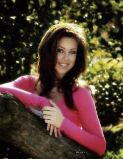
Most scenes give you ways to hide flaws by using the foreground. Although it is often overlooked, making use of the foreground not only gives you the ability to hide a client’s flaws but, from an artistic standpoint, provides a greater ability to create the illusion of depth in your portraits. By using an element in the foreground, the subject in critical focus, and then a background that recedes farther and farther from the subject, you have a built-in sense of depth.
BEFORE:
When correcting a client’s flaws, it is amazing how even a simple foreground element like a plant or a few columns can soften or hide a large hip, tummy bulge, large upper arm, or hairy forearm. Whether you have something as simple as a client sitting backwards in a chair, or an entire set arranged to hide problem areas, it is a very effective way to give clients a version of reality they can live with.
COORDINATING THE FOREGROUND AND BACKGROUND
Learning how to coordinate the style, look, and color of the foreground elements with the other parts of the scene can be a challenge. A plant or tree is often used in the foreground because it is easy. It goes with just about everything and it doesn’t take any time to prepare. Chairs are also a
popular and versatile choice for the foreground element. Either one can be effective. (Indoors and out, you can enhance the feeling of depth by using multiple elements in the foreground, or by adding elements in between the subject and the background.)
OUTDOORS
What do you do when you are outside and have a client with a large body size? Well, first, you might find a tree and do the peek-a-boo pose, with the body hidden behind the tree and the face coming out from around the side of the tree. (Although this pose is a classic of corrective posing
technique, it is also a popular pose for young ladies who don’t have weight issues.) You might also photograph a girl lying in tall grass that obscures the outline of her hips and thighs. You could also simply decide to create something other than a full-length portrait.
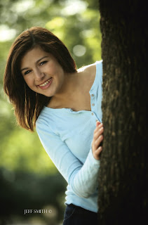 This is a popular pose for subjects of all shapes and sizes. The tree in the foreground creates a nice sense of depth but also allows you to hide as much of your subject as necessary.
Outdoors, many photographers work at the edge of a clearing or have the subject leaning against a tree or column that has nothing else around it. This provides a scene in which the first element is the subject, then the background elements that recede farther and farther away from the subject. While I do this on occasion, I prefer to use a scene that provides elements in the foreground. This could mean using a tree with lower branches or posing the client in the middle of what most photographers consider the background—so there are foreground elements between the subject and the camera.
BEFORE:
The density of the foreground elements will determine how much of the subject you are going to see. If the foreground is too thick, you will see none of the subject’s body. In this situation, you have to ask yourself why you’re presenting a reduced head size if it doesn’t result in seeing any more of the person. You might be better off just composing the image more tightly (cropping out areas you want to conceal rather than hiding them behind something).
Years ago I was hired to photograph a rodeo queen. She came from a nearby mountain community, so we looked around this area for a place to photograph her. We found an area where the light was great and the field of grass was high—it was perfect . . . or so I thought. The first problem was that it was late spring and we were in an area that was known for having a high rattlesnake population. Not realizing this, we walked through the tall grass without a clue. The second problem was that the grass was so high and so thick that you couldn’t even see an outline of her legs from the thighs down. Since I was very young at the time, though, I was very excited about these photos (and not getting bit by a snake), so I had a 30x40-inch print made for the studio. My wife looked at it when I unveiled it to our staff and she said, “It looks like she’s missing her legs!” In short, I should have cropped it closer and eliminated the foreground that showed nothing but grass.
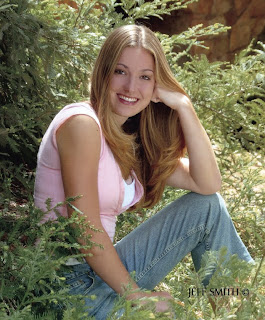 The density of the foreground elements will determine how much of your subject is visible behind them.
Sometimes we get so caught up in the lighting, the posing, and the beauty of what we are focusing on, we don’t notice the unnecessary elements (like all that grass) and forget that someone else has to live with our creation. My wife was right; although I thought the foreground of grass was beautiful, the client would have preferred to see the subject larger in the frame—not ten feet of grass in the foreground.
IN THE STUDIO
The ability to add foreground elements and use them correctively is one the main reason we use sets, as opposed to just background fabrics, in the studio. Sets also allow us to place elements at different distances from the camera, which creates more depth than is possible with a painted background. I have always said I want at least five points of focus in the average studio portrait. The client is the main point of focus, but even in a head-and-shoulders pose there should be at least four other points of focus at different distances from the camera.
We have found many background and foreground elements at the local home store. For example, I purchased a French door on clearance for $10. We have also purchased ladders, steel grates, tin roofing material, and many other interesting foreground and background items at this type of store. You are only limited by your imagination and your time to shop around. When I first opened my studio, like most new photographers, I had all kinds of time but very little money to purchase sets. Now, with over three thousand seniors to photograph each year, my writing, and my family, I have much more money than I do time to look for background items, so I tend to purchase them from set manufacturers.
Whether you purchase them or create your own set elements, you need to look for unique ways to use them. Many photographers struggle with this when using the large, expensive sets that some designers sell. One problem is that they sometimes position the set components flat to the camera—and then wonder why their images didn’t look like those in the brochure. By angling any set toward the camera, you can create a foreground and bring the background to life by adding focal points at different distances. (Note: This idea works with most props, as well. Instead of placing a chair or couch flat to the camera, turning it [bringing one arm closer to the camera than the other] creates depth in the portraits—and a place to hide a seated client’s hips, thighs, and not-so-flat tummy!)
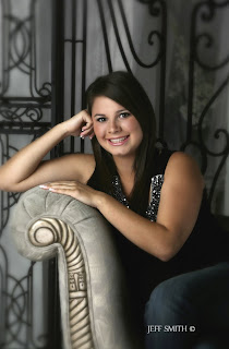
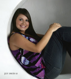
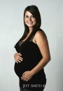 Posing—especially when combined with the use of obstructions—is one of the most powerful tools photographers possess. Look above to see portraits of this mom-to-be. Would you have guessed she was pregnant in any of these images?
Similarly, the average photographer sees an arch at a trade show. He buys it, brings it into his studio, and it remains a single arch for all time. Yet, in addition to being an arch, it is also three individual pieces that can be combined with other set components to create multiple looks. This
gives you the most for your money—and it also provides opportunities to improve your photographs and hide your clients’ flaws.
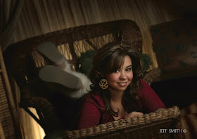
Always be on the lookout for items to put in front of clients—items that look natural and coordinate with your sets and outdoor scenes. Even the Viper or Harley (popular props at our studio) can produce a foreground to hide clients’ problem areas behind. Just use your imagination!
BUY THIS BOOK FROM AMAZON


No comments:
Post a Comment