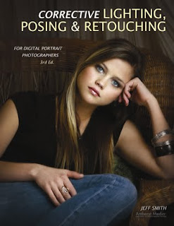
 Today's post comes from the book Corrective Lighting, Posing & Retouching for Digital Portrait Photographers, 3rd Ed by Jeff Smith. It is available from Amazon.com and other fine retailers.
Lighting a portrait is a simple process that photographers have complicated over the years. This has happened for two reasons. First we are gadget freaks. We think, “Why should I use one light when I have three?” Second, most teachers of professional lighting techniques are sponsored by (a nice way of saying their fees are paid by) equipment companies. These companies have all that equipment to sell, so the question becomes, “Why use one light, when we want to sell three and we can charge more for the big one than the little ones?”
This leads many photographers down the path of “crapping up” a simple thing. If I sent most photographers into a white room with one large window, they would be able to take a properly lit image. However, if I gave these same photographers a flash unit with a softbox attached, many of them would look lost. Yet, isn’t it the same thing? If you put the softbox where the window was and placed the subject in the same position in relation to it, wouldn’t it appear the same?
The second problem of sponsored learning is the “bigger is better” approach to main lights, which is completely wrong—at least from the perspective of correcting flaws. These monster sources of main light are the most forgiving to improper placement, but they are the least controllable. It is like the different between a rifle or shotgun, a bow and arrow or a grenade. They all might get the job done, but one is more precise than the other. (Of course, the other is more forgiving if you’re a lazy shooter who doesn’t like to take the time to aim!)
 Smaller main light sources give you better control over which areas of your subject are lit and which remain more in shadow.
Huge main light sources illuminate everything on the subject—they ruin the shadowing that we need to conceal our clients’ problems. With a four- to six-foot main light source, a subject will be evenly lit from head to toe. It will light her less-than-flat stomach, her large thighs, her “cankles” (ankles that never really slim down, so the calf appears to be connected directly to the foot), and her size twelve extra-wide feet. What a lovely sight.
To have control over your light, the light source must be smaller. You want light only where the client’s face and body can handle light being put. Small light sources allow you to place light exactly where you want it (and, therefore, draw the viewer’s eyes to the desired areas). If you have a huge light box and really don’t want to buy another (or don’t have room for a second light box), make or buy a reducer. Simply cut a small hole in the middle of a thick piece of black fabric and you have created a smaller main light source! Some companies like Photo-Flex have reducers available that are custom designed to their light boxes, but the fabric works just as well. (Note: Grids/louvers can also be used to narrow the beam of light, but they don’t allow you to feather the light [softening it by using the light rays from just the edge of the light box].)
Huge main lights aren’t the only way we can overcomplicate our lighting. When I first started in this profession I went to a week-long class and studied with a man who was literally a legend. He showed the class his unique style of lighting and discussed the ratios of lighting he used when photographing. He explained that he used a 3:1 lighting ratio when not diffusing an image and a 4:1 lighting ratio when diffusing. (Note: For all you young photographers, this was in the days of film, when fine grain, medium-format film gave us too much detail for the average client’s face.)
I came away from this week of learning an enlightened photographer—right up until I started using these lighting ratios in my studio. The models used for the demonstrations were white with a suntan, but in my studio I worked with many Hispanic and East Indian people that had every shade of skin from olive to chocolate brown. While these lighting ratios worked well for my suntanned clients, the ratio was much too high for someone with darker skin.
Another light went off; “Wouldn’t dark skin reflect less light in the shadow areas than light skin? Do you know how many shades of skin there are between suntan white and chocolate brown?” Taking what I had been taught, I would have had to test and come up with a working lighting ratio for every shade of skin and then categories what range of skin tone worked with each lighting ratio. What started off a simple way to understand lighting in a classroom setting turned into a complicated nightmare in the everyday workings of my photography business.
Unfortunately many theories are just like this one—good for the exact context in which they were demonstrated, but not very practical in everyday in business. I needed to find a simpler, more practical way to deal with this issue, and it dawned on me that I didn’t need to use flash to fill the shadows. Using flash to fill the shadow, you are always guessing at the amount of fill. With a reflector, the fill is always proportionate to the output of the main light. (You do, however, have to work in a studio area that has subdued lighting, with little or no ambient light from windows or overhead lights.)
Therefore, the first step to un-“crapping up” my lighting was to change from fill flash to filling in the shadows with a reflector. This allows me to fill the shadow on the face and leave certain parts of the body unfilled. Reflectors have different surfaces, everything from plain white to highly reflective silver, so you can use the material that gives you the best working distance and look (white will be placed the closest and provide the softest quality of lighting, etc.). The best part of using a reflector to fill the shadow is that what you see is what you get.
SHADOW, NOT LIGHT
Because of our photographic training, we often think that corrective lighting will do the most to hide flaws. Well, it doesn’t! In fact, our “training” in how to light a portrait is the biggest problem. When we start to learn about lighting, we learn that light is our “paintbrush.” Corrective techniques, however, rely on shadow, not light.
 It is shadow that gives a portrait dimension, and it is shadow that lets you disguise your clients’ flaws.
Any student photographer with two lights and a meter can create a decent portrait—just put the main light at a 45-degree angle to the subject and place the other light behind the camera. Set the lights so the main light is two stops brighter than the light behind the camera, stick a diffusion filter on the lens, and there you have it—I have just taught everyone with any knowledge of photography to create a realistic portrait with the appearance of a third dimension. This is the lighting setup mall studios use because it is easy to learn, easy to use and, for most of the buying public, acceptable for a cheap portrait. Unfortunately, this is also the lighting setup that many professional studios use. While clients will accept this type of portrait if they are getting it cheap, they are not going to pay a professional studio’s price for something they could get at the mall for much less. Professionals need to deliver more than an “acceptable” portrait. This is where shadow comes in.
 Shooting in a dark area ensures that no light is bounced off the walls or items in the room, so I can put light and shadow exactly where I want it and not have it diminished by the surroundings.
It’s obvious that not much would exist in an image without light, but it is the darkness that draws the viewer’s eye to the light. It is shadow that gives a portrait dimension, and it is shadow that lets you disguise your clients’ flaws—flaws they aren’t paying to see (or, perhaps better, flaws they won’t pay for if they do see them).
Corrective lighting is about control of light, but even more importantly, it is about control of shadow. In a basic lighting setup like I described earlier, control is impossible. Combine a large main light and a fill light with the white walls of most studios and you have light bouncing around off of everything. The three pitfalls of the average lighting setup are:
1. Using a main light modifier that is too large and uncontrollable. Because of our love of light, we reason that bigger is better. In fact, the larger your light source/modifier, the less control you have. If you use umbrellas and want to control your light better, throw them away and buy a small softbox with louvers.
2. Using fill flash instead of reflector fill. The fewer lights you can use in your camera room, the more control over the lighting you will have. When you use fill flash, you get fill everywhere and have no control of the shadow formation in specific areas.
3. Using light-colored camera rooms. These add to the lack of control in the shadow areas. In corrective lighting, I want light to fall only and precisely where I put it. That can’t happen with white or cream-colored walls and floors. These lightcolored surfaces themselves become a source of fill light, just like using a white reflector.
You must start thinking in terms of directing the viewer’s gaze to the areas where you want it to go (these are the areas you will light) and keeping the viewer’s gaze away from the areas you don’t want them to see (by leaving those areas in shadow).
At times, you will have to control the light and shadow very carefully, because hiding one problem in shadow will make another problem more noticeable. A good example would be when photographing a young lady with a heavy face. Your first instinct would be to have a portion of her face in shadow to reduce its apparent width. But what if she has a large nose and the shadow on the side of the nose makes it appear larger? The same is true for the hair, which might be dull and have dark roots showing in blonde hair. To make the hair look shinier, you would light it—but to hide the roots you would need to leave it in shadow. Using smaller lighting sources and pinpoint fill, you can deal with these multiple problems that require two types of lighting.
BUY THIS BOOK FROM AMAZON


No comments:
Post a Comment