 Today's post comes from the book Lighting Essentials: A Subject-Centric Approach for Digital Photographers by Don Giannatti. It is available from Amazon.com and other fine retailers.
I am sometimes amazed how many online discussions there are about the evils of shadows. Shadows are a natural result of light, so I’m not sure that killing all shadows is the best way to light everything. Sure, there are some cases when a shot requires nearly or completely nonexistent shadows, but for the most part, we define the light by showing the shadow—even a very faint one. Shadows tell us the direction of the light just as certainly as the highlights do. Shadows define and sculpt, create contrast, provide modeling of the subject, and can be used to add an air of mystery to a photograph. Shadows are very important to photography, so we need to be able to control them and their relation to the highlights also produced by the light that created them.
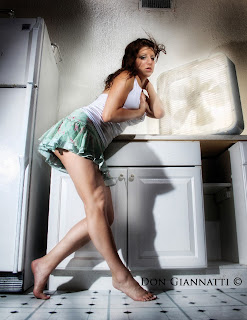 This image of Briana was photographed at a motel on Anna Maria Island. It was raining like heck and we couldn’t leave the little laundry room to wait for our ride to the airport, so we decided to make photographs. I placed one speedlight behind the fan (it was spinning; the strobe froze the blades) and one on a stand behind her to camera left, putting the shadow of her legs on the laundry sink. A third light was placed high and focused on her face. Each light was set to the same output, and their careful placement meant that she didn’t have a lot of leeway in her movement. The shadows are a big part of the feel of the final image, giving it a whimsical look that wouldn’t have been present with flat or one-sided lighting.
CONTROLLING THE SHADOWS
I love shadows. They give an image dimension and depth, mystery and grace. Shadows can be fairly faint and still help establish a background, the angle of light, or separation of the subject from the other elements in the picture. Conversely, they can be quite strong and add a hard “edge” to the image. Subject-centric lighting means knowing how to create the types of shadows
you need and place them to portray your subject in the way you have envisioned.
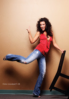 This shot of Richelle and the chair is made more interesting by the shadow on the wall. Shadows are not the enemy of photography, they are part of what we do.
 The Angle of the Shadows. Shadows are created by a light source, so they fall away from whatever object blocked that light (creating the shadow) at the same angle as the light hit the obstruction. For example, if the light is coming in toward the subject at a 30 degree angle, the resulting shadow will also be at a 30 degree angle. Shadow is, after all, just the light interrupted. The Quality of the Shadows. Light sources that are large in relation to the subject (or, more to the point, the obstruction) produce soft-edged shadows. Light sources that are small relative to the subject yield sharp-edged shadows.
The Exposure of the Shadows. Shadows can be very light or very dark. One way to control this is by adding a light source on the shadow side of the subject. This light will “open” the shadow area—meaning that it will bring it closer to the exposure level of the main light side of the subject.
Many times, fill cards (reflectors) are used for this purpose. To do this, the card is placed on the shadow side of the subject and angled toward the face. Essentially, the card works like a mirror; light striking it from an angle (the angle of incidence) is reflected at an equal and opposite angle (the angle of reflectance). So when I put a fill card up next to a face, I make sure it is at the correct angle to receive as much light as possible from the main light and direct it onto the shadow side of the face, rendering the shadows brighter.
Alternately, you could add a second light source—or a third—to open up the shadows. There are boundless ways to have the subject be rendered by the light, and it is sometimes one’s personal style that determines what approach will be used.
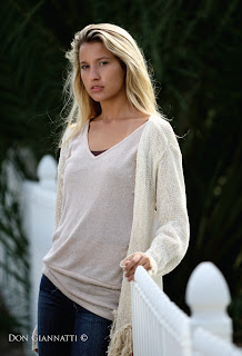 On the whole, this image was exposed correctly; I like the way her hair is rendering and the white fence looks white. Unfortunately, it is not a good exposure for her face. To use the lighting as-is, I would have had to open up another 2/3 stop or so to compensate—but that would have changed the exposure of the whole shot.
 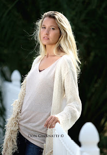 Instead, I provided fill light on her face from a large white fill card in front of her. By controlling this, I made sure the face presented correctly (returning more light to the camera). Because the fill card only affected her face and the front of her shirt, the exposure for the rest of the scene remained unchanged—preserving what I liked about the previous image.
No comments:
Post a Comment