 Today's post comes from the book The Best of Family Portrait Photography by Bill Hurter. It is available from Amazon.com and other fine retailers.
LINES AND SHAPES
As you will see, designing successful family portraits depends on your sensibility of the intangible: those implied lines and shapes in a composition.
Lines. A line is an artistic element used to create visual motion within the portrait. It may be implied by the arrangement of the family members, or inferred, by grouping various elements within the scene. The photographer must be able to recognize real and implied lines within the photograph.
A real line is one that is obvious—a horizon line, for example. An implied line is one that is not as obvious; the curve of the wrist or the bend of an arm is an implied line. Real lines should not
cut the photograph into halves. It is better to locate these at one-third points within the photograph.
Implied lines, like the arms and legs of the group, should not contradict the direction or emphasis of the composition, just modify it. These lines should provide gentle, not dramatic changes in direction, and again, they should lead to the main point of interest.
 Beautiful design doesn’t happen by accident. In this wonderful portrait by Deanna Urs, you will find a statuesque pyramid shape composed of the entire group and a lovely S curve created by the mother’s pose. Deanna used rich fabrics to drape her subjects, lending a timeless atmosphere to the portrait. The beautiful flowing lines of the people offset all of the square lines and edges found in the background props.
 Lines that meet the edge of the photograph—real or implied—should lead the eye into the scene and not out of it, and they should lead toward the subject. A good example of this is the country road that is widest in the foreground and narrows to a point where the subjects are walking. These lines lead the eye straight to the subjects. By the way, the point at which the road in this
example narrows to a point on the horizon is known as the vanishing point.
Shapes. Shapes are groupings of like elements: diamond shapes, circles, pyramids, etc. Usually, it is a collection of faces that forms this type of pattern. Shapes are used to produce pleasing designs within the composition that guide the eye through the picture.
Pleasing Compositional Forms. The S-shaped composition is perhaps the most pleasing of all. The center of interest will fall on either a third line or a golden mean, but the remainder of the composition forms a gently sloping S shape that leads the eye through the photograph and to the main point of interest. The Z shape is a close relative to the S-shaped design.
 The pyramid is the one of the most pleasing shapes to the eye and is often used in photographing large groups. The simple shape brings order to chaos. This image by Tibor Imely displays perfect color coordination and beautiful lighting created by the twilight. When the sun has set below the horizon, its rays continue to light the overhead sky and clouds, creating the softest most beautiful light of the day. Tibor uses no fill light when working at this location, which he frequents often because of the light and pleasant sea-oats background.
 Another pleasing form of composition is the L shape or inverted L shape, which is observed when the group’s form resembles the letter L or an inverted letter L. This type of composition is ideal for reclining or seated subjects. These compositional forms may encompass line alone or line and shape to accomplish the pattern.
 Amidst this beautifully posed image you will find a delightful S curve meandering through the composition, almost unnoticeably. Within the posing you will find various triangles and overlapping triangles that are a result of expert group posing. This image is by Robert and Suzanne Love
 Direction. Regardless of which direction the subjects are facing in the photograph, there should be slightly more room in front of the group on the side toward which they are facing.
For instance, if the family is looking to the right as you look at the scene through the viewfinder, then there should be more space to the right side of the subjects than to the left of the group in the frame. This gives the image a visual sense of direction.
Even if the composition of the image is such that you want to position the family group very close to the center of the frame, there should still be slightly more space on the side toward which the group is turned.
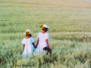 In this beautiful portrait by Fran Reisner, the sisters are positioned to the left of center, moving into the frame, creating a strong sense of direction. They are positioned at one of the points of interest according to the rule of thirds. The field of wheat, with its horizontal lines from foreground to horizon, contrasts the strong vertical shapes of the young girls
At first, such an arrangement may seem to be a foreign concept, but the more you learn to recognize these elements, the more they will become an integral part of your group compositions.
As in any artistic venture, the goal of the family portrait photographer is to provide visual direction and movement in the image, guiding the viewer’s eye through the composition in an interesting way. The opposite of this is a static image, where no motion or direction is found and the viewer simply “recognizes” rather than enjoys all of the elements in the photo.
SUBJECT TONE
The eye is always drawn to the lightest part of a photograph. The rule of thumb is that light tones advance visually, and dark tones retreat. Therefore, elements in the picture that are lighter in tone than the subject will be distracting. Bright areas, particularly at the edges of the photograph, should be darkened either in printing, in the computer, or in-camera (by masking or vignetting) so that the viewer’s eye is not drawn away from the subject.
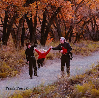 This portrait by Frank Frost combines the warm tones of autumn with the stark black and red outfits of the family. The strong diagonal line runs through the composition, giving it a dynamic quality and a sense of direction. The tones throughout the image coordinate and unify the photograph.
 There are some portraits where the subject is the darkest part of the scene, such as in a high-key portrait with a white background. This is the same basic principle at work; the eye travels to the region of greatest contrast. Regardless of whether the main subject is light or dark, it should dominate the rest of the photograph either by brightness or by contrast.
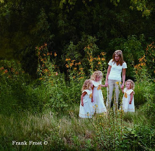 It’s amazing how nature sometimes cooperates with a photographer. Here, the Black-eyed Susans in the background seem to provide a well conceived frame around the family. The daughters’ ribbons match exactly the color of the flowers. The photographer, Frank Frost, carefully burned in areas of tone that might compete with the family so that your focus is drawn to them. Also notice the strong triangle shape created by the composition, offset on a rule-of-thirds line to create a dynamic composition.
 Whether an area is in focus or out of focus has a lot to do with determining the amount of visual emphasis it will receive. A light-colored background that is lighter than the group, but distinctly out of focus, will not necessarily detract from the family. It may, in fact, enhance and frame the group, keeping the viewer’s eye centered on the subjects.
The same is true of foreground areas. Although it is a good idea to make them darker than your subject, sometimes you can’t. If the foreground is out of focus, however, it will detract less from the group, which, hopefully, is sharp.
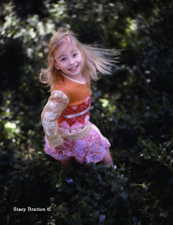 This photograph by Stacy Bratton shows you why parents hire professional photographers to create portraits of their children. This is such an innovative image, made even more effective by shallow depth of field and a relatively slow shutter speed that blurs the child’s hair. And the expression is priceless. Everything about the image is original and fresh.
 A technique that is becoming popular is to diffuse an area of the photograph you want to minimize or use to focus attention on your main center of interest. This is usually done in Photoshop by selecting the area and “feathering” it so that the diffusion effect diminishes the closer you get to the edge of the selection.
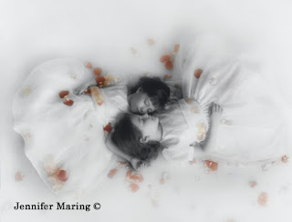 Tension and balance are the two most effective ways to achieve visual interest in a photograph. Here, in Jennifer Maring’s beautiful portrait of sisters, you can see both states at work. The balance and tension are derived from the same area, the forms of the two sisters, which loosely resembles the infinity sign or numeral 8, a highly symmetrical symbol. The imbalance or tension comes from the same place—all of the deviations that make the two matching forms different; for example one girl is bigger than the other, one’s dress is less perfectly shaped than the other, and so on.
 Expert family portrait photographers insist on tight control over wardrobe for a big family photograph. Instead of dictating one “uniform” for the entire family, they will define complementary color schemes. For example, where multiple families are displayed, each will be in a different outfit—khaki and red, or denim and white. Other families within the group will have different coordinating outfits—khaki and yellow, or denim shirts and khaki pants. The result is uniformity and diversity.
TENSION AND BALANCE
Once you begin to recognize real and implied lines and to incorporate shapes and curves into your family portraits, you need to become aware of the concepts of tension and balance. Tension, or visual contrast, is a state of imbalance in a photograph—a big sky and a small subject, for example, is a situation having visual tension.
Although tension does not have to be “resolved” in an image, it works in tandem with the concept of balance. As you examine the photographs in this book and read the captions, you will hear these terms referred to often. For example, a group of four on one side of an image and two subjects on the other side of the frame produce visual tension. They contrast each other because they are different sizes and not necessarily symmetrical. But the photograph may be in a state of perfect visual balance by virtue of what falls between these two groups, or for some other reason. For instance, using the same example, these two different groups could be resolved visually if the larger group is wearing dark clothes and the smaller group is wearing brighter clothes. The eye then sees the two groups as more or less equal—one group demands attention by virtue of its size, the other gains attention by virtue of its brightness.
These strategies are subjective to a large extent, but there is no question that the eye/brain reacts favorably to both balance and visual tension and they are active ingredients in great photography.
BUY THIS BOOK ON AMAZON

Great! Thanks! I just found your blog and will be subscribing to it and looking forward to future posts!
ReplyDelete