Top 5 Poses for High School Seniors

Today's post comes from the book Master Guide for Photographing High School Seniors by Dave Wacker, Jean Wacker and J.D. Wacker. It is available from Amazon.com and other fine retailers.

Top-Five Senior Girl Poses

The Ski Slope. The ski-slope pose is an easy, sitting-on-the-ground pose with excellent balance. It provides a wide triangular base and long, dynamic diagonal lines.


The Standing S. With clear alternating posing lines, this classic female pose is slimming, yet it helps to define body curves.


The Lean. The lean is a very graphic and dynamic pose that will not work for every subject and every outfit. It exaggerates the feminine S curve and is very effective for posing a series of images: full-length, three-quarter-length, and even tight head-and-shoulders portraits.


Head and Shoulders. Depending upon the subject’s build, hair, and facial shape, several poses can be used for girls’ head-and-shoulders portraits. However, tipping the shoulders and tilting the head toward the higher shoulder is always the most feminine look.


Hands. In this crossed-arm pose, known as “The Butterfly,” the wrists are bent, the hands are shown at the edge, and the fingers are long and beautiful.


Top-Five Senior Boy Poses

The Mountain. The mountain pose is a very easy, ground-level pose for senior boys—especially if you show them how to position their legs. Tipping the head toward the raised knee forces all of the posing lines to converge, creating a very masculine C pose. This is a very comfortable pose and can yield several good images when photographed for different crops, at different angles, etc.


The Standing C. Start by turning the subject to the side and having him shift his weight to his back leg. This will tip most of the posing lines in one direction. Tip his head toward his lower shoulder to complete construction of an elongated C.


The Lean. This is probably our favorite, multifunctional pose for senior boys, because it works for almost everyone. Provide a three-foot wooden ladder for the boy to put his foot on, have him lean his arm on his leg, tip his head to his lower shoulder, and that’s about it. You can do several images with this pose, including an excellent head-and-shoulders portrait. Give your subject a ball and the same pose works great for sports portraits, as well.


Head and Shoulders. Depending upon the subject’s build, hair, and facial shape, several poses can be used for guys’ head-and-shoulders portraits.Just be sure to keep the head tipped toward the lower shoulder, which is masculine, not the higher shoulder, which is very feminine.


Hands. As when posing girls’ hands, try to show the edge of the hand and avoid too many prominent knuckles. A closed hand is good for boys, as long as they don’t close it too tightly, straining the knuckles and shortening the fingers.


BUY THIS BOOK FROM AMAZON

Posing Elements

Today's post comes from the book The Best of Portrait Photography, 2nd Edition by Bill Hurter. It is available from Amazon.com and other fine retailers.

Tilting the Head. Your subject’s head should be sightly tilted in every portrait. By doing this, you slant the natural line of the person’s eyes. When the face is not tilted, the implied line of the eyes is straight and parallel to the bottom edge of the photograph, leading to a static composition. By tilting the person’s face, the implied line becomes diagonal and the pose appears more dynamic.

Masculine and Feminine Poses. While there is considerable debate over the relevance of the terms “masculine” and “feminine,” they are generally understood by portrait photographers to refer to a pose containing certain basic elements—much of it relating to the direction the subject’s head is tilted. In the masculine pose, the head and body are turned in the same direction and the head is tipped toward the low (far) shoulder. In the feminine pose, the head is turned and tipped toward the high (near) shoulder; the body is leaned forward at the waist, then tilted slightly in the opposite direction from the way the face is turned. For example, if the subject is looking to the left shoulder, the body should lean slightly to the right.

This portrait is casual, but it still adheres to the basics of good posing. The shoulders are turned at an angle and the head tipped toward the far shoulder in a traditional masculine pose. The camera viewpoint is high, providing a unique perspective, and the hands are treated casually. Teenage boys should be posed naturally to relieve self-consciousness. Photograph by Deborah Lynn Ferro.

The Eyes. The area of primary visual interest in the human face is the eyes. The eyes are the most expressive part of the face and if the subject is bored or uncomfortable, you will see it in
their eyes.

Engaging the Eyes. The best way to keep the subject’s eyes active and alive is to engage the person in conversation. Look at the person while you are setting up and try to find a common frame of interest. Ask your subject about himself; it’s the one subject everyone is interested in talking about. If the person does not look at you when you are talking, he or she is either uncomfortable or shy. In either case, you have to work to relax your subject and encourage trust. Try a variety of conversational topics until you find one the person warms to and then pursue it. As you gain your subject’s interest, you will take his or her mind off of the portrait session.

This album page by Heidi Mauracher exemplifies the feminine pose. The bride’s head is tipped toward the near shoulder and the beautiful sloping line of the shoulders. Also, notice the beautiful hand posing; the edges of the hand are photographed and the graceful fingers are separated by a small amount of space. Notice, too, that the bride is not really resting her chin on her hand; it is an effective illusion of the pose.

Direction. The direction the person is looking is important. Start the portrait session by having the person look at you. Using a cable release or wireless remote with the camera tripod- mounted forces you to become the host and allows you to physically hold the subject’s attention. It is a good idea to shoot a few frames of the person looking directly into the camera, but most people will appreciate some variety. Looking into the lens for too long a time will bore your subject, as there is no personal interaction when looking into the camera. Many photographers don’t want to stray too far from the viewfinder and so they will “come up” from
the viewfinder to engage the subject just prior to the moment of exposure.

Iris Position. The colored part of the eye, the iris, should border the eyelids. In other words, there should not be much white space between the top or bottom of the iris and the eyelid. If there is a space, it should be intentional—as when creating a wide-eyed, innocent look, for example.

Di Fingleton is a magistrate in Australia. For his book, The Faces of Queensland, Marcus Bell chose to isolate only one eye as the basis for his portrait of her. You can see the compassion and intelligence in this portrait as effectively as if the entire face were pictured

Pupil Size. Pupil size is also important. If working under bright lights, the pupil will be very small and the subject’s eyes will look “beady.” A way to correct this is to have your subject close their eyes for a moment just prior to the exposure. This allows the pupils to return to a normal size for the exposure.

Just the opposite can happen if you are working in subdued light; the pupil will appear too large, giving the subject a vacant look. In that case, have the subject stare momentarily at the brightest nearby light source to contract the pupil.

The Mouth. Generally, it is a good idea to shoot a variety of portraits—some smiling and some serious (or at least not smiling). People are often self-conscious about their teeth and mouths, but if you see that your subject has an attractive smile, get plenty of exposures of it.

One of the best ways to produce a natural smile is to praise your subject. Tell him or her how good they look and how much you like a certain feature of theirs. Simply saying “Smile!” will produce a lifeless, “say cheese” type of portrait.With sincerity and flattery you will get the person to smile naturally and their eyes will be engaged.

A natural smile is often the key to a successful portrait. Pictured is professor Ian Frazier, who heads up the Queensland Center for Immunology and Cancer Research in Australia. Marcus Bell chose to picture him in a closed mouth smile that seemed to be indicative of his character. This portrait reminds us that the mouth is as expressive as the eyes.

It may also be necessary to remind the subject to moisten his or her lips periodically. This makes the lips sparkle in the finished portrait, as the moisture produces tiny specular highlights on the lips.

Also, pay close attention to be sure there is no tension in the muscles around the mouth, since this will give the portrait an unnatural, posed look. Again, creating a relaxed environment is the best way to relieve tension, so talk to the person to take his or her mind off the session. Some people have a slight gap between their lips when they are relaxed. If you observe this, let them know about it in a friendly, non-critical way. If they forget, simply remind them. Although this gap is not disconcerting when casually observing the person in repose, when frozen in a portrait it will look unnatural to see the subject’s teeth showing through the gap.

One of the most engaging smiles can be seen when both the mouth and the eyes smile simultaneously. The best photographers are well paid to find and isolate just such moments of pure joy. Photograph by Alisha and Brook Todd.

Laugh Lines. An area of the face where problems occasionally arise is the frontal most part of the cheek—the part of the face that creases when a person smiles. Some people have pronounced furrows that look unnaturally deep when they are photographed smiling. You should take note of this area of the face. If necessary, you may have to increase the fill-light intensity to lighten these deep shadows, or adjust your key light to be more frontal in nature. If the lines are severe, avoid a “big smile” type of pose altogether. (Note: In some cases, these smile creases define character. If so, the remedial lighting should be avoided in order to showcase this trait.)

Chin Height. The height of the subject’s chin will have an impact on the viewer. If the person’s chin is too high, he or she will look haughty; if it is too low, the subject will look timid or lacking in confidence.

You would not think that chin height would be a crucial element in a good portrait, but it definitely is. In this appealing senior portrait by Ira Ellis, the chin height of this young man makes him appear confident but fun loving. A higher or lower chin height would not necessarily have been as appropriate with this pose.

Beyond these psychological implications, a person’s neck will look stretched and elongated if the chin is too high. The opposite is true if the chin is held too low; the person may appear to have a double chin or no neck at all.

The solution is a medium chin height. When in doubt, ask the sitter if the pose feels natural. This is usually a good indicator of what looks natural.

BUY THIS BOOK FROM AMAZON

Feathering Light

Today's post comes from the book Christopher Grey's Studio Lighting Techniques for Photography. It is available from Amazon.com and other fine retailers.

Some time ago, I was involved in a conversation between photographers who believed that digital cameras simply could not record an adequate contrast range. Horror stories flew about the difficulties of shooting blacksuited executives with white shirts, tuxedoed groomsmen and whitegowned brides, and interracial couples. The problem, as they saw it, was that one side of the contrast range had to be slighted in favor of the other. The ultimate dilemma, of course, was deciding which side would take the hit. Most decided it would be best to shoot for the bright side and fix the rest in Photoshop.

Though that approach works in theory, it’s misguided in reality by assuming that exposure deficiencies can always be adjusted to “normal” by using Levels or Curves adjustments. They cannot. After a certain point (1/3 stop of overexposure or 2/3 stop of underexposure), straight Photoshop adjustments will not look the same as a perfectly exposed counterpart. The second flaw in the argument is the tremendous amount of extra work a photographer would have to do just to make the proofs presentable. In other words, one would have to do major, time-consuming retouching on each and every image before making a single dime on prints. Such an investment of time is simply not acceptable in a successful digital workflow environment, even if you go through the trouble of shooting RAW files.

In truth, a little more planning on the front end would mean no work at all on the back end—no masking, no adjustments, no RAW processing—just a quick trip to the printer for terrific proofs (cosmetic retouching optional). We can accomplish this task in the studio by controlling the
strength and direction of the light.

The models for this chapter are friends of mine, Sandra and Keith, who are very much in love and engaged to be married. He is African American, she is Latina. To make this exercise more difficult (and to prove how easy this actually is), I requested that Keith wear white clothing and Sandra wear black. Because I want substantial modeling of the planes of their faces, I will use only one light for my main light, plus two kickers and a background light.

Given enough distance and a large enough light source, such as a large softbox or umbrella, it’s quite possible that you could keep your source far enough away from the subjects so that the light spread will be constant over both (or more) of them.

But what if you don’t have that option? Many photographers work in relatively small spaces and have to make the most of them. Also, many, if not most, do not have the luxury of working with large (4x6-foot) softboxes or umbrellas with a diameter larger than 36 inches.
After my friends arrived, I placed two tape marks on the floor to indicate their positions and began to tweak my previously roughed-in lighting scenario. My main light was a strobe in a 3x4-foot softbox, set at the optimum distance (in my opinion) of 7 feet from the two subjects. At that distance, when the main light is aimed to the center of the two people (which is the logical place to aim it), the difference in exposure from his right shoulder to her left shoulder was 4/10 of a stop, 2/10 on each side of my target aperture of f/5.6 and too wide a range to properly expose everything. I decided I’d fix it after the other lights were set (diagram above).

To separate the subjects from the background and add visual interest, I added two strobes in strip light softboxes, one on each side behind the couple and camera-blocked with black bookends. As a twist to what’s usually done, I powered the two lights down to 1/3 stop less than the main light. I knew I would still have a highlight along the edges because the angle of incidence of those two lights bounced light straight back to the camera along the lens axis, which, by itself, looked like this (image below).


To add depth, I mounted a strobe with a beauty bowl and a 25 degree grid (a favorite combo) on a boom arm. From directly above the couple the light was aimed behind and below shoulder height. This background light was powered 1/3 stop less than the target value for the main light, as measured at the hot spot (image below).


Once the secondary lights were in place, I angled the main light softbox significantly to the left, actually aiming it past her left shoulder. At first blush this doesn’t make sense because logic dictates that he will not get enough light. In truth, however, that’s exactly what we want.

Good softboxes are designed to spray light evenly, but not necessarily with the same intensity, in all directions at it exits the box. What I did was feather the light, by angling the box, until the strength of the light on the right side equaled the strength on the left. From there it was a simple matter to power up the generator to get my target f-stop of f/5.6. I know it looks and sounds odd, but if you try it, I guarantee you it will work (diagram below).


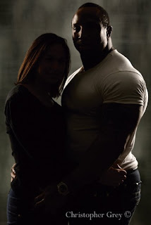
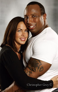
The shoot began with Keith. If he would be overexposed, it would most likely be from this side, as it’s closest to the light. Note that there is detail in even the brightest parts of his shirt as well as in her black outfit. Note also that both faces are represented perfectly, even though no other lights are in play (image below, top). (By the way, all of these images are JPEGs straight out of the camera. A little cropping, but no Curves or Levels adjustments at all [image below, bottom].)


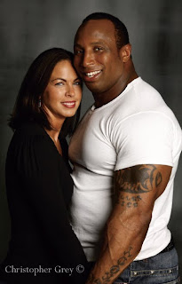
When all lights are up, the true beauty of feathered light becomes obvious. The exposure is even across the board, the kicker lights add contour and visually separate the couple from the background, and the background light provides dimension. The feathered light is so constant and perfectly controlled that their positions make no difference at all, as long as they stay on their marks (image below).


A Bonus
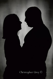
As we were wrapping up this shoot, it occurred to me that this scenario would be very romantic without the main light. I turned it off but maintained the camera’s aperture at f/5.6. The background light does wonderful things, adding a sense of mystery to the image, while the side lights contour my friends and give them some dimension (image below). The ability of light to feather itself across a large area is something that you’ll be able to use in dozens of situations. You only need to play with this once to get the concept, and each additional time you use it, it will become easier to estimate just how much angle you’ll need. The first time I tried it, years ago, I spent ten minutes getting it right. These days, it takes only a minute or two. The best part? You can feather light from much shorter light-to-subject distances.


BUY THIS BOOK FROM AMAZON

Light and Color

Today's post comes from the book Lighting Techniques for Photographing Model Portfolios by Billy Pegram. This book is available from Amazon.com and other fine retailers.

Color Temperature. When we look at a visible light source, it appears to be white, but it’s actually a mixture of colors that our eyes are designed to perceive as white. In fact, few light sources are actually neutral in their color. Most have some some color cast. This color is measured in degrees Kelvin (K). As a result, it is known as the color temperature. The higher the temperature, the more bluish the light is; the lower the temperature, the more reddish the light is. As shown in the table below, light sources have many different color temperatures.

Overcast daylight . . . . . . . . . . . . . . . . . . .6500–7200K
Midday sun . . . . . . . . . . . . . . . . . . . . . . .5400–5700K
Sunrise or sunset . . . . . . . . . . . . . . . . . . .2000–3000K
Fluorescent (daylight-balanced) . . . . . . . . . . . . .6500K
Electronic flash . . . . . . . . . . . . . . . . . . . . .5600–6200K
Fluorescent (cool white) . . . . . . . . . . . . . . . . . . .4300K
Tungsten-halogen . . . . . . . . . . . . . . . . . . . . . . .3200K
Household lamps (40–150W) . . . . . . . . . .2500–2900K
Candle flame . . . . . . . . . . . . . . . . . . . . . . . . . . .2000K

Color temperature has a direct bearing on how colors will be recorded in your images. In many cases, getting the desired image colors requires compensating for the color of the light source. This is most commonly accomplished through film selection, filtration, or white-balance selection.


Without changing the lighting, notice the huge change that adjusting the white-balance setting makes in the way all of the colors on this chart are recorded.


Daylight films render colors accurately, as your eye sees them, when used under light with a color temperature of 5500K (the light found in the middle of the day). Later in the day, the color temperature is lower. Shooting with daylight film, this will result in colors that are warmer than they appeared to your eye. To correct for this, you would need to add a color-compensating filter to your camera. In the digital world, however, things are simpler. To control how your camera “sees” color, you adjust its white-balance setting to match the color temperature of the light. Digital SLRs have white-balance presets (like daylight, incandescent, and fluorescent) or you can create a custom white-balance settings by taking a reading off a white card illuminated by the light source you’ll be using.

Practical Example: Adding Variety with White Balance. The three images below, all photographs of Brigitte, were shot to illustrate how a simple change in white balance or exposure will drastically change the effects of your photographs. The lighting for this series was a very simple: a small soft box was pointed directly at the model from about six feet away and angled down to cover the mask of her face (the forehead, eyes, cheeks, nose, lips, and chin). Two White Lightning strobes were aimed at the model’s garment and goboed to prevent lens flare. With these lights, the correct white balance (normal representation of colors) should be either a daylight or flash setting on your camera’s menu. Setting the camera to a tungsten white balance produces a blue tonality that can lead to spectacularly beautiful images.


Changes in white balance and exposure are a simple way to add variety. Here, the white-balance and exposure were set to match the flash.


Here, the exposure remained the same, but the white-balance setting was changed to tungsten.


In this image, the white-balance setting was left on tungsten, but the image was overexposed by one stop.

This is not a situation of right or wrong, good or bad; the only question is whether or not the results meet your expectations—and the expectations of the client who is paying you. For example, this would not be an appropriate technique to try if you knew that the client required accurate color to show a garment or product packaging. (Note: When you take a job from a commercial client, there will normally be an art department or, at minimum, a graphic designer with whom you will work. Be creative. Give them a variety of options—maybe even something you try in postproduction, as seen in the image below. Demonstrate to the client that you are proficient and possess creative ability. By doing so, you will gain their trust and respect, which usually opens them to allowing you more creative control.)


Further variations can be explored using postproduction enhancements.