 Today's post comes from the book Lighting Techniques for Photographing Model Portfolios by Billy Pegram. This book is available from Amazon.com and other fine retailers.
Color Temperature. When we look at a visible light source, it appears to be white, but it’s actually a mixture of colors that our eyes are designed to perceive as white. In fact, few light sources are actually neutral in their color. Most have some some color cast. This color is measured in degrees Kelvin (K). As a result, it is known as the color temperature. The higher the temperature, the more bluish the light is; the lower the temperature, the more reddish the light is. As shown in the table below, light sources have many different color temperatures.
Overcast daylight . . . . . . . . . . . . . . . . . . .6500–7200K
Midday sun . . . . . . . . . . . . . . . . . . . . . . .5400–5700K
Sunrise or sunset . . . . . . . . . . . . . . . . . . .2000–3000K
Fluorescent (daylight-balanced) . . . . . . . . . . . . .6500K
Electronic flash . . . . . . . . . . . . . . . . . . . . .5600–6200K
Fluorescent (cool white) . . . . . . . . . . . . . . . . . . .4300K
Tungsten-halogen . . . . . . . . . . . . . . . . . . . . . . .3200K
Household lamps (40–150W) . . . . . . . . . .2500–2900K
Candle flame . . . . . . . . . . . . . . . . . . . . . . . . . . .2000K
Color temperature has a direct bearing on how colors will be recorded in your images. In many cases, getting the desired image colors requires compensating for the color of the light source. This is most commonly accomplished through film selection, filtration, or white-balance selection.

Without changing the lighting, notice the huge change that adjusting the white-balance setting makes in the way all of the colors on this chart are recorded.

Daylight films render colors accurately, as your eye sees them, when used under light with a color temperature of 5500K (the light found in the middle of the day). Later in the day, the color temperature is lower. Shooting with daylight film, this will result in colors that are warmer than they appeared to your eye. To correct for this, you would need to add a color-compensating filter to your camera. In the digital world, however, things are simpler. To control how your camera “sees” color, you adjust its white-balance setting to match the color temperature of the light. Digital SLRs have white-balance presets (like daylight, incandescent, and fluorescent) or you can create a custom white-balance settings by taking a reading off a white card illuminated by the light source you’ll be using.
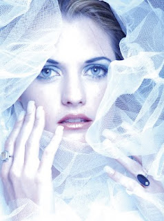
Practical Example: Adding Variety with White Balance. The three images below, all photographs of Brigitte, were shot to illustrate how a simple change in white balance or exposure will drastically change the effects of your photographs. The lighting for this series was a very simple: a small soft box was pointed directly at the model from about six feet away and angled down to cover the mask of her face (the forehead, eyes, cheeks, nose, lips, and chin). Two White Lightning strobes were aimed at the model’s garment and goboed to prevent lens flare. With these lights, the correct white balance (normal representation of colors) should be either a daylight or flash setting on your camera’s menu. Setting the camera to a tungsten white balance produces a blue tonality that can lead to spectacularly beautiful images.

Changes in white balance and exposure are a simple way to add variety. Here, the white-balance and exposure were set to match the flash.

In this image, the white-balance setting was left on tungsten, but the image was overexposed by one stop.
This is not a situation of right or wrong, good or bad; the only question is whether or not the results meet your expectations—and the expectations of the client who is paying you. For example, this would not be an appropriate technique to try if you knew that the client required accurate color to show a garment or product packaging. (Note: When you take a job from a commercial client, there will normally be an art department or, at minimum, a graphic designer with whom you will work. Be creative. Give them a variety of options—maybe even something you try in postproduction, as seen in the image below. Demonstrate to the client that you are proficient and possess creative ability. By doing so, you will gain their trust and respect, which usually opens them to allowing you more creative control.)


No comments:
Post a Comment