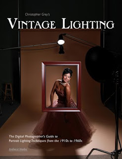
 Today's post comes from the book Christopher Grey's Vintage Lighting: The Digital Photographer's guide to Portrait Lighting Techniques from the 1910 to 1970. It is available from Amazon.com and other fine retailers.
1930s—The Dirty Thirties
The often-used title for that decade had nothing to do with sexual mores but rather with the incredible dust storms that ravaged the nation’s food belt. The Great Depression was in full swing at the start of the decade, with many citizens impoverished or, at the very least, in need of fresh food and clean water.
Photographically, lighting styles were evolving into the greatest burst of visual elegance to date. Movies had become the “great escape” for people, and audiences in the ’30s saw movie stars as even more “larger than life” than they did in the ’20s. MGM’s tag line, “More stars than there are in heaven” was never more valid, as actors became the elite royalty of the country.
Personally, I think the two great photographers that fully emerged during this decade, Clarence Sinclair Bull and George Hurrell, were geniuses at what they did, but I don’t think they truly understood their craft. After studying their work for years (I happily own several original and signed Hurrell prints), I’d have to say they understood the nuances of photography, especially lighting, but on only an intermediate level. They frequently made “mistakes” that would doom us if we used them today on, say, a high school graduate. Upwardly directed shadows, sometimes multiple shadows, could brand any one of us as a low-grade photo moron unworthy to wield any camera of more than two megapixels. Unless we’re shooting retro Hollywood, of course.
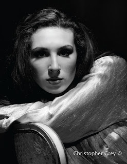
Hurrell and Bull were hired to photograph both the biggest and smallest names in Hollywood. Regardless, the people they shot had attitude. For historians to say that their results were timeless because the photographers were able to draw some monumental performance out of an actor, to look deeply into their souls, I say phooey. The stars could act; that was their job, after all. They only required a little direction and trust in the photographer to make things happen. Your clients will need more direction from you to acquire the attitude of a star and make the shoot successful.
Blown-Out Highlights
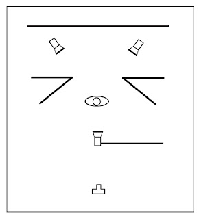
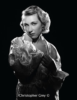
Two classic looks were achieved with three lights with grids, precise positioning of the main light to establish the contrast and specularity of the light, and serious overexposure from the kickers.
Two lights were set about 6 feet behind the model, each sporting a 40 degree grid, quite wide for many applications but perfect here because the lights will cover all of the body I wish to include in the images. I began by measuring each light separately and to the same power, f/16 as I recall, although that doesn’t matter as much as the final main to accent light ratio. I wanted these accent lights to be really bright, to actually burn out any detail that would be directly hit.
Because the lights were covered with rather wide grids, the risk of flare onto the lens was guaranteed. To remedy this, I moved black bookends into the scene, keeping light on my beautiful model while keeping it off my beautiful lens and saving my glass.
The main light was fitted with a 10 degree grid and placed on a boom so it was directly over the model, in a straight line to the axis of the lens, and about 4 feet from the model. This light was powered 1 stop below the two kickers, but this reading would be the working aperture for the camera. One note of caution here: you should not meter the light in the traditional sense, with the meter below the chin and aimed at the camera. The correct way to meter any light fitted with a grid is to meter with the dome placed between the model’s eyes, aimed at the camera. Diagram below:
Let me back up just a bit. When the light is placed in this position, directly over the lens’ axis, and the subject is looking directly at the camera, we get butterfly lighting, but when the subject moves her head to either side, the effect is more like broad or short lighting. This means that a light placed this way, along the axis, is extremely versatile, perhaps even more so than with actually using a set light scenario. It all depends on how you visualize the placement of your model’s face in your composition.
My first series was very successful, absolutely duplicating a classic look of the ’30s. My model sat on a stool (which was cropped out when I went to 8x10), toying suggestively with her robe. Again, this is a classic look, as the female stars of the time were quite aware they were being exploited for their acting ability as well as their sex appeal. Note the splash of light on the model’s nose. This is often considered a “mistake” in traditional portrait photography, and it certainly can be. The trick is to keep it as minimal as possible. Too much light will make the nose look too prominent. A nose splash from both sides is visual death, as the nose will look huge. It’s important to control it completely, and the easiest way to mess it up is to place the two kickers too far away from the model’s sides. If that’s what you see, move the lights in and flag them more tightly. You can thank me later. Photo below.
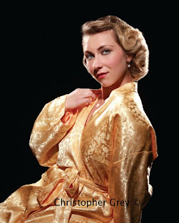
My second setup was really easy. All I had to do was move the boom-mounted light within a couple feet of the model and power it down to the previously determined f/stop. There is no set formula to determine the distance, as it all depends on how much of the model’s face and figure you want to show. Remember that the kickers will define the rest of her shape.
My model was standing this time, with the circle of light much more clearly defined. I think you can readily see how cool and dramatic a grid-spotted main light can be. Photo below.
Parabolic reflectors with grid spots will produce beautifully contrasty, modeled light. Is this appropriate for a head and shoulders portrait? When dealing with retro light, absolutely. Even though this shot was cropped above the transition zone, the part of an image that recedes into shadow, the result is fantastic. Add a little sepia toning and crop to a traditional size, such as 8x10 inches, and you’ll have a product that your client’s friends will look at and say, “Is that your grandmother? You look just like her!” Your client will then tell her friends about the incredible photographer she hired to get the image (unless she’s protective and selfish, of course, in which case you’d better have an advertising program in place). Photo below.
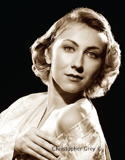
One further note: in the 1930s, ’40s, and ’50s, Hollywood’s retouchers spent hours slaving over negatives to make everything perfect, working on the eyes and blemishes but spending the most time getting rid of flyaway hair. I typically do the same thing when I feel it’s necessary, especially on retro hair, because it’s worked and pinned, essentially beaten into submission to get the correct style. I clone out most of it, leaving a few stray ends just to keep it looking natural but still perfectly styled. The worst image you could produce would be one with every hair perfectly in place. It doesn’t ever work that way in real life, even with someone who is as follicly challenged as your humble author.

No comments:
Post a Comment