Showing posts with label composition. Show all posts

Mixed Lighting


Today's post comes from the book Doug Box's Flash Photography: On- and Off-Camera Flash for Digital Photographers by Doug Box. It is available from Amazon.com and other fine retailers.


Color Conversion Gels
Every light source, natural or artificial, has a specific color temperature, measured in Kelvin degrees. Daylight and flash, for instance, have a color temperature of about 5500K, while incandescent light measures about 3200K. The lower the temperature of the source, the “warmer” the light. The higher the color temperature, the “cooler” the light.

When you’re working in the studio, you have complete control over your lighting. However, when you’re shooting on location, you will encounter many lighting variables. When you’re faced with working with lights of different color temperatures, you have a powerful tool at your disposal: gels. These gelatin sheets can be used to modify your light source, changing the color temperature of your flash. You cannot gel the ambient light, so you must gel your on or off-camera flash to match the color temperature of the ambient light.

Here is an image taken on a cruise ship. It was nighttime, so the incandescent lightbulbs provided the only light in the scene. To capture the final image, I determined the exposure, placed a conversion filter on my flash, and changed the camera’s white balance preset to incandescent. That was it.

I photographed this image using an off-camera flash (5500K) modified with a color conversion gel to bring the flash temperature to 3200K. I also set the camera’s white balance preset to incandescent in order to produce neutral skin tones on the subject. However, the rest of the image has a blue color cast because the light is 5500K or higher. In addition, the light is flat and boring. The exposure was f/4 at 1/6 and ISO 200. The flash metered at f/4.


Here is the setup shot for the final image. The softbox was placed at the 45º/45º position. It was positioned perpendicular to the ground, so that the face of the box was parallel to the subject’s face. If you take a close look the final image, you can see that this rendered the face perfectly lit, and the light gently fell off so the subject’s shirt and pants—and even the rock wall—did not appear overlit. A small Morris Midi light with a warm gel was used below and behind the subject as a rim light.


Here is the final image. Selecting a faster shutter speed (1/60) rendered the background 3.5 stops underexposed, rendering the sky darker and more dramatic.

Case Study: Gels and Exposure Compensation
The images of the biker below were made in a challenging lighting situation. Let’s take a look at how I was able to make a successful image using gels and flash exposure compensation.

Here’s the scenario: The light in this scene came from streetlights—sodium vapor lights with a color temperature of roughly 2750K. I didn’t have the proper gel to convert my flash to 2750K, so I used a color conversion gel to produce an incandescent color balance, which is approximately 3200K. As you can see, the background is a little warm and the man’s back is too dark. The color isn’t perfect, but I like the way it looks. The exposure was f/4 at 0.5 second and ISO 200. In the first image, the on-camera flash was off.

To create the second, third, and fourth and fifth images in the series, I changed the flash exposure compensation on my ungelled on-camera flash to –3, –2, and –1, and 0 respectively. I used the flash compensation setting on the back of the flash rather than making the change via my camera. It is faster and allows for a –3 exposure, versus the camera’s maximum setting of –2. Each of the images in this series was made using the E-TTL mode on the on-camera flash, and each has a different contrast range, yet the images were captured almost as quickly as the flash recycled. The exposure of the subject’s face was consistent throughout all of the images because the off-camera flash was used in manual mode. The camera was also used in the manual mode.

Each of the images in this series was made using the E-TTL mode on the on-camera flash, and each has a different contrast range, yet the images were captured almost as quickly as the flash recycled. Note that the subject’s back, which was initially quite dark, became lighter with each exposure change. The exposure of the subject’s face was consistent throughout all of the images because the off-camera flash was used in manual mode. The camera was also used in the manual mode. As the man’s back becomes lighter, it also becomes more blue because of the color cast that an ungelled on-camera flash added when lighting the back of the subject.What a difference using gelled flash can make! The flash exposure compensation for the final image was set to –2.


Using Gels for Creative Effect
Sure, gels come in handy when you need to convert your flash units to match the color of the ambient light in the scene, but you can also use gels to create more interesting effects. There are some times when you may want to add strong color to a background or to an overall scene to create a more diverse array of image looks or moods. I keep a pack of gels in my camera bag at all times. I am surprised at how often I grab a little piece of color magic.

The images on the next page show how you can use gels to create a wide variety of portrait looks for your clients. By adding creative color to your images, you can add mood and character to your portrait offerings, which can lead to bigger sales.

This image was made with an ungelled flash and a softbox

Here, you can see the effect that was achieved when a purple gel was added to the kicker light (a flash) positioned behind the subject. I like both photographs, but the one made with the gelled flash seems to have more depth and appeal.


To create these two images, I used small Morris slaves with gels to color the black corrugated tin background.

To create the final image, I simply pointed the lights toward the camera, and they became an interesting part of the overall composition.
Portrait Photography: Behind the Scenes

Today's post comes from the book Professional Portrait Photography: Techniques and Images from Master Photographers by Lou Jacobs Jr. This book is available from Amazon.com and other fine retailers. In the book, Jacobs profiles 10 leading portrait photographers about their craft and their business. Here is an excerpt from his profile of photographer Chris Nelson.

A former photojournalist and reporter, Chris used to supplement his income shooting weddings, advertising images, and senior portraits. In high school in the 1970s, he and his friends built a darkroom and shot for the school paper, yearbook, and sporting events. In 1991, he started a portraiture business now called Fall Creek Portrait Design in Fall Creek, WI. Since portraiture became his lifelong interest, Chris has earned Accolades of Photographic Mastery and Outstanding Photographic Achievement from WPPI, and is proud of winning WPPI’s senior portrait category in 2002 and 2004.

Describe your background.
I studied at University of Wisconsin–Milwaukee and graduated with a BA in English with photojournalism and fine art photography as part of my studies. While still in college, I did photography and graphic design for the college magazine, and after graduation, I worked at several newspapers as a reporter and photographer. Since my background was not portraiture, I wanted to learn all I could about this new area, and joining WPPI and PPA were great avenues.

Who are your influences and mentors?
When I caught Monte Zucker’s 1999 tour, and that of portrait artist Al Gilbert, I was blown away by their use of barebulb flash, as opposed to using softboxes, umbrellas, and reflectors. Those photographers had fluid posing styles that made subjects look really natural. I analyzed what they were doing and adopted some of their techniques so my work would look different from most other photographers’ portraits.

Don Blair and Michele Gauger influenced the foundations of my photographic style. Robert Lino and the late Dean Collins influenced my glamour style. While glamour photography comprises only about 20 percent of my studio’s business, that style influences much of my work. All my high school senior girls want to look like models, and seniors are 60 percent of my business.


Describe your studio.
I worked out of my home studio during a three-year transition from photojournalism to portraiture. I continued to take assignments with the local newspaper and shot for Chippewa Valley Technical College, creating images of students for the school’s cutting-edge programs.

In 1994, I moved into my current building, an 1880s bank on the main street of Fall Creek, WI (population 1,250). After renting half the building, I bought the property in 1998 and began restoration. In 2004, I added a large window-lighted camera room, a new production room, and a second dressing room. The studio is now about 3,000 square feet. Though I have two camera rooms, I still do a lot of location work because my clients and I love the variety. Many photographers in the vicinity don’t leave their studios.

I have three employees, my daughter Erin, my son Tim, and Ashley who does a little of everything, except shooting. She specializes in Photoshop, retouching, and finishing images, does client consultations, and a good share of the sales work.


Erin is like Ashley’s understudy, with much the same aptitude for graphics software applications. She has a great eye for design and is in training for high school senior album layout. Tim is a high school junior who enjoys being second camera at weddings, doing mostly candids. We expect when he’s in college he can shoot weddings on his own.

How do you approach your sessions?
The root of portraiture is the word portray. Photographers seek to visually portray their clients in artistic images that describe aspects of their lives or personalities. Before sessions I normally do a consultation where we get to know each other and exchange ideas; that helps keep us on track. How I approach getting what they want evolves through my style, coming from my consciousness and vision. If a casual observer can identify with and understand the meanings conveyed by an image, it’s a good, if not a fine, portrait.

How do you approach posing?
I have favorite poses, but they have to fit the subject. A pose might look great for one person and awkward for another, so you have to analyze your subject. My job is to accentuate the good features and downplay or hide what we don’t want to show through lighting. I try to make a positive aspect of the subject’s appearance so dramatic and compelling that viewers don’t notice a negative. For example, I created a glamour portrait of a woman who had recently had a baby and hadn’t lost all of her belly. She said her husband loved her butt, so I posed her with it at about a 30-degree angle to the camera and had her twist at the waist and look over her shoulder. This hid her tummy, and we chose a high key background with a hint of pink, which blended with her outfit.

In the last few years, I’ve adopted a new posing style by letting people pose themselves. I have clients talk about themselves and I watch their body language. When they do something that looks good, I tell them and then light that pose so it looks natural. This saves the effort of trying to fit someone into a pose. For example, I told a senior girl to pose on a stool in front of a formal
background. Instead, she knelt on it, sitting on her hocks, a pose I’ve never seen before. I said she looked great. I turned the stool about 45 degrees away from the main light, and she turned to look at me. The picture was uniquely her.

What strategies do you employ to communicate with your subjects and elicit the desired expressions?
I often describe the photo session as a stage performance where the part clients play is to talk about themselves. I reassure them, especially shy clients, that it’s my job to make them look good. “What’s the most important thing about a picture?” I’ll ask, and I get all kinds of answers. I’ll say, “The real answer is that you look great. The better I understand what you want, the better I can do this.”


In my orientation about posing, especially for women, I mention the ability to move body parts separately, face toward the light, and tip their head over their left shoulder. I’ll tell them, “Don’t move your upper body, but turn your hips away from me to the right.” I also tell people I don’t want them to smile all the time, that we need to capture a range of moods and expressions. I’ll suggest, “Point your chin toward me a little,” often getting a slightly bewildered look. Their cooperation shows they know I care what their images look like.

Shooting sequences is critical. If you get a good pose, quickly get different angles that really add variety to a sitting. Ask clients not to abandon a pose as soon as they hear the shutter click.

What type of backgrounds work best for you?
When we expanded the building we left the exterior brick exposed. I add props such as an old antique radio and phonograph, or antique furniture. I prefer props you find by chance to those from photographic catalogs, though I do have some of those. I also own painted backdrops, both muslins and canvases.

When a contractor remodeled a house near my studio I was given great old columns, a couple of which now frame the Plexiglas block window I built. I covered the cracked paint of the columns with a light coat of turquoise paint that harmonizes with the earth tones. The columns are used as the center of a set with the Plexiglas window backlit using a tungsten lamp.

Do you conduct any location sessions?
At least 60 percent of my sessions include an outdoor segment, which pleases seniors, couples, and families. We use one of our terrific locations like the rusty riveted steel and geometric trusses of an old railroad bridge. I work in natural light at a dozen or so spots near my studio, and I often augment with a strobe. The sun is a main light, the ambient light level is another, and my strobe or reflector is a third.

Where the sun is intense and there’s no shade or reflected light, I’ll use the sun as backlight with a portable strobe as a main light. If the ambient light level is f/5.6 at 1/250, I’ll set the strobe at f/5.6, which gives me an f/8 highlight or a 2:1 ratio. An f/11 separation light (the sun) gives the subject’s hair a beautiful highlight.


The junkyard is another favorite spot for seniors. I found it doing a senior session for the owner’s son, and I immediately made arrangements to shoot there often. I also use a rustic barn with peeling paint, a hayloft, and antique implements. Horses, goats, geese, turkeys, and ducks add to the atmosphere.

How do you promote your studio?
One main advertising site is a mall kiosk where we have a 10x18-foot display at a key spot; it’s expensive but worth it. We rotate images often, and clients who appear in the display are flattered. Once a year, we sell the prints at 55 to 70 percent off list. Equally important is our web site, which keeps growing and is really quite a bargain. Do your best to keep your web site fresh. The more places you can reinforce your message, the better.


You are in a position where your photography can promote a lot of other businesses (or nonprofits) and end up photographing in the process of doing your job. This type of networking is huge and often doesn’t cost much. I make images available to hotels, limo companies, bars, hair salons, radio stations, and hospitals for nothing more than a photo credit. It’s surprising how much word of mouth you get as a result.

We also do as many as twenty different mailers a year, many of them smaller like our re-order and customer appreciation sale, plus the four we do yearly to our senior prospects. Always refer prospective clients to your web site, where you can put more detailed information. I also do radio advertising and trades for promotional events as well as giving sessions away to nonprofits and community organizations.

How important is a photographer’s personality to his or her success?
Your personality and your ability to communicate with and understand your clients is critical. They will love you for making the effort. In addition, you need to decide what kind of image you want people to have of your studio. They need to understand what kind of photography you do. Image and branding is important, and you have to make the decisions noted above. Once you decide on the message, don’t ever water it down.


BUY THIS BOOK FROM AMAZON

Portrait Photography Recipes

Today's post comes from the book Rangefinder's Professional Photography: Techniques From the Pages of Rangefinder Magazine, edited by Bill Hurter. It is available from Amazon.com and other fine retailers. This book compiles the work of almost 100 photographers as featured in Rangefinder magazine's Cookbook features. Essentially, each photographer offers a photograph and explains how they created it. Here are two of the "recipes".


Fernando Escovar: A Retro Fashion Series

I thought it might be a good idea to produce a retro style in my next fashion series, so I started with an old Shure microphone, like the ones you see in movies from the 1950s. I remembered a location at Bellagio in Las Vegas where they have a cool lounge called the Fontana Bar. They also have an old drum set with an ornate “B” on the bass drum.

A model/actress friend of mine, Amanda Swisten, loves anything retro, so I asked if she would do this for me. As a photographer you have to make a lot of phone calls to orchestrate these “mini movies.” The hair and makeup all had to be just right for this project, which ran as a sixteen-page spread and cover for Las Vegas magazine.


After I scouted and secured the location, I made a shot list with the editor to see what outfit looked best for each scene. That exercise took half a day. After making the selections, we had a fitting with Amanda to double-check the clothes.


I am all digital now, sporting Canon’s 1Ds Mark II, and I don’t remember how I ever lived before digital. The other day I was shooting an assignment for a client who wanted film. I kept looking down at the camera body to view the image I had just captured, but I couldn’t because it was a film camera.

With digital, I can quickly check my work when I am building a shot with lights—like the image of Amanda singing in front of the striking red curtains. I wanted to make sure I was getting shadows where I wanted them. I also wanted to keep light on the drum set and not fully on Amanda while shooting 100 ISO at f/8 and 1/125 second; shooting digital allowed me to ensure
these elements.

We made fine adjustments, flagged off the main Profoto strobe with some GatorBoard, and covered the other strobes with amber gels to give off some deeper colors. I only used three heads on this shot with an Acute 2400 pack.

INGREDIENTS
Camera: Canon 1Ds Mark II
Exposure: 100 ISO at f/8,
1/125 second
Light: Profoto strobe,
flagged off with
GatorBoard; other
strobes covered with
amber gels; Acute
2400 pack


Monte Zucker: The Touch
For this image, Monte Zucker wanted to create a high-key portrait outdoors with simple props. In order to do so, the first thing he looked for was a covered area with strong backlighting. The perfect setting was under a covered porch with no light coming in from above. To get the backlighting, he waited for the afternoon sun, then used a Westcott translucent panel directly behind the couple to diffuse the backlight.

The camera was a Canon EOS 10D loaded with a 640MB Delkin memory card. The ISO was adjusted to 200. Monte says, “I used aperture priority with the lens set at f/5.6. The internal exposure meter saw a lot of white behind them and stopped down too much, so the figures were underexposed. I had to override the in-camera meter by a stop and a half to get the correct exposure on their faces.


“Heads were positioned for profiles of both, with my normal lighting pattern for profiles coming thru the Westcott translucent panel. In addition, they were lying on a Westcott Black/White 4x6-foot panel.

“I used a 27-inch silver reflector as a kicker to help brighten the image. The reflector (Westcott’s Monte Illuminator) was tipped upward to catch light coming over the top of the translucent panel. This opened up the shadows slightly without overpowering the main light coming through behind them.”


Very little was done in Photoshop, except to remove a few minor blemishes from their skin. “The couple in the picture were high-school friends. They came to pose for one of my workshops. They got more and more into my photographing them when they saw how much fun we were having. They originally told me that they didn’t like posed photos, but as we took more pictures and they looked at the LCD screen, they got more enthusiastic. They said, ‘These aren’t what we meant when we said we didn’t like posed pictures. These are fun!’ They said they’ve never looked this good in photographs.”

About photography, Monte says, “It’s exciting to see how far you can take it and nail it every time! I believe in it completely and teach it with love and with passion.” —Bob Rose

INGREDIENTS
Camera: Canon EOS 10D
Lens: Canon 28–135mm
f/4 IS Zoom
Memory Card: Delkin
640MB
White Balance: ExpoDisc
Light Control: Westcott
4x6-foot panel,
Translucent panel and
27-inch silver reflector
(Monte Illuminator)

Portraits of Mothers with Two Children

Today's post comes from the book Mother and Child Portraits: Techniques for Professional Digital Portraits by Norman Phillips. It is available from Amazon.com and other fine retailers.

Let's review images of mothers with two children. Some of the images were created in the studio, and others were made on location. Photographing three subjects requires more guile than working with a mom and one child. Depending on the age of the children involved, we may find ourselves facing some unexpected challenges.

The Michael Ayers portrait below was created in an all window light setting. The room in which the subjects were photographed had four windows arranged in a semicircle. One window was at camera left, one was at camera right, and there were two windows behind the subjects.


The window light in this scene produced what is called “double lighting” on the subjects. In other words, the lighting pattern on the mother is different than the lighting pattern on the children. The lighting on the mom is unconventional. Photographers commonly seek to have the subject’s face illuminated on one side by the main light. Here, Michael’s subject has highlights on both sides of her face, and the ratio we seek to achieve is seen on both cheeks. The lighting on the kids is a little more conventional. Both have highlights on the right side of their face. Because the group was not positioned facing the light source, there are no distinct catchlights in the eyes. See the diagram below.


The posing and composition are lovely. There is a wonderful diagonal leading line that runs from the boy on the left of the frame to his mom at the right.

Jody Coss created the portrait shown below using a low-key set in her studio. The three subjects were attired in dark clothing, in keeping with the low-key portrait concept. The main light was a softbox placed 45 degrees off both camera and subjects. A hair light placed by the background was directed onto their hair.


The posing arrangement Jody used is very attractive, and the mom and older child how a great deal of interest in the new baby.

In this photo, we see a multi-generational image by Terry Jo Tasche. Here, the mother of the children was joined by her own mother for a family portrait. The posing is casual, and from the grandma’s elbow up, the portrait has a lot going for it. There are smiles all around, and there are two nice diagonals—one that runs from the baby to the young mother and one that runs between the toddler and the grandmother.


The lighting on the group came from a softbox positioned at camera left. A light placed behind the camera provided fill.

Michael Ayers is a well-regarded Photoshop artist, and in next image we see evidence of his talents. Black & white portraits with selective “handcoloring” are very popular in some markets, and this application is one to consider when presenting images to your clients.


The family group was seated on a porch swing—hence the tight composition. The subjects’ arrangement produced a nice diagonal line that leads the viewer to examine the expression on each subject’s face. The background elements add a nice touch and do not compete for our attention. The splash of color in the leaves helps to keep our gaze fixed on the focal point of the image.

Michael chose the right location and the right time of day to capture the image. The beautiful, soft sunlight softly modeled the subjects’ faces and rendered the ladies in a nice 21/2:1 ratio.

The next portrait is a masterpiece by Edda Taylor. The posing is exquisite and the lighting is simply perfect. There is not a single notion that anything might have been done differently, and certainly not better.


If we analyze the pose, we can see how skillfully it was done. The mother and daughter’s placement anchored the pose at the left of the image. They joined hands behind the bouquet with their arms creating a lovely curve from their shoulders to the flowers. The other daughter was tucked into the composition, with the right side of her body behind her mom. In this position, she was able to lightly rest her chin on her mother’s shoulder. The posing of her hand on her mom’s arm is a nice finishing touch.

The main light for this image was a 4x6-foot softbox at camera left, close to the camera position. A large reflector positioned at camera right produced the fill light. The beautiful lighting produced a delightful range of tones across all elements of the image.

Jeff and Kathleen Hawkins used a low-key set in their studio to create the portrait shown below. The subjects were dressed in black velvet. Their dark eyes are beautiful, and the expressions are all different and intriguing.


The main light was a softbox placed a little more than 45 degrees off camera left. A fill light was also used; it was set to produce half the light that the main light produced. This helped to soften the modeling. Finally, a hair light was set at the same power as the main light. The exposure and lighting were excellent, and the skin tones were beautifully rendered. We can also see nice detail in the hair.

The next image, a portrait by Michael Ayers, falls into the storytelling category. Michael positioned his subjects at a bay window. He had them turned toward the leftmost window, and this created a different lighting pattern and ratio on each of the faces. The lighting pattern on the boy produced shallow modeling. The lighting pattern we see on the mom is quite flattering, even though she is slightly in the shadow of her son, who was blocking the light coming from the window behind him. The girl was posed in profile and was rendered in a 2:1 ratio.


The light from the window behind the subjects allowed Michael to capture detail in the subjects’ hair.

The posing, with the mom at the center and both children posed at an angle to the camera, resulted in a triangular composition that draws the viewer’s gaze across the image.

When a child is learning to walk, we are presented with the opportunity to document some special moments with the family, as Jeff and Kathleen Hawkins did below. The beach was the perfect setting for this image of a mom and her elder daughter holding the infant daughter’s hands while she takes some of her first steps. The time of day and the overcast lighting produced the soft modeling on all three subjects. The overcast sky and the sea to the left served as the main light. The sandy beach produced much of the fill light seen in the image.


The composition is nicely balanced with the figures in the right-hand two thirds of the frame.

This next photo explores a different concept in posing in which the subjects are posed in a vertical composition. One girl was seated on her mom’s lap, and the other stood on the seat upon which the mother was seated. Note that the heads do not appear “stacked” and that each girl’s head is slightly tilted to the right. This helped to create a more dynamic feel in the image.


The main light was a 28x42-inch recessed softbox positioned at 50 degrees off camera left and slightly feathered across the group. A single-diffused Westcott Stripbank provided the hair light, and a 48-inch concertina reflector panel provided a little fill from the left of the subjects.

I have heard many a pet owner claim that their pet is like a child to them, so I have decided to include a family portrait that features a dog. Next, we see a lovely portrait by Jeff and Kathleen Hawkins. Here, the dog is positioned much as a small child would be. This composition is very attractive. Each face is presented in a unique plane, and the staggered position of the clients creates a nice undulating line through the image.


The Hawkins’ subjects were attired in black and posed in front of a high-key backdrop. A single diffused softbox was positioned to camera left, and the reflected light from the background spilled onto the boy’s face. Light from the right side of the set created a highlight on the mother’s left cheek.

BUY THIS BOOK FROM AMAZON

Window Lighting

Today's post comes from the book Monte Zucker's Portrait Photography Handbook. This book is available from Amazon.com and other fine retailers.

One of the most popular choices for indoor lighting is window light. It’s available for a good part of the day and it’s cheap. When you’ve got indirect sunlight through the window, it’s also easy to work with. Even with direct sunlight, a simple translucent scrim, such as the Westcott 1707, can make it useable for portraiture. The key to successful window lighting is that you want to achieve the same lighting patterns as you would when creating a studio portrait.

When you know what you’re doing, window light can create a dramatic impact.

Sometimes it works to show the window itself in your image. This can be a distraction, though, so you should use the setup judiciously.


DIRECTION OF THE WINDOW
When photographers first began creating daylight portraits, they favored north light as their main light source. That’s because a north-facing window gets no direct sunlight and is usable most of the day. Of course, if you live in the southern hemisphere, you need to go to a window with a southern exposure.

To create a fullface view, the camera is next to the wall with the window.

To create a two-thirds view, the camera moves further out into the room.

For a profile, move the camera even further into the room. For all these views, the subject never moves; the camera is simply repositioned. The background has been muted, however, by positioning the camera.


COMMON PITFALLS
Height of the Light Source. There are several pitfalls with using window light. One of them is the height of the light source. As we discussed in a previous chapter, good portrait lighting should come from above the eye level of the subject. You might think that this would not be a problem with light coming through a window, but quite often the light is not coming from the sky. Often, it’s bouncing off a building or off the sidewalk outside. This means the light will be coming up from below the subject. That’s not good at all; the more powerful light will miss your subject’s face and concentrate on the lower part of their body.

When you see this happening, you need to seat your subject so that the predominant amount of light is hitting their face with a slight fall-off toward the lower part of their body. Alternately, you can cover the bottom of the window and hope that the light coming in over top of that obstruction will be more appropriate. Better yet, find a different window.

Window Treatments. Another thing to be aware of is window treatments that cover the top of the opening and force most of the light to come in from below. If you’re standing your subject near a window like this, the strongest light will be on the bottom of that person, missing the face. Not good! To correct that problem, you would need to seat your subject so that the strongest light illuminates their face.

Showing the Window. Many photographers who use window light show the window in all of their photographs. For the most part, I find the windows to be a distraction. Certainly, you wouldn’t want to get your portrait lights in a photograph, would you? I can see including the window in a portrait from time to time, but not in every image.

DISTANCE OF WINDOW TO SUBJECT
If you keep your subjects a short distance from the window, you’ll find that the light wraps around them more beautifully and with much less contrast than when they’re very close to the window. Therefore, I’ve found it best to work a few feet from the window. With digital cameras, it’s easy to increase your ISO setting to 600, 800, or 1000 without degrading the photograph,
so the drop in light intensity shouldn’t be a big problem.


CAMERA AND SUBJECT POSITIONS

One of the biggest problems photographers have with window lighting is knowing where to stand when setting up for the portrait, and how to change from one facial view to another during the session. Here’s the secret: When photographing with a light source that you cannot move, you have to position your subject’s face to attain the proper lighting first, then adjust your camera position to get the desired view of the face. In other words, when you can’t move the light, move the camera.


Position the Subject. Many photographers have trouble finding the right pattern on their subjects’ faces. Often, this is because they are not standing in the right place. To really see what you’re doing and to “set” the light pattern, you need to be standing against the wall—right next to the window. Your subjects should be standing a few feet away from the window and around the middle or slightly closer to the far end of the opening. Then, turn the face toward the window—but not directly into the window.When you do that you get flat lighting and lose all dimension to the face. Once you see the desired pattern, keep the subject’s face in place and pose the body to support the face.

Position the Camera. Once the proper pose is achieved—that’s it; you cannot turn the subject to achieve full-face, two-thirds, and profile views. Instead, you will move the camera from one position to another. For a full-face picture by a window, the camera will need to be located right against the wall by the window. That’s the only place that you can position yourself and still get a proper light pattern. For a two-thirds view, move away from the wall toward the center of the room. For a profile, move still further into the room. Because the subject and the window remain stationary, the lighting on the subject’s face will be consistent.

USING A REFLECTOR WITH WINDOW LIGHT
When placing a reflector to enhance the window light you have two choices—just as you do when using a reflector in the studio. If the light pattern is already there and all you want to do is to open up the shadows, then the reflector goes on the shadowed side of the face. If, however, there is light only on one side of the face, there is no light in the eyes, and there is no appropriate lighting pattern, then the reflector should be placed on the highlight side of the face; it is what will create the lighting pattern for you.

CAMERA AND SUBJECT POSITIONS
One of the biggest problems photographers have with window lighting is knowing where to stand when setting up for the portrait, and how to change no appropriate lighting pattern, then the reflector should be placed on the highlight side of the face; it is what will create the lighting pattern for you.

In some cases, a reflector can be be paired with window light to be used as the main light.

Reflector for Fill Light. The most common use for a reflector is to open up the shadows in a portrait, allowing you to render detail throughout the image.When used for this purpose, the reflector should remain forward of the face, not beside the it. When it is in front of the face, it can pick up the light from the window and push it around to open up the shadows. When it is beside the face, on the other hand, it tends to act like a second main light source, bringing in noticeable light from the side opposite the main light.

Reflector for Main Light. Another use for a reflector is when the window lights only half of the face. In this case, what you need is an appropriate main light. To accomplish this, the reflector should be placed on the highlight side of the face and, initially, turned toward the window. Then, slowly turn the reflector until it bounces the light onto the shadow side of the face and creates the desired lighting pattern.

BUY THIS BOOK FROM AMAZON

Composition and Design

Today's post comes from the book The Best of Family Portrait Photography by Bill Hurter. It is available from Amazon.com and other fine retailers.

LINES AND SHAPES
As you will see, designing successful family portraits depends on your sensibility of the intangible: those implied lines and shapes in a composition.

Lines. A line is an artistic element used to create visual motion within the portrait. It may be implied by the arrangement of the family members, or inferred, by grouping various elements within the scene. The photographer must be able to recognize real and implied lines within the photograph.

A real line is one that is obvious—a horizon line, for example. An implied line is one that is not as obvious; the curve of the wrist or the bend of an arm is an implied line. Real lines should not
cut the photograph into halves. It is better to locate these at one-third points within the photograph.

Implied lines, like the arms and legs of the group, should not contradict the direction or emphasis of the composition, just modify it. These lines should provide gentle, not dramatic changes in direction, and again, they should lead to the main point of interest.

Beautiful design doesn’t happen by accident. In this wonderful portrait by Deanna Urs, you will find a statuesque pyramid shape composed of the entire group and a lovely S curve created by the mother’s pose. Deanna used rich fabrics to drape her subjects, lending a timeless atmosphere to the portrait. The beautiful flowing lines of the people offset all of the square lines and edges found in the background props.

Lines that meet the edge of the photograph—real or implied—should lead the eye into the scene and not out of it, and they should lead toward the subject. A good example of this is the country road that is widest in the foreground and narrows to a point where the subjects are walking. These lines lead the eye straight to the subjects. By the way, the point at which the road in this
example narrows to a point on the horizon is known as the vanishing point.

Shapes. Shapes are groupings of like elements: diamond shapes, circles, pyramids, etc. Usually, it is a collection of faces that forms this type of pattern. Shapes are used to produce pleasing designs within the composition that guide the eye through the picture.

Pleasing Compositional Forms. The S-shaped composition is perhaps the most pleasing of all. The center of interest will fall on either a third line or a golden mean, but the remainder of the composition forms a gently sloping S shape that leads the eye through the photograph and to the main point of interest. The Z shape is a close relative to the S-shaped design.

The pyramid is the one of the most pleasing shapes to the eye and is often used in photographing large groups. The simple shape brings order to chaos. This image by Tibor Imely displays perfect color coordination and beautiful lighting created by the twilight. When the sun has set below the horizon, its rays continue to light the overhead sky and clouds, creating the softest most beautiful light of the day. Tibor uses no fill light when working at this location, which he frequents often because of the light and pleasant sea-oats background.

Another pleasing form of composition is the L shape or inverted L shape, which is observed when the group’s form resembles the letter L or an inverted letter L. This type of composition is ideal for reclining or seated subjects. These compositional forms may encompass line alone or line and shape to accomplish the pattern.

Amidst this beautifully posed image you will find a delightful S curve meandering through the composition, almost unnoticeably. Within the posing you will find various triangles and overlapping triangles that are a result of expert group posing. This image is by Robert and Suzanne Love

Direction. Regardless of which direction the subjects are facing in the photograph, there should be slightly more room in front of the group on the side toward which they are facing.

For instance, if the family is looking to the right as you look at the scene through the viewfinder, then there should be more space to the right side of the subjects than to the left of the group in the frame. This gives the image a visual sense of direction.

Even if the composition of the image is such that you want to position the family group very close to the center of the frame, there should still be slightly more space on the side toward which the group is turned.

In this beautiful portrait by Fran Reisner, the sisters are positioned to the left of center, moving into the frame, creating a strong sense of direction. They are positioned at one of the points of interest according to the rule of thirds. The field of wheat, with its horizontal lines from foreground to horizon, contrasts the strong vertical shapes of the young girls

At first, such an arrangement may seem to be a foreign concept, but the more you learn to recognize these elements, the more they will become an integral part of your group compositions.

As in any artistic venture, the goal of the family portrait photographer is to provide visual direction and movement in the image, guiding the viewer’s eye through the composition in an interesting way. The opposite of this is a static image, where no motion or direction is found and the viewer simply “recognizes” rather than enjoys all of the elements in the photo.

SUBJECT TONE
The eye is always drawn to the lightest part of a photograph. The rule of thumb is that light tones advance visually, and dark tones retreat. Therefore, elements in the picture that are lighter in tone than the subject will be distracting. Bright areas, particularly at the edges of the photograph, should be darkened either in printing, in the computer, or in-camera (by masking or vignetting) so that the viewer’s eye is not drawn away from the subject.

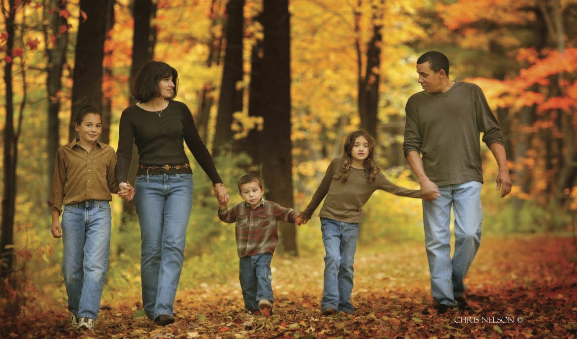
This portrait by Frank Frost combines the warm tones of autumn with the stark black and red outfits of the family. The strong diagonal line runs through the composition, giving it a dynamic quality and a sense of direction. The tones throughout the image coordinate and unify the photograph.

There are some portraits where the subject is the darkest part of the scene, such as in a high-key portrait with a white background. This is the same basic principle at work; the eye travels to the region of greatest contrast. Regardless of whether the main subject is light or dark, it should dominate the rest of the photograph either by brightness or by contrast.

It’s amazing how nature sometimes cooperates with a photographer. Here, the Black-eyed Susans in the background seem to provide a well conceived frame around the family. The daughters’ ribbons match exactly the color of the flowers. The photographer, Frank Frost, carefully burned in areas of tone that might compete with the family so that your focus is drawn to them. Also notice the strong triangle shape created by the composition, offset on a rule-of-thirds line to create a dynamic composition.

Whether an area is in focus or out of focus has a lot to do with determining the amount of visual emphasis it will receive. A light-colored background that is lighter than the group, but distinctly out of focus, will not necessarily detract from the family. It may, in fact, enhance and frame the group, keeping the viewer’s eye centered on the subjects.

The same is true of foreground areas. Although it is a good idea to make them darker than your subject, sometimes you can’t. If the foreground is out of focus, however, it will detract less from the group, which, hopefully, is sharp.

This photograph by Stacy Bratton shows you why parents hire professional photographers to create portraits of their children. This is such an innovative image, made even more effective by shallow depth of field and a relatively slow shutter speed that blurs the child’s hair. And the expression is priceless. Everything about the image is original and fresh.

A technique that is becoming popular is to diffuse an area of the photograph you want to minimize or use to focus attention on your main center of interest. This is usually done in Photoshop by selecting the area and “feathering” it so that the diffusion effect diminishes the closer you get to the edge of the selection.

Tension and balance are the two most effective ways to achieve visual interest in a photograph. Here, in Jennifer Maring’s beautiful portrait of sisters, you can see both states at work. The balance and tension are derived from the same area, the forms of the two sisters, which loosely resembles the infinity sign or numeral 8, a highly symmetrical symbol. The imbalance or tension comes from the same place—all of the deviations that make the two matching forms different; for example one girl is bigger than the other, one’s dress is less perfectly shaped than the other, and so on.

Expert family portrait photographers insist on tight control over wardrobe for a big family photograph. Instead of dictating one “uniform” for the entire family, they will define complementary color schemes. For example, where multiple families are displayed, each will be in a different outfit—khaki and red, or denim and white. Other families within the group will have different coordinating outfits—khaki and yellow, or denim shirts and khaki pants. The result is uniformity and diversity.

TENSION AND BALANCE
Once you begin to recognize real and implied lines and to incorporate shapes and curves into your family portraits, you need to become aware of the concepts of tension and balance. Tension, or visual contrast, is a state of imbalance in a photograph—a big sky and a small subject, for example, is a situation having visual tension.

Although tension does not have to be “resolved” in an image, it works in tandem with the concept of balance. As you examine the photographs in this book and read the captions, you will hear these terms referred to often. For example, a group of four on one side of an image and two subjects on the other side of the frame produce visual tension. They contrast each other because they are different sizes and not necessarily symmetrical. But the photograph may be in a state of perfect visual balance by virtue of what falls between these two groups, or for some other reason. For instance, using the same example, these two different groups could be resolved visually if the larger group is wearing dark clothes and the smaller group is wearing brighter clothes. The eye then sees the two groups as more or less equal—one group demands attention by virtue of its size, the other gains attention by virtue of its brightness.

These strategies are subjective to a large extent, but there is no question that the eye/brain reacts favorably to both balance and visual tension and they are active ingredients in great photography.

BUY THIS BOOK ON AMAZON