Showing posts with label women. Show all posts

The Wireless Approach

Happy New Year! Today's post comes from the book Just One Flash: A Practical Approach to Lighting for Digital Photography by Rod & Robin Deutschmann. It is available from Amazon.com and other fine retailers.


Communication Through the Air
There are only two ways of triggering your flash wirelessly: optically (using another light source as a triggering device) or through the use of a radio transmitter and receiver.

Radio Triggering.
The radio option is, by far, the best; it’s cheaper, easier to use, and more reliable. To trigger your remote flash, we recommend a simple Cactus radio transmitter and receiver combination. At less than $40 a pair, there really is no better option for the manual off-camera flash photographer. Attach the transmitter to your camera and the receiver to your flash (any flash) and you’re ready to shoot. As a manual shooter, there will be no need to worry about camera or flash settings; you will have already dialed those in.


Beyond this, all of the same rules, processes, and techniques apply as before—except that you do lose the high-speed sync option. This isn’t that big of a deal, since you already know how to employ the cross-polarizing technique or to use several neutral-density filters to eliminate excess light.There are, of course, other radio systems available. Pocket Wizard is a very popular brand among photographers looking for a way around manual shooting. They offer a transceiver that allows for both manual and automatic shooting . . . but at nearly $200 a unit, this is a very expensive way of getting your flash to behave. As we tell our students, it really pays to be a confident manual shooter.

Off-camera wireless flash offers the optimum in control. With your flash now positioned well away from the camera, there is no excuse for an image not to appear as you like it. For these images, a volunteer (thanks Ed) held a flash and pointed it at our subject while each student in the workshop created their own version of the scene—changing the white balance, contrast, saturation, and focus to match their own unique vision.


When the flash is set to gently illuminate your subject, it should just caress, not overwhelm. In the image directly below, we see a perfectly illuminated model. In the bottom photo, we see what happens when the flash is set too high.


Optical Triggering.
You also have an optical choice when it comes to triggering your off-camera flashes. This comes in the form of small optical triggering devices that sit on the foot of your flash. When they sense another flash firing they send a small electrical signal to the flash they are attached to and force it to fire. This is called a “slaved” flash. The flash creating the triggering burst is the “master” unit.

This is a classic approach, but it has some drawbacks. First, it requires a line-of-sight triggering scenario. If the receiver can’t see the triggering flash, it will not fire its own unit. This prohibits certain placement constructs that you, as the artist, may feel are important—such as backlighting and complex side-lighting scenarios. Additionally, while slaved flashes are extraordinarily useful indoors, they don’t work so well outside. If there is an excess of ambient light (such as sunlight) there is a strong chance the receiver will not “see” the triggering flash. Plus, the price can be prohibitive. A good optical device will cost $50 or more . . . and if you’re going to spend that much on a tool that has limitations, why not spend less on a radio version that doesn’t?


To maintain the beauty of the sky above San Diego’s skyline, a single hand-held flash was employed. This extra light, aimed at our model and her concrete perch, enabled the photographer to choose a shutter speed that allowed the background to look the way it does. Any shutter speed slower than this would have created a background that was just too bright for the intended message.


Many camera manufacturers today offer an advanced lighting system that employs a similar optical slave/master technology. This is limited, as well, by line-of-sight prerequisites and requires expensive proprietary flash units to work. Again, a simple radio transmitter and receiver will outperform this advanced system—and will do it for a fraction of the cost. There is nothing advanced about a flash system that limits you to a line-of-sight firing scenario.

BUY THIS BOOK FROM AMAZON

Direction of the Light

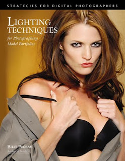
Today's post comes from the book Lighting Techniques for Photographing Model Portfolios by Billy Pegram. It is available from Amazon.com and other fine retailers.

In addition to its quality, you must also consider the direction of the light. As noted above, light that comes from overhead is usually not flattering, because it creates dark shadows on the eyes. Instead, look for light that strikes the subject from another angle.

Front Light. Light that comes from directly in front of the subject is commonly used in beauty photography because it tends to smooth the skin and flatter female faces. However, it can also flatten the features and create a lack of depth in your image.

Angled or Side Light. Light that strikes the subject’s face from an angle puts highlights on one side of the subject (the side closer to the light) and shadows on the other side of the subject (the side farther from the light). This adds a sense of depth and helps show the shape of the subject. As a result, it is a great lighting choice for images designed to showcase the model’s body (such as fitness shots). Because light from the side accentuates texture, it also works well for clothing shots where texture needs to be visible. One downfall of this lighting is that the model’s face will be shown with texture, as well. This can be effective with men’s facial structure, but it is not normally as flattering to a woman’s face.

Light that skims across the body from the side is great for highlighting a toned physique.

Backlight. Backlight occurs when the light source is directly behind the subject and directed toward the camera. One thing to watch out for when using strong backlighting is lens flare. This occurs when light shines directly into the lens and results in a loss of contrast and color saturation, and in some cases the creation of bright geometric artifacts (reflections off the elements within the lens itself).

In this image, Backlighting created highlights to separate the subject from the background.

When paired with some kind of stronger front or side light, backlighting can add impact and separation to a photograph by accenting the edges of the subject, an effect called rim lighting. In the image above, a light placed at an angle to the subject illuminated her from the front. Two lights behind the subject created bright highlights (rim lighting) along the edges of her body, separating her from the background. In this case, the lights themselves also formed a compositional element in the background.

With a weaker (or nonexistent) front or side light, backlighting can also allow you to create silhouette (or semi-silhouette) effects. Experimenting with this technique you can achieve some amazing photographs. In the series of photographs below, I focused on the model. Her body shielded my lens, and I had her move slightly to my left so the sun would just break past her body. I varied the output of my flash for each photograph, achieving a variety of different exposure and results. Who is to say which exposure is correct?

Different flash settings combine with backlighting to produce a variety of effects.


BUY THIS BOOK FROM AMAZON

Correcting Flaws With The Scene

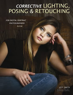
Today's post comes from the book Corrective Lighting, Posing & Retouching for Digital Portrait Photographers, 3rd Edition by Jeff Smith. It is available from Amazon.com and other fine retailers.

The scene or setting can often be one of the most effective tools you have for correcting clients’ flaws. As you have seen, letting the body blend into the background can make problem areas like large hips or a balding head much less noticeable. This works well in low-key portraits, but when you start working with high-key settings (or even with a client in light-colored clothing), the problem area is still obvious. But, just as with poses that use the knee, arm, or leg to disguise a problem, elements in the scene can also be used to conceal flaws.


USING THE FOREGROUND
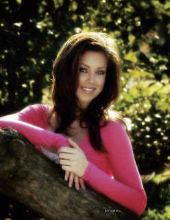
Most scenes give you ways to hide flaws by using the foreground. Although it is often overlooked, making use of the foreground not only gives you the ability to hide a client’s flaws but, from an artistic standpoint, provides a greater ability to create the illusion of depth in your portraits. By using an element in the foreground, the subject in critical focus, and then a background that recedes farther and farther from the subject, you have a built-in sense of depth.

BEFORE:


AFTER:

Foreground elements add depth and allow you to hide anything your client might not want to see.

When correcting a client’s flaws, it is amazing how even a simple foreground element like a plant or a few columns can soften or hide a large hip, tummy bulge, large upper arm, or hairy forearm. Whether you have something as simple as a client sitting backwards in a chair, or an entire set arranged to hide problem areas, it is a very effective way to give clients a version of reality they can live with.

COORDINATING THE FOREGROUND AND BACKGROUND
Learning how to coordinate the style, look, and color of the foreground elements with the other parts of the scene can be a challenge. A plant or tree is often used in the foreground because it is easy. It goes with just about everything and it doesn’t take any time to prepare. Chairs are also a
popular and versatile choice for the foreground element. Either one can be effective. (Indoors and out, you can enhance the feeling of depth by using multiple elements in the foreground, or by adding elements in between the subject and the background.)

OUTDOORS
What do you do when you are outside and have a client with a large body size? Well, first, you might find a tree and do the peek-a-boo pose, with the body hidden behind the tree and the face coming out from around the side of the tree. (Although this pose is a classic of corrective posing
technique, it is also a popular pose for young ladies who don’t have weight issues.) You might also photograph a girl lying in tall grass that obscures the outline of her hips and thighs. You could also simply decide to create something other than a full-length portrait.
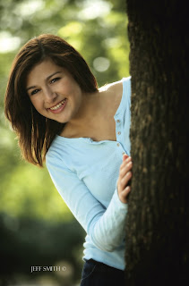
This is a popular pose for subjects of all shapes and sizes. The tree in the foreground creates a nice sense of depth but also allows you to hide as much of your subject as necessary.

Outdoors, many photographers work at the edge of a clearing or have the subject leaning against a tree or column that has nothing else around it. This provides a scene in which the first element is the subject, then the background elements that recede farther and farther away from the subject. While I do this on occasion, I prefer to use a scene that provides elements in the foreground. This could mean using a tree with lower branches or posing the client in the middle of what most photographers consider the background—so there are foreground elements between the subject and the camera.

BEFORE:


AFTER:

Adding a foreground element can help create an image that is easy on the subject’s ego.

The density of the foreground elements will determine how much of the subject you are going to see. If the foreground is too thick, you will see none of the subject’s body. In this situation, you have to ask yourself why you’re presenting a reduced head size if it doesn’t result in seeing any more of the person. You might be better off just composing the image more tightly (cropping out areas you want to conceal rather than hiding them behind something).

Years ago I was hired to photograph a rodeo queen. She came from a nearby mountain community, so we looked around this area for a place to photograph her. We found an area where the light was great and the field of grass was high—it was perfect . . . or so I thought. The first problem was that it was late spring and we were in an area that was known for having a high rattlesnake population. Not realizing this, we walked through the tall grass without a clue. The second problem was that the grass was so high and so thick that you couldn’t even see an outline of her legs from the thighs down. Since I was very young at the time, though, I was very excited about these photos (and not getting bit by a snake), so I had a 30x40-inch print made for the studio. My wife looked at it when I unveiled it to our staff and she said, “It looks like she’s missing her legs!” In short, I should have cropped it closer and eliminated the foreground that showed nothing but grass.
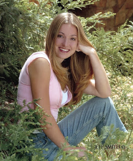
The density of the foreground elements will determine how much of your subject is visible behind them.

Sometimes we get so caught up in the lighting, the posing, and the beauty of what we are focusing on, we don’t notice the unnecessary elements (like all that grass) and forget that someone else has to live with our creation. My wife was right; although I thought the foreground of grass was beautiful, the client would have preferred to see the subject larger in the frame—not ten feet of grass in the foreground.

IN THE STUDIO
The ability to add foreground elements and use them correctively is one the main reason we use sets, as opposed to just background fabrics, in the studio. Sets also allow us to place elements at different distances from the camera, which creates more depth than is possible with a painted background. I have always said I want at least five points of focus in the average studio portrait. The client is the main point of focus, but even in a head-and-shoulders pose there should be at least four other points of focus at different distances from the camera.

Chairs can be turned to create simple foreground elements.

The railing is used as a foreground element.

We have found many background and foreground elements at the local home store. For example, I purchased a French door on clearance for $10. We have also purchased ladders, steel grates, tin roofing material, and many other interesting foreground and background items at this type of store. You are only limited by your imagination and your time to shop around. When I first opened my studio, like most new photographers, I had all kinds of time but very little money to purchase sets. Now, with over three thousand seniors to photograph each year, my writing, and my family, I have much more money than I do time to look for background items, so I tend to purchase them from set manufacturers.

Whether you purchase them or create your own set elements, you need to look for unique ways to use them. Many photographers struggle with this when using the large, expensive sets that some designers sell. One problem is that they sometimes position the set components flat to the camera—and then wonder why their images didn’t look like those in the brochure. By angling any set toward the camera, you can create a foreground and bring the background to life by adding focal points at different distances. (Note: This idea works with most props, as well. Instead of placing a chair or couch flat to the camera, turning it [bringing one arm closer to the camera than the other] creates depth in the portraits—and a place to hide a seated client’s hips, thighs, and not-so-flat tummy!)
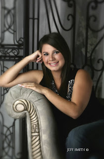


What are these poses hiding through the use of simple obstructions (mostly the subject’s own body)?
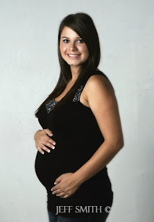

Posing—especially when combined with the use of obstructions—is one of the most powerful tools photographers possess. Look above to see portraits of this mom-to-be. Would you have guessed she was pregnant in any of these images?

Similarly, the average photographer sees an arch at a trade show. He buys it, brings it into his studio, and it remains a single arch for all time. Yet, in addition to being an arch, it is also three individual pieces that can be combined with other set components to create multiple looks. This
gives you the most for your money—and it also provides opportunities to improve your photographs and hide your clients’ flaws.


Always be on the lookout for items to put in front of clients—items that look natural and coordinate with your sets and outdoor scenes. Even the Viper or Harley (popular props at our studio) can produce a foreground to hide clients’ problem areas behind. Just use your imagination!

BUY THIS BOOK FROM AMAZON

Subtractive Lighting

Today's post comes from the book Jeff Smith's Lighting for Outdoor & Location Portrait Photography by Jeff Smith. It is available from Amazon and other fine retailers.

Subtractive lighting is just what the names implies: removing light or, in essence, creating shadows to achieve a more dimensional portrait. I learned subtractive lighting from Leon Kennamar, who was probably the most well-known subtractive-light photographer of his day. The outdoor portraiture he created was truly outstanding, because with subtractive lighting he could completely control the shadows of his images—something that most photographers to this day don’t do. As we have already learned, it is the darkness that draws our eyes to the light and without shadows, no one notices or cares about the light.

Here, a reflector is actually used as a gobo. Placed directly over the subject’s head, the reflector blocks the overhead light and eliminates the dark circles under the subject’s eyes.

The downside of the teaching of subtractive lighting is that, while it is great for creating shadows, reducing the size of the main light to a proper size, or keeping light from hitting a certain part of the subject or scene, a scene must be close to ideal to use only subtractive lighting techniques.

To demystify subtractive lighting, let’s call it what it is: creating shadows. For example, if you have a main light that produces beautiful catchlights in the eyes but a flat lighting on the face, you know that your main-light source lacks direction and is too large. To correct the problem, just put a black panel, gobo, flag, or other light-blocking device on the side of the subject where the shadow should be. This will create a shadow and improve your final image.

A white reflector is used over the subject’s head as a gobo, blocking the overhead light and producing a more flattering lighting effect.


Which type of light blocker to use will depend on the circumstances. Black devices block light from the desired area, but they also tend to suck the light out of neighboring areas. Depending on the light levels and scene, white blockers can actually bounce light back onto your subject, adding a color cast or changing the desired appearance of the lighting. Let’s imagine you are placing a blocker above a subject to block the overhead light. If my subject was standing in a grassy area, I would typically use a white reflector for this. The light from the ground won’t cast enough light into this white reflector to act as a light source and won’t affect the light hitting the face. If, on the other hand, the subject was standing on light-colored concrete in direct sunlight, the concrete would reflect up enough light to change the appearance of the lighting. Switching to a black device might be necessary, although it would tend to darken the hair of the top of the head.

BASIC DECISIONS
The decision to add light or take it away always starts with the selection of the background. Many photographers suggest that you first find the light and then determine the background based on that area of ideal lighting. This is the practice employed by photographers who work at those “ideal light” times of day. When I go into an area, however, it is usually in the middle of the day, so my first consideration is to look for usable backgrounds; I know that I can make the light usable no matter what it currently looks like. This is the basic idea of working on location when the lighting isn’t perfect—it is much easier to change the light on the subject than the light on the background or the scene around the subject.

Once a background is located, the next decision is whether to use additive light sources or subtractive light sources—although there are times that both are used in the same image. This is typically a straightforward decision: if the light on the background is more intense than that on the subject, you must use at least some additive light sources. However, if the background is lit by the same light as the subject, then subtractive lighting alone may be enough. I find that there are very few scenes in which the light can’t be improved dramatically using additive or subtractive techniques.

SUBTRACTIVE LIGHTING IN PRACTICE
The easiest way to learn subtractive lighting is to start with a subject and available light only. Then, add the lighting controls you need and observe their effects as you transform the portrait into a salable image.

The unmodified light gives this subject raccoon eyes and unpleasant highlights on her cheeks and nose.

In the first image (above), you see this beautiful young lady in a typical outdoor location. The amount of light in the subject’s area is relatively close to the amount of light on the background area. This means that we will not have to add light to balance the scene (i.e., darken the background). However, because the light is coming down from directly overhead, the subject has raccoon eyes as well as unattractive highlights on her forehead and nose.

The first correction I would make is to place a white reflector overhead to block this light. I would use white here because the shaded grass will not reflect enough light up to the white reflector to affect the final image. In the second photo (below), you can see the improvement in the lighting with just that one correction. Yet, while the image is improved, there are still some problems that need to be corrected. The eyes have nice catchlights in them, but the face has no shadowing or transition zone to draw the viewer’s eyes to the most important areas of the face and hide those that shouldn’t be seen.

Adding a gobo overhead corrects some of the problems, but leaves the image without any shadowing to shape the face.

Therefore, a second step would be to place a black panel on the right side of the frame to establish a shadow zone and create a transition from highlight to shadow. In the third image (below) you see the effects of this change. The face appears thinner and the structure of the face is more noticeable. While this is a major improvement, we aren’t done yet!

Placing a black panel to camera right creates a shadow zone.

As you look at photo three, you see a little highlight toward the end of the nose, this means that the main light is wrapping too far around the subject. To compensate, you could put another black panel on the opposite side of the subject to reduce this side light—but that would create a second shadow on the highlight side of the face. The best solution is to use a piece of translucent fabric. Placed to camera left, this will reduce the light coming from the side without creating a second noticeable shadow area.

Now we are getting close to a salable image—actually, at this point, this image is better than most of the outdoor portraits I see displayed in some studios. Still, let’s take it one step further. Since most of the light in this scene comes from above, I almost always add a white or silver reflector underneath the subject’s face to give the portrait a more glamorous look. The light from this reflector brings out more of the eye color; softens the darkness under the eyes, something all of us have; and helps to smooth the complexion. I use white when reflecting sunlight and silver when reflecting light from a shaded area. At this point we have created a salable professional portrait.

Subtractive Light Photo Booth.
Subtractive lighting is one of the simplest ways to control the lighting in an average scene. Therefore, I have used these principles to assemble a photo booth that provides perfect outdoor lighting with any outdoor background. This booth consists of the exact combination of modifiers discussed above: a 4x8-foot black panel on a rigid frame, a translucent panel on a rigid frame, a
white reflector attached to the two panels with clamps, and a white or silver reflector clamped at the level needed to provide light in the appropriate place for a head-and-shoulders pose.


This photo booth makes outdoor lighting very easy to deal with. To use it, I look for an area that has strong backlighting, usually provided by the sun. I want to have each client separated by a backlight, since the majority of them have darker hair and I instruct them to wear darker shades of clothing as well. When I can find this backlight, I use the white reflector; when working in a shaded area with little or no backlight, I use the silver reflector.


The only variable in this setup is the main light. In most scenes, the area in front of the subject will be open sky, providing a fairly good main-light source—at least with all the photo-booth’s modifiers in place. Should the area have obstructions that don’t provide a usable main-light source, you can simply add a reflector or scrim with mirrored light to produce one.

BUY THIS BOOK FROM AMAZON

Mothers with Children from Birth to Eleven Months


Today's post comes from the book Mother and Child Portraits: Techniques for Professional Digital Portraits by Norman Phillips. It is available from Amazon.com and other fine retailers.

When posing children under one year of age, we must consider comfort and safety more than is required with any other group. In this chapter, we will see a variety of excellent posing options that will help you meet these important objectives when photographing your own subjects.

In the first image (photo by Sarah Johnston), the closeness of the subjects depicts the special relationship they share. The fact that the baby’s hand is beautifully placed on the mother’s shoulder makes the posing that much more special. Add this to the three-quarter view of the mom, and we have a delightful portrait.


The baby appears wrapped in a soft, white blanket. The fabric adds texture in the image and nicely sets off the infant’s skin tones. Because the blanket was white, it supported the high-key concept of the image. It is these little things that make the difference. The high-key vignette makes this black & white impression very appealing. See the diagram below.


Next (photo by Jody Coss) is a high-impact image that employs the split lighting technique to perfection. Most interesting is that it holds our attention even though we cannot see the baby’s face or the mom’s eyes. The contrast is much greater than we would normally expect to see in this type of portrait.


To create this image, Jody used a small softbox, positioned with the bottom edge at the mother’s chin and tilted downward. The front edge of the light was positioned level with the baby’s head. Reflected light from the right of the camera gently separated the subjects from the background.

Note the delicate diagonal line that runs through the mother’s hand and up toward her brightly lit hair. This is the result of carefully considered posing of the two subjects. Jody digitally created a black mat for the image and added a lovely sentiment to enhance the portrait. It is an excellent example of the steps that can be taken to increase the impact of your images.

The next sequence of images (photos by Norman Phillips) illustrates how we can use window light in portraiture. In the first, the mother and her baby are posed almost in the window frame so that the bright white wall creates a split lighting set and virtually blows out the highlights on her left cheek. The pose allowed the mom and her baby to respond to the camera.


Here, the baby turned her head toward camera left. The change in position caused the light ratio on her face to be reduced. This is better for the baby, but it does not improve the lighting on the mother.


To create the image shown in the next photo, I moved the subjects away from the window to reduce the contrast and more evenly illuminate them. This eliminated the bright white wall near the window and made for a more acceptable set. There is a 21/2:1 light ratio in the portrait.


In this photo, the subjects were moved farther into the room, and the result was more even lighting. We now have a 2:1 ratio.


For the last photo, the subjects were moved once more. The mother was positioned on the bright side of the set, and the subjects’ angle to the light was more oblique. This caused the light to be feathered across the subjects. With the change in position and the mom’s head partially blocking the light from falling on the baby’s face, we achieved the desired 3:1 light ratio.


The posing in these portraits is conventional, with the mother and infant cheek to cheek but with the baby’s head at a lower position in the composition, thereby creating a diagonal line between the subjects.

This photo (by Jeff and Kathleen Hawkins) shows a profile pose of the mother and her naked baby. When we present this pose, we demonstrate the relative size of the baby because the mother’s hands are cradling her. Having the baby lifted close to the mom’s head further emphasizes her small size.


A softbox was placed at 30 degrees off the subjects, with another softbox illuminating the back of the mother’s head. This produced a relatively even lighting pattern with a ratio of a little over 2:1. By placing the subjects against a low-key backdrop, Jeff and Kathleen produced a dramatic contrast between the subjects and the background. The impact is strong yet soft and flatters both subjects. The diagram for this photo is below.


Mark Laurie is well known for his glamour style portraiture—a subgenre in which female subjects are typically less than fully clothed. In this photo, the mom appears without any evidence of clothing. The image emphasizes the physical contact that is so crucial in the nurturing of an infant. The portrait is simply delightful. It shows the happiness that the two share, even if the baby is unable to express it at such an early age. It is the impression that we should seek to create when photographing a mom and her infant.


Mark used a large 40x60-inch softbox at 45 degrees from the camera and subjects (at camera right) in a brightly lit set, where the ambient light provided fill. The overall lighting produced a beautiful rendering of the subjects’ skin tones.

The photo below is another Mark Laurie portrait that depicts the natural, nurturing bond between a mother and her baby. It is beautifully feminine and evokes the tenderness associated with motherhood.


A 40x60-inch softbox was placed at camera right, and a large reflector at the left of the subjects provided a fill source equal to 1/2 f-stop less than the main light. The overall lighting cast an even illumination across both figures and beautifully rendered the skin tones. The pose shown here is natural and needed only a little refinement from Mark to ensure the subjects’ best-possible presentation to the camera.

BUY THIS BOOK FROM AMAZON