Shooting Up, Down, and Across

Today's post comes from the book Christopher Grey's Lighting Techniques for Beauty and Glamour Photography by Christopher Grey. It is available from Amazon.com and other fine retailers.

Shooting down or shooting up are angles many of us don’t use. Why not? They’re dramatic or fun, depending on how they’re approached. They’re also difficult because you may have to angle yourself in an uncomfortable position to get what you want. Depending on her perspective to the camera, your model may have to do the same. Here are a few tips.

SHOOTING UP
The most important detail when shooting from any position is to carefully place the main light relative to your angle to the subject. In other words, if you light her so she looks great when you’re standing at full height, the setup will probably make her look awful when you drop to your knees and raise the camera. Set the light so it looks good from your shooting position, with the model in at least a basic pose, for better results. I can hear many of you questioning my sanity and asking why I would point out something so basic, but I’ve seen too many subjects lit badly when photographed from these angles that I felt I needed to address the issue.

Shooting up is more difficult than shooting down or across. The perspective problems you may encounter when the camera is so close to the model that the lower half of the image (the area closest to the lens) looks larger than the upper half might be difficult to deal with (image below).


Angling the model so that she leans slightly toward you and moving back a bit may be all you need to get an excellent image. In the first image, the light, a bare tubed strobe, was placed at a typical height for her position. When she looked down at the camera, however, it was completely in the wrong position, creating deep shadows that hid her eyes and the underside of her cheeks and chin. Not very attractive. See image below.


Angling the model toward the camera meant the main light needed to be lowered to get an attractive nose shadow. Consequently, the light stand holding the cookie (the flag with a quarter-moon pattern cut into it) had to be raised to get it to the same position.

The final image was augmented with an additional fill card at camera right. It filled in the shadows and added detail to her clothing. Net result? A beautiful image of a beautiful woman. See image below.


SHOOTING DOWN
Shooting down, at least from a perspective standpoint, is easier than shooting up. The same attention to the angle of light must be paid, though, or you may end up with lighting scenarios that are not flattering.

To create the next image, I used a 2x3-foot softbox for the main light (the only light necessary because the model was ringed with white cloth). It was set to the camera-left side of the set and angled it so it would produce an effect that would resemble butterfly lighting if the model had been upright to the camera. Two black flags, each 12x30 inches, were separately mounted to accessory arms on light stands, cutting the light to the top of the pillow and the right side of the model’s shirt and body. The gobos were set at slightly different angles and close to the light, to avoid sharp shadows and deeper underexposure. This added a bit of visual interest that a typical viewer just can’t put a finger on.


I removed the gobos and moved in a three-stair step stool to the side of the air mattress that kept my model comfortable. It’s difficult to position yourself directly over a model without building some sort of scaffold, something most of us (myself included) don’t have sitting around. The easiest way to simulate the effect is to get on a short ladder and lean over the subject.

Hold the camera in the landscape position (horizontally) and lean in as far as possible. You can rotate the image to the vertical position in postproduction. If the light is positioned correctly and you’re in the right place, you’ll be amazed how natural it looks, even though you might have been a foot or two off center. See image below.


SHOOTING ACROSS
When you’re shooting across a reclining model, you’re subject to the same “rules” that apply when you’re shooting up or down, with one exception. Certainly, the main light must be placed in a situation that will render attractive light. That’s a given (or it should be).

In any such situation, and regardless of the depth of field you may have dialed in, be sure to focus on the eye nearest the camera. Doing so will put the primary point of interest exactly where an eventual viewer expects it. This is especially true when using a telephoto lens wide open or with a large aperture. See image below.


BUY THIS BOOK FROM AMAZON
Today's post comes from the book The Digital Photographers Guide to Light Modifiers by Allison Earnest. It is available from Amazon.com and other fine retailers.

This series of images was created for Sarah Jarvela, an aspiring model. The concept of the shoot was to create three different personalities in a one-hour session. I chose to start with a strong headshot using a traditional four light setup (photo below). To obtain a pure white background, the model was positioned close to the white background so the lights illuminating the set would also illuminate the background. (Incidentally, the background lights were adjusted to record 11/2 stop brighter than the main light, ensuring a clean white background.) Two side kicker/accent lights, both fitted with directional grids, were placed just behind Sarah to create very hard, directional accents on the sides of her face. The main light was a medium softbox, placed high on a boom stand at a 45-degree angle to camera right, high and above the camera axis.

This headshot was created using hard-edge double kickers. SUBJECT: Sarah. CAMERA: Nikon
D300, 24–70mm f/2.8 lens, Lexar media. SETTINGS: AWB, manual mode, 1/100 second, f/20, ISO 200.

For the next photo, I simply powered down the two accent lights to the right and left of the model, moving them further from the middle of the background. Additionally, the model was moved farther from the background to ensure a crisp, neutral gray background. Remember the Inverse Square Law!

The accent lights were turned off to create a simple photograph of Sarah. SUBJECT: Sarah. CAMERA: Nikon D300, 24–70mm f/2.8 lens, Lexar media. SETTINGS: AWB, manual mode, 1/125 second, f/16, ISO 200.

The funky pink chair seen in photo below had sat in my prop room for quite some time just waiting for the right session. Sarah’s choice of pink clothing proved to be the perfect pairing. With the same main light (a medium softbox) attached to a boom stand, placed close to the model and pointed down, the light was very soft. Two softboxes, attached to monolights, were used as kickers—so the light accenting the model was also soft and diffused. The light on Sarah’s right leg came from a small strip softbox. Lastly, the background lights were turned on. The model was quite pleased with all the images she received and was surprised how different they all appeared in such a short session.

Changing to a 80–200 f/2.8 lens compressed this image nicely. A kicker was also added to the
right of the model for increased separation. SUBJECT: Sarah. CAMERA: Nikon D300, 80–200mm f/2.8 lens, Lexar media. SETTINGS: AWB, manual mode, 1/100 second, f/16, ISO 200.


DRAMATIC LIGHTING

Staying updated with the latest photography equipment, props, and techniques is essential to creating fresh images. On a recent trip to Photo Plus Expo in New York City, I fell in love with Drop it Modern backgrounds (www.dropitmodern.com). One of their unique, custom fabric backgrounds proved to be perfect for the next set of images, shot for my friend Michelle Lopez.

The background, made of heavy fabric with black velvet patterns, absorbed a tremendous amount of light. To illuminate it, a Speedotron focusable spotlight was used with custom cookies/gobos designed by Colorado CustomMetal (www.coloradocustommetal.com). The focusable spot, attached to its own 1200W power pack, produces intense, direct light that allows cookies to be placed between the modeling light and the lens for special effects.

The Speedotron focusable spotlight can be used with a custom cookie (here, flowers) to produce designs on backgrounds or for special effects


For the next photo, the main light was a single Hensel Integra monolight with a 22-inch silver beauty dish and white diffusion sock attached. Two kickers/accent lights with 7-inch parabolics and barndoors were placed to the left and right of the model to add further separation and depth. These were set to record at one stop more than the main light. As you can see in the set scene, the camera-right kicker was further diffused with a white scarf. The barn doors on the other kicker were closed to create a more directional light source.

Kickers to either side of the model added separation and depth. Notice that the lights were modified with barndoors to control the light illuminating the subject SUBJECT: Michelle Lopez. CAMERA: Nikon D300, Lexar media. SETTINGS: AWB, manual mode, 1/125 second, f/6.3, ISO 200.

The photo below was created by turning off the main light (the beauty dish) and the focusable spot. I also changed the model’s position and moved the monolight with the barndoors (to camera left) higher and closer to the model. This became my new main light. An incident-light reading was taken and the exposure adjusted accordingly. Just by moving a couple lights and changing the model’s pose, I produced a very different photograph in one session. Try to think outside of the box and you’ll be amazed how your style will change.

This is the same lighting setup as in the previous photo—except the light with the barndoors (to camera left) was positioned closer to the subject to become the main light. The Speedotron spotlight was turned off and the right kicker repositioned to the pose. SUBJECT: Michelle Lopez. CAMERA: Nikon D300, Lexar media. SETTINGS: AWB, manual mode, 1/125 second, f/8, ISO 200.


Studio Lighting for Children's Portraits

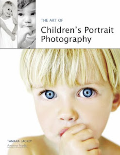
Today's post comes from the book The Art of Children's Portrait Photography by Tamara Lackey. It is available from Amazon.com and other fine retailers.

When you are shooting in the studio, you have an incredible amount of options from which to choose when creating “the perfect light” for your session. You are basically considering three or four main factors: the main light, the fill light, and a reflector (for extra fill). Often, you should consider adding a back light or hair light, as well.

The main light is aimed at the subject to create the basic pattern of light and shadow on their face. One of the simplest ways to manage your main light is to use a large softbox and position it at a distance from the subject. This allows you soft, even lighting and a great spread of lighting to help track the little one as he makes his way around the shooting space.

The fill light is used to open up shadows that may be created on your subject’s face by the main light (or any other ambient lighting). This can be an actual second light source (set to produce less light than the main) or a reflector placed on opposite side of the subject from the main light. When using a fill light source, a supplementary reflector can also be added for additional fill. This is often used to create a more flattering and evenly distributed lighting effect across your subject, or to pop up catchlights in the eyes.


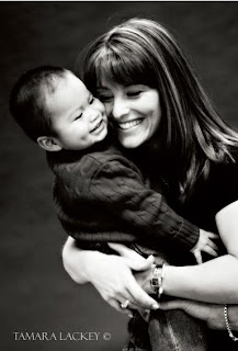
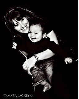
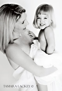
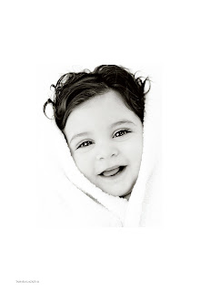
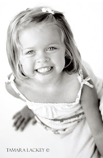
The choice between an artificial lighting setup and natural lighting setup can make the same scene look very different. You decide. Do you want the look of man-made lighting for a crisp and clear shot—an image that really pops (left)? Or do you want natural lighting, for a warm, soft, and more gentle image (right)?


It’s a good idea to keep a reflector in easy reach or attached to a small boom for easy placement when needed. Foam-core art board can be used as a simple and inexpensive reflector. This can be purchased in a variety of sizes (or cut down to whatever size you like), making it a very flexible option. It can also be very handy to create a large foam-core modifier by taping two pieces of 4x8-foot board together at one edge. This produces a large V-shaped modifier (often called a bookend) that can stand up on its own, making it great for bouncing light evenly across your subject. It can also be used as a simple backdrop when your subject scampers into it.

The following are some simple portrait lighting configurations to consider for a shooting room that has one main window.

Setup A. This setup employs a main light (a large softbox), fill from a 4x8-foot bookend, a reflector, and a back light (see diagram). It offers you a clear, well exposed image with flattering, even light. You may accumulate some shadowing, but it is usually to pleasing effect. This is a great setup for children who move around a lot! (Note: For this setup, the window is blacked out, so it does not affect the lighting.)


Setup B. This setup incorporates window light softened with a scrim as the main light, fill from a 4x8-foot bookend, and a reflector. Optionally, a video light can also be added. The light produced by this setup may be a little softer and warmer than that achieved with setup A. Because you do not have to wait for the lights to recharge, it also makes it easier to shoot in a rapid-fire style, so you don’t miss that quick change in expression.


Setup C. In this setup, window light (with a scrim for softening) and a large softbox are combined as the main light for a controlled high-key look. Fill light comes from a 4x8-foot bookend placed to the side of the subject. Also used are a reflector and a back light. Altogether, this creates a very high-contrast, ultra-defining, minimally shadowed image that is bright and inviting. It does, however, limit you a bit in terms of how widely the subject can roam.


BUY THIS BOOK FROM AMAZON