 Today's post comes from the book Corrective Lighting, Posing & Retouching for Digital Portrait Photographers, 3rd Edition by Jeff Smith. It is available from Amazon.com and other fine retailers.
Personally, I think posing is the most fascinating part of what we do. If you put a person in front of a window, you can move their arm or their leg—or do something as simple as turn their head—and completely change their appearance. With light as a constant, posing the various parts of the body can be the difference between a happy client and one who walks out of your studio without buying.
The pose can make even the most basic type of portrait come alive. Other than the expression, nothing will sell more than the pose. Posing can also do more to hide clients’ flaws than any other technique—and probably as much as all of the others combined. Posing alone can hide almost every flaw that the human body can have. For every person, in every outfit, there is a pose that can make them look great. You just have to find it.
THE PURPOSE OF THE PORTRAIT
Your first consideration in posing is the purpose of the portrait, not just making the client look good. Too often, a photographer creates beautiful images that the client never buys—and the photographer never understands why. Usually, it is because the portrait that was created didn’t match the client’s purpose for having the portrait taken.
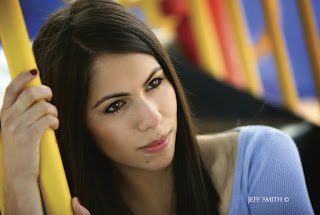
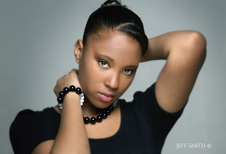
 A pose like this makes for a striking image—but if this were my daughter, I might get a little creeped-out looking at it (and receive some strange looks if colleagues saw the portrait on my desk).
 I have children, and when I see a photo of them I want to see them the way I see them everyday—relaxed and looking like they are enjoying life. I also have a wife. When I see her, I want to see the beautiful woman that God has given me to share my life. I am a business owner and author, and when I see photos of myself in this light, I want see a traditional portrait taken to fit a specific purpose. If you mix up any of these portraits and give them to the wrong person it doesn’t work. I don’t think my children want an alluring picture of their mother any more than they want a photo of me looking like a sober judge.
In the same vein, many senior portrait photographers struggle with the fact that educators and books present very sexy, fashion-oriented portraits of seniors. Photographers love these, but they don’t sell well to the client—because most people want senior portraits to send out to family and close adult friends. Parents don’t want to send out a portrait in which their teen daughter looks “sexy.” However you can incorporate a fashion edge in less alluring portraits that will actually sell.
This is the difference between thinking like a photographer and businessperson: a businessperson knows that pretty pictures don’t pay the bills, pictures that fulfill the purposes of the client do. Here is an interesting fact: You can take a somewhat crappy portrait that has so-so lighting and isn’t posed or composed very well, but if it fulfills the purpose of the client, in all likelihood they will buy that somewhat crappy picture.
 To be salable, portraits must sometimes please two different people. In the case of senior portraits, this means pleasing the senior and their parent.
Conversely, if your portrait doesn’t fulfill the purpose your client had in mind, even if it is an award-winner, they will walk out without buying the portrait that helped put a ribbon around your neck. While I don’t advocate taking so-so portraits, I think photographers could live a whole lot better if they would just think of each client’s wishes when they create portraits—and make creative decisions based on the client’s wants and not their own.
CHOOSE THE RIGHT STYLEOnce you know the reason the portrait is being taken and to whom it will be given, you can design a portrait to fit that need. This is the first step in designing a portrait. The clothing, pose, lighting, expression, and set/location/background should all be selected to produce that style of portrait, for that buyer.
Keep in mind, however, that in some cases you may need to balance the demands and tastes of multiple people. In senior portrait photography, for example, we have two buyers. This means that two different styles of portraits are required. The senior is the first buyer, and she will want to look cool for her friends. The second buyer is the parent, who will want a portrait that makes her little girl look like the young lady she sees when she looks at her daughter. If you don’t consider both buyers, and the end use of each set of portraits, you will lose half your business—or never get the senior through the door in the first place.
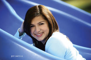
Once you understand the purpose of the portrait, you need to select a posing style that will be appropriate for the final portrait. Basically there are three posing styles to work with: traditional posing, casual (or “slice of life”) posing, and glamorous posing.Within a single person’s session you may use a variety of posing styles. This is a business decision you must make. But to learn posing you need to be able to distinguish between the various types of posing and know what type of situation each is suited for.
Traditional Posing. Traditional posing is used for business and yearbook portraits, as well as for photographing people of power or distinction. This style of posing reflects power, and to some degree wealth, respect, and a classic elegance. Whether these portraits are taken in a head-and shoulders or full-length style, the posing is largely linear, with only slight changes in the angles of the body. Whether sitting or standing, the spine of the body stays fairly straight and the shoulders stay fairly square. The back is straight and the chest is up (unless photographing a woman with a large bust).
 Casual Posing.
 Casual poses show the person you are photographing as they really are. Watching people as they relax, read a book, watch TV, or have a picnic at a park will give you some of the best posing ideas you can find. Notice the way people lay, lean or rest their bodies, legs, arms, and even faces. See how people use one part of the body to support another. They will bring up their knees to support their arms and bring up their hands to support their heads. Casual poses are used when the portrait is to be given to a loved one, like a sibling or parent.
 Glamorous Posing.
 Glamorous poses make the person look alluring—the way they wish they looked all the time. Ideas for these poses can be found in sources from fashion magazines to lingerie catalogs. If you want to add to your glamour posing style, look at a Victoria’s Secret catalog. Your clients may have more clothing on, but the structure of the posing will be the same.
The purpose of defining each type of pose, as well as determining the reason the portrait is being taken, is to have a direction for the session. This is the point at which a photographer’s own style and experience take over. For example, many of my traditional poses are much more glamorous in their look than what the average photographer would consider traditional. This is because, as human beings, I think we all want to appear attractive.
If you don’t have a great deal of time to spend with your client before a session, ask them to tear out images from magazines or catalogs that show what they have in mind for their portraits. This is a great way to get new posing ideas that are handpicked by your target market. (I keep all these tear sheets for my next test session.)
BASIC PRINCIPLESLess is More. The less you show of a person, the fewer flaws you have to correct. I can create a beautiful and salable portrait of a woman who is a hundred pounds overweight, provided I compose it as a waist-up image. With the right clothing, the correct lighting, and a cool pose to help hide the signs of weight gain, it will be beautiful. If this client wanted me to create a full-length image of her, however, it would be much harder. It could be done, but beyond a certain weight, it is extremely difficult to provide the client with full-length images her ego will accept.
The idea of “less is more” isn’t just for minimizing the flaws that the average paying client has. Some of the most requested poses for all clients, at least as of this writing, are the extreme close-ups. In fact, head-and-shoulders poses make up 75 percent of the portraits that people actually purchase. While photographers have always thought that full-length poses should be included in a session for variety, there are clearly times when they shouldn’t be—and from a business standpoint, spending time on portraits that are less likely to sell doesn’t make sense.
Stand, Don’t Sit. When weight is a concern, which it will be for about 75 percent of your clients, standing is often better than sitting.When someone sits, the legs push up the stomach, the stomach pushes up the chest, the chest hides the neck, and before you know it you have a lady with her head sitting on top of two large breasts. When you stand that same person, gravity works in your favor and pulls the weight downward, away from the face.
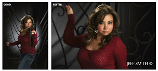
Camera Angle. When photographing larger people, elevate your camera angle so you are shooting down toward your client. With the client posed normally, simply raising their face up toward the elevated camera stretches and smooths the skin of the neck and face. This is very effective—and it’s all the rage right now even for subjects with average builds.
This technique works on portraits from head-and shoulders to full-length. With the camera in an elevated position (yes, you will need to stand on a ladder), the body can be included in the shot—but its size will be minimized because it is partially obscured by the face and shoulders.
 Tighter shots make up 75 percent of what people actually buy—and, for most subjects, they are the most flattering type of images.
 . When the subject’s body touches or rests on a surface, it should only rest on bone. If you have a client sit down, the butt and thighs are going to mushroom out, adding weight and inches to them in their portraits. If, on the other hand, you have the client roll to the side and shift their weight onto one hip (where there is a bone) the hips will look thinner and the bottom will be hidden from view.
The same is true for resting an arm on a column or tree branch. The average client will rest their forearm on the surface, making it mushroom out and appear larger. Instead, have them shift their weight to the elbow and slightly raise their forearm off the posing surface.
If a pose has a client sitting squarely on their bottom, lift their knees up. Bringing one foot or both closer to the camera keeps the pressure points on the two hip bones, lifting the thighs so they do not mushroom out.
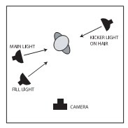
Turn the Body Away from the Main Light. No matter what style of posing you are using, start with the body facing away from the main light. This is the thinnest view of the body and creates shadowing in which we can hide flaws. Then, turn the face back toward the main light to properly light it and stretch out the loose skin that most clients have under the chin.

 Today's post comes from the LED Lighting: Professional Techniques for Digital Photographers by Kirk Tuck. It is available from Amazon, Barnes & Noble, and other fine retailers.