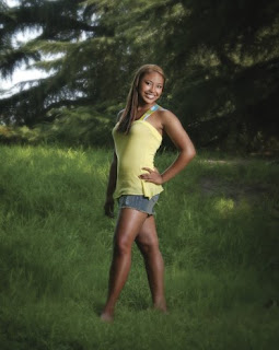
Using Flash On Location

Today's post is from the book Jeff Smith's Lighting for Outdoor & Location Portrait Photography. This book is available from Amazon.com and other fine retailers.


FLASH AS MAIN LIGHT
Flash in an outdoor scene should only be used as a main light, not the fill light. Natural light is much too soft and delicate to try to fill the shadows with flash. Attempting to use flash for fill on location causes most of the unnatural lighting you see in outdoor portraits.

When we use flash outdoors, the flash is the main light and is placed in the main-light position (45 to 90 degrees from the camera position, at a starting height that has the light box roughly level with the subject’s chest). The natural light is then used to fill the shadows.

FLASH CHARACTERISTICS
To use flash outdoors, as in the studio, you must understand the characteristics of different types of light and learn how to control them. With studio flash units, there are many factors that can impact the characteristics of the light: the size of the modifier, the interior fabric, the diffuser panels, whether the light reflects off the back of the light modifier or is aimed toward the subject, the use of louvers and grids, as well as the angle of main light to the subject. Here are some things to consider:

1. The larger the light source, the softer the lighting.

2. The closer the light source is to the subject, the softer the lighting will be.

3. A silver interior on a light box will provide more contrast than a white interior.

4. The opacity of the front diffusion panels will affect the characteristics of the light. I never use a second interior baffle because I feel this oversoftens the light.

5. Louvers and grids will increase the contrast of any light modifier and keep the light only where you want it in the scene.

6. The closer you place the light to a 90-degree angle to the subject, the more contrast the light will have. The closer you bring the light to the 45-degree position in relation to the subject, the softer the light will appear. It will produce less shadowing to contour the subject.
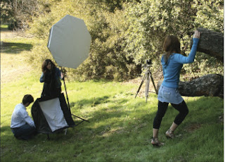
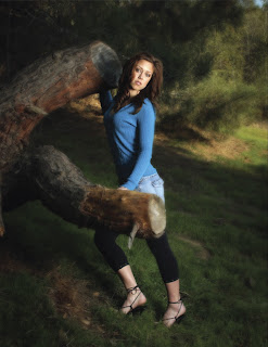
Here, an Octagon Box is used as the main light. A second softbox is added below the subject’s head height to produce a more glamorous appearance.


This tells you how to control the lighting—and thus, how to control the outcome of the image. I am all about working with what I have to produce the look I want. You don’t need every gadget known to man, you need to learn how to control light so well that you can reliably change its characteristics to produce exactly the look you want for a particular scene and/or client. For example, if you only had a 4x6-foot light box and you found the light it produced was too soft for a scene, you could:

1. Power up the light and move it further from the subject.

2. Take off the front diffusion panel.

3. Move the light more toward the 90-degree position.
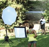

Here, you can see that the front panel of the flash, housed in a softbox, is on. This produces a softer light than removing the panel.
Knowledge is power—and when working on location you test your knowledge of lighting every day. Each scene, every room, or each side of a building will be different, and it’s never controlled like in the studio. The creative process of working with flash on location is no different than in the studio. You first decide what you and the client want the end product to be, then you make the required decisions to lead you to that end product.

In this pair of images, you see the lighting setup (below) and final image (bottom). For this shot, the front panel was removed from the main light to create a harder lighting effect.


* Excerpted from the book Jeff Smith's Lighting for Outdoor & Location Portrait Photography


BUY THIS BOOK FROM AMAZON

Lighting Different Facial Shapes


Today's post comes from the book Sculpting with Light- Techniques for Portrait Photographers by Allison Earnest. This book is available from Amazon.com and other fine retailers.

Butterfly Lighting.
Rectangular faces can also be successfully lit using butterfly lighting. You may have noticed that traditional light ratios and light placement have not been used throughout the series on lighting different facial masks. The light techniques are more interpretive lighting, which means the light is placed to suit each individual subject.

In plate 77, M’shell was photographed with a Hensel Integra 500 monolight fitted with a beauty dish as the main source of illumination. This was positioned two feet above the camera and pointed down toward the model’s face, producing a soft butterfly shadow under her nose. With the camera set on manual, an incident-light exposure reading was made, indicating an aperture of f/11. The white background received no additional illumination, thus rendering it as gray.


PLATE 77—A beauty dish was used as the main light. It was placed two feet above the camera and directed down toward the model’s face. (Manual mode, ISO 200, 1/125 second, f/11)


Plate 78 was made without changing my main light position or exposure. The change we see was created by adding a strip light approximately 70-degrees to camera left. Used for fill light, this was set to record an exposure half as bright as the main light. Two additional lights were also added: a background light and a hair light. The background light was aimed toward the white background paper and adjusted to record an exposure of f/16—one stop brighter than the main light. This rendered the background its actual color, white. The hair light was fitted with a grid to ensure hard separation. This light was positioned behind the subject to camera right and set to f/16. To add sparkle to M’shell’s eyes, a California Sunbounce zebra reflector was also positioned just under the model’s face, and a gobo was placed close to the model’s left side to block any additional light and sculpt a pleasing shadow on her cheek. Finally, a household fan was used to create a sense of motion.


PLATE 78—Several lights were added to create this final portrait. For fill, a strip light was added to camera left. A hair light was added behind the subject to camera right.To light up the eyes, a reflector was placed below the model’s face. Finally, a gobo was placed close to the model’s left side to sculpt her cheek. (Manual mode, ISO 200, 1/125 second, f/11)


PLATE 79—Here you can see the exact setup that was used to produce the final image of M’Shell.The gobo consisted of a black presentation board purchased at a local craft store. Remember, the choice of equipment doesn’t have to be expensive, just effective. (Manual mode, ISO 200, 1/125 second, f/11)

* Excerpted from the book "Sculpting with Light" by Allison Earnest


BUY THIS BOOK FROM AMAZON

Seated Posing

Today's post comes from the book Jeff Smith's Posing Techniques for Location Portrait Photography by Jeff Smith. This book is available for Amazon.com and other fine retailers.

Certain clients or situations call for a pose that is still relaxed but not on the ground. The decision to get the client up off the ground may be one based on making use of a particular background, foreground, or even the lighting. It may also be because your client prefers not to be on the ground, because the ground is too wet for the client to pose comfortably, or because you need a somewhat less casual look. Sitting poses appear relaxed, but not as casual as poses on the ground. In group portraits, they also lack the close feeling of poses on the ground. (Seated poses may, however, be used in combination with ground poses in group portraits. This can help bridge the gap between standing members and those on the ground.).
FINDING A SEAT
There are two parts to posing people sitting outdoors: first, you must know how to pose them; second, you must have something to pose them on. Finding something to pose client on can be difficult in certain locations. Some locations have very little that is at the appropriate height; other locations have logs, rocks, fallen trees, and other man-made sitting areas. If your location doesn’t provide any natural or man-made places to pose your clients, you can even bring them with you—natural-looking stools or chairs made of canes or branches, or even some light-weight fake rocks or logs can do the job. Personally, I prefer not to haul a bunch of stuff with me to outdoor shoots, so I tend to look for natural places for my clients to sit.


COMMON PROBLEM AREAS
Hips and Thighs. Once you find a seating area, there are two important rules that you must always remember. Before I tell you, though, I want to show you the first one. I want you to put this book down. If you are sitting, stand up. Now, sit back down and watch your thighs and hips (if you’re wearing a skirt or dress, you may have to tuck the material tightly around your legs to see this). If you are being honest, your legs and hips will grow in width anywhere between 25 and 60 percent depending on your muscle tone. I don’t care how much time you spend in the gym, you will widen out. So that’s our first rule: never sit someone down flat on their bottom.

While you are still seated, roll over onto your hip—the one that would be closer to the camera. Notice how much slimmer your legs appear? Your bottom is now behind you, so it doesn’t mushroom out widening the hips. So that’s our second rule: pose your clients on their hip closest to the camera or make sure that this area will be blocked from the view of the camera.

Waistline. One last thing, look at your waistline. I don’t care how many situps you do every morning—in a seated pose, your waistband or belt will cut in and cause a “belly” to form over the top of it. The only cure for this problem is to hide the area from view. If that is impossible, have the client sit up as straight as possible to stretch out and flatten the stomach area, minimizing the problem.

GROUND THE POSE
The second rule of sitting a client deals with the feet and legs. Never have a client sit without being able to touch the ground. A foot must be grounded. Once you have a foot that is grounded, the other foot/leg becomes the accent leg. You can cross the leg over the grounded leg, you can bring the leg back and push up the heel of the foot, whatever you want to do, but always have one foot on the ground and the accent leg in a position that adds interest to the pose and subject.


ANGLE THE BODY AND LEAN FORWARD
As in most poses, seated poses should have the subject’s body turned to the side of the frame. Unless you are pulling the legs in close to the body to rest the arms on top of them, the knees should never be pointing directly back at the camera.


Looking at outdoor portraits taken by other photographers, I often notice that they have the subject reclining back into a chair or sitting straight up on a rock or log. In contrast, I prefer to have the subject leaning forward to rest on their knees; this automatically covers the waistline, which becomes such a problem in seated poses. I also think it looks much more natural. If you have ever sat on a rock or log, you know that you tend to make yourself more comfortable by leaning forward on your knees.

In group portraits, having the seated subjects lean forward onto their knees also lowers their faces to get them closer to any subjects who might be posed on the ground. When we are photographing a couple, we often pose the man in a seated pose leaning forward, while the woman is posed on the ground between the legs. We have the man lean onto his one knee and then angle the woman slightly toward the other knee so the faces are closer to side by side, instead of one over the other.

*Excerpted from the book "Jeff Smith's Posing Techniques for Location Portrait Photography"

Composition


Today's post comes from the book Portrait Photographers Handook, 3rd Edition by Bill Hurter. It is available from Amazon.com and other retailers.

Composition in portraiture is no more than proper subject placement within the frame. There are several schools of thought on proper subject placement, and no one school is the only answer. Several formulas are given here to help you best determine where to place the subject in the picture area.

THE RULE OF THIRDS
Many photographers don’t know where to place the subject within the frame. As a result, they usually opt for putting the person in the center of the picture. Unfortunately, this is actually the most static type of portrait composition you can produce. The easiest way to improve your compositions is to use the rule of thirds. Examine the diagram shown below (left). The rectangular viewing area is cut into nine separate squares by four lines. Where any two lines intersect is an area of dynamic visual interest. The intersecting points are ideal spots to position your main point of interest. The main point of interest in your portrait can also be effectively placed anywhere along one of the dividing lines. In head-and-shoulders portraits, the eyes are the center of interest. Therefore, it is a good idea if they rest on a dividing line or at an intersection of two lines. In a three quarter-or full-length portrait, the face is the center of interest. Thus, the face should be positioned to fall on an intersection or on a dividing line. In most vertical portraits, the head or eyes are twothirds from the bottom of the print. This is also true in most horizontal compositions, unless the subject is seated or reclining. In that case, they may be at the bottom onethird line.


The rule of thirds (left) and the golden mean (right) are two ways of achieving dynamic compositions in portrait photography. In each case, the center of interest, the face or eyes, should be placed on or near an intersection of two lines within the picture rectangle.


THE GOLDEN MEAN
A compositional principle similar to the rule of thirds is the golden mean, a concept first expressed by the ancient Greeks. Simply, the golden mean represents the point where the main center of interest should lie and it is an ideal compositional type for portraits. The golden mean is found by drawing a diagonal from one corner of the frame to the other. Then, draw a line from one or both of the remaining corners so that it intersects the first line perpendicularly. By doing this you can determine the proportions of the golden mean for both horizontal and vertical photographs.


DIRECTION
Sometimes you will find that if you place the main point of interest on a dividing line or at an intersecting point, there is too much space on one side of the subject and not enough on the other. Obviously, you would then frame the subject so that he or she is closer to the center of the frame. It is important, however, that the person not be placed dead center, but to one side of the center line. Whatever direction the subject is facing in the photograph, there should be slightly more room in front of the person (on the side of the frame toward which he is facing). For instance, if the person is looking to the right as you look at the scene through the viewfinder, then there should be more space to the right side of the subject than to the left of the subject in the frame. This gives the image a sense of visual direction. Even if the composition is such that you want to position the person close to the center of the frame, there should still be slightly more space on the side toward which the subject is turned. This also applies when the subject is looking directly at the camera. He should not be centered in the frame; there should be slightly more room on one side to enhance the composition.

LINES
To effectively master the fundamentals of composition, the photographer must be able to recognize real and implied lines within the photograph. A real line is one that is obvious—a horizon, for example. An implied line is one that is not as obvious; the curve of the wrist or the bend of an arm is an implied line. Real lines should not intersect the photograph in halves. This actually splits the composition into two halves. It is better to locate real lines at a point one-third into the photograph. This weights the photo in a way that is more appealing to the eye. Lines, real or implied, that meet the edge of the photograph should lead the eye into the scene and not out of it—and they should lead toward the subject. A good example of this is the country road that is widest in the foreground and narrows to a point where the subject is walking. These lines lead the eye straight to the subject. Implied lines, such as those of the arms and legs of the subject, should not contradict the direction or emphasis of the composition, but should modify it. These lines should present gentle, not dramatic, changes in direction. Again, they should also lead to the main point of interest—either the eyes or the face.


Excerpted from the book "Portrait Photographer's Handook, 3rd Edition" by Bill Hurter.