Showing posts with label bill hurter. Show all posts

Portrait Photography Recipes

Today's post comes from the book Rangefinder's Professional Photography: Techniques From the Pages of Rangefinder Magazine, edited by Bill Hurter. It is available from Amazon.com and other fine retailers. This book compiles the work of almost 100 photographers as featured in Rangefinder magazine's Cookbook features. Essentially, each photographer offers a photograph and explains how they created it. Here are two of the "recipes".


Fernando Escovar: A Retro Fashion Series

I thought it might be a good idea to produce a retro style in my next fashion series, so I started with an old Shure microphone, like the ones you see in movies from the 1950s. I remembered a location at Bellagio in Las Vegas where they have a cool lounge called the Fontana Bar. They also have an old drum set with an ornate “B” on the bass drum.

A model/actress friend of mine, Amanda Swisten, loves anything retro, so I asked if she would do this for me. As a photographer you have to make a lot of phone calls to orchestrate these “mini movies.” The hair and makeup all had to be just right for this project, which ran as a sixteen-page spread and cover for Las Vegas magazine.


After I scouted and secured the location, I made a shot list with the editor to see what outfit looked best for each scene. That exercise took half a day. After making the selections, we had a fitting with Amanda to double-check the clothes.


I am all digital now, sporting Canon’s 1Ds Mark II, and I don’t remember how I ever lived before digital. The other day I was shooting an assignment for a client who wanted film. I kept looking down at the camera body to view the image I had just captured, but I couldn’t because it was a film camera.

With digital, I can quickly check my work when I am building a shot with lights—like the image of Amanda singing in front of the striking red curtains. I wanted to make sure I was getting shadows where I wanted them. I also wanted to keep light on the drum set and not fully on Amanda while shooting 100 ISO at f/8 and 1/125 second; shooting digital allowed me to ensure
these elements.

We made fine adjustments, flagged off the main Profoto strobe with some GatorBoard, and covered the other strobes with amber gels to give off some deeper colors. I only used three heads on this shot with an Acute 2400 pack.

INGREDIENTS
Camera: Canon 1Ds Mark II
Exposure: 100 ISO at f/8,
1/125 second
Light: Profoto strobe,
flagged off with
GatorBoard; other
strobes covered with
amber gels; Acute
2400 pack


Monte Zucker: The Touch
For this image, Monte Zucker wanted to create a high-key portrait outdoors with simple props. In order to do so, the first thing he looked for was a covered area with strong backlighting. The perfect setting was under a covered porch with no light coming in from above. To get the backlighting, he waited for the afternoon sun, then used a Westcott translucent panel directly behind the couple to diffuse the backlight.

The camera was a Canon EOS 10D loaded with a 640MB Delkin memory card. The ISO was adjusted to 200. Monte says, “I used aperture priority with the lens set at f/5.6. The internal exposure meter saw a lot of white behind them and stopped down too much, so the figures were underexposed. I had to override the in-camera meter by a stop and a half to get the correct exposure on their faces.


“Heads were positioned for profiles of both, with my normal lighting pattern for profiles coming thru the Westcott translucent panel. In addition, they were lying on a Westcott Black/White 4x6-foot panel.

“I used a 27-inch silver reflector as a kicker to help brighten the image. The reflector (Westcott’s Monte Illuminator) was tipped upward to catch light coming over the top of the translucent panel. This opened up the shadows slightly without overpowering the main light coming through behind them.”


Very little was done in Photoshop, except to remove a few minor blemishes from their skin. “The couple in the picture were high-school friends. They came to pose for one of my workshops. They got more and more into my photographing them when they saw how much fun we were having. They originally told me that they didn’t like posed photos, but as we took more pictures and they looked at the LCD screen, they got more enthusiastic. They said, ‘These aren’t what we meant when we said we didn’t like posed pictures. These are fun!’ They said they’ve never looked this good in photographs.”

About photography, Monte says, “It’s exciting to see how far you can take it and nail it every time! I believe in it completely and teach it with love and with passion.” —Bob Rose

INGREDIENTS
Camera: Canon EOS 10D
Lens: Canon 28–135mm
f/4 IS Zoom
Memory Card: Delkin
640MB
White Balance: ExpoDisc
Light Control: Westcott
4x6-foot panel,
Translucent panel and
27-inch silver reflector
(Monte Illuminator)

Glamour Portrait Makeover

Today's post comes from the book Jerry D's Extreme Makeover Techniques for Digital Glamour Photographers by Bill Hurter. It is available from Amazon.com and other fine retailers.

Vandella is a bubbly, confident, and giving person who needed a little bit of a self-image boost. All of us experience what Vandella was feeling when she first met Jerry. She was tied up in the day-to-day routine of her life and needed to be reminded of the fact that she is special. When her portrait was delivered, she felt as if she had been given a new lease on life.

This how Vandella looked when she came to Jerry’s studio.

Makeup
Vandella’s makeup was applied using the basic principles covered in chapter 1 of this book. At the completion of this process, the image below was created. This was the starting point for postproduction enhancement.

This is the first version of Vandella’s portrait. Notice the wrinkled tulle of the background fabric and the lack of shape in the oversized shirt.

Postproduction
The first step was to reshape her body and adjust the size of her breasts. This was accomplished using Photoshop’s Liquify filter (Filter > Liquify). Liquify is essentially a separate application within Photoshop that is used to stretch or distort areas within the photograph. In the Liquify window, Jerry selected the Forward Warp tool with a brush size of 516, a density setting of 50, a brush pressure of 80, and a turbulent jitter setting of 50 (this scrambles the reformatted pixels). With this tool, Jerry proceeded to adjust her shape by pushing the pixels into the desired positions. The image below shows Vandella after the Liquify process. In the upper right quadrant of the image, you can see that Jerry used the Clone Stamp tool to copy new fabric into the areas that were vacated by the Liquify filter. Note, too, the reshaped torso of Vandella.


Vandella’s torso was reshaped using the Liquify filter. After reshaping, Jerry used the Clone Stamp tool to repair areas of the background that became obviously distorted.

Jerry used the Clone tool to reshape Vandella’s hips, waist and arms (image below). The tool was set to 100 opacity and flow with a brush hardness of 80.

The torso was then reshaped using the Clone Stamp tool.

Next, a duplicate background layer was created. To this, Jerry applied the Gaussian Blur filter (Filter > Blur > Gaussian Blur) at a radius setting of 20 pixels. Working on the Gaussian Blur layer, Jerry then made two passes with the Eraser tool set at 30 percent opacity, restoring soft detail. Finally, he made another pass with the Eraser tool set at 80 percent opacity to bring out sharp image details (below).

After applying the Gaussian Blur filter on a duplicate background layer, sharpness was restored using the Eraser tool.

Jerry next applied the Burn tool as shown in the next image. This was adjusted to a 14 percent exposure setting. This technique creates shadows, which gives the illusion of depth. With each pass, the tonal values become deeper until the final effect is achieved.

The Burn tool was applied to add shape-revealing shadows.

Then, Jerry adjusted the contrast using the Brightness/Contrast function (Image > Adjustments > Brightness/Contrast). His objective was to deepen the blacks and lighten the whites, producing better overall contrast (below).

The contrast was enhanced to deepen the blacks and lighten the whites.

The final step was to use the Dodge tool, at an exposure setting of 25 percent, around the edges of the body. This cleaned up all of the distracting details and gave the background a cleaner look. This image shows Vandella’s final portrait.

The completed image of Vandella.

Composition and Design

Today's post comes from the book The Best of Family Portrait Photography by Bill Hurter. It is available from Amazon.com and other fine retailers.

LINES AND SHAPES
As you will see, designing successful family portraits depends on your sensibility of the intangible: those implied lines and shapes in a composition.

Lines. A line is an artistic element used to create visual motion within the portrait. It may be implied by the arrangement of the family members, or inferred, by grouping various elements within the scene. The photographer must be able to recognize real and implied lines within the photograph.

A real line is one that is obvious—a horizon line, for example. An implied line is one that is not as obvious; the curve of the wrist or the bend of an arm is an implied line. Real lines should not
cut the photograph into halves. It is better to locate these at one-third points within the photograph.

Implied lines, like the arms and legs of the group, should not contradict the direction or emphasis of the composition, just modify it. These lines should provide gentle, not dramatic changes in direction, and again, they should lead to the main point of interest.

Beautiful design doesn’t happen by accident. In this wonderful portrait by Deanna Urs, you will find a statuesque pyramid shape composed of the entire group and a lovely S curve created by the mother’s pose. Deanna used rich fabrics to drape her subjects, lending a timeless atmosphere to the portrait. The beautiful flowing lines of the people offset all of the square lines and edges found in the background props.

Lines that meet the edge of the photograph—real or implied—should lead the eye into the scene and not out of it, and they should lead toward the subject. A good example of this is the country road that is widest in the foreground and narrows to a point where the subjects are walking. These lines lead the eye straight to the subjects. By the way, the point at which the road in this
example narrows to a point on the horizon is known as the vanishing point.

Shapes. Shapes are groupings of like elements: diamond shapes, circles, pyramids, etc. Usually, it is a collection of faces that forms this type of pattern. Shapes are used to produce pleasing designs within the composition that guide the eye through the picture.

Pleasing Compositional Forms. The S-shaped composition is perhaps the most pleasing of all. The center of interest will fall on either a third line or a golden mean, but the remainder of the composition forms a gently sloping S shape that leads the eye through the photograph and to the main point of interest. The Z shape is a close relative to the S-shaped design.

The pyramid is the one of the most pleasing shapes to the eye and is often used in photographing large groups. The simple shape brings order to chaos. This image by Tibor Imely displays perfect color coordination and beautiful lighting created by the twilight. When the sun has set below the horizon, its rays continue to light the overhead sky and clouds, creating the softest most beautiful light of the day. Tibor uses no fill light when working at this location, which he frequents often because of the light and pleasant sea-oats background.

Another pleasing form of composition is the L shape or inverted L shape, which is observed when the group’s form resembles the letter L or an inverted letter L. This type of composition is ideal for reclining or seated subjects. These compositional forms may encompass line alone or line and shape to accomplish the pattern.

Amidst this beautifully posed image you will find a delightful S curve meandering through the composition, almost unnoticeably. Within the posing you will find various triangles and overlapping triangles that are a result of expert group posing. This image is by Robert and Suzanne Love

Direction. Regardless of which direction the subjects are facing in the photograph, there should be slightly more room in front of the group on the side toward which they are facing.

For instance, if the family is looking to the right as you look at the scene through the viewfinder, then there should be more space to the right side of the subjects than to the left of the group in the frame. This gives the image a visual sense of direction.

Even if the composition of the image is such that you want to position the family group very close to the center of the frame, there should still be slightly more space on the side toward which the group is turned.

In this beautiful portrait by Fran Reisner, the sisters are positioned to the left of center, moving into the frame, creating a strong sense of direction. They are positioned at one of the points of interest according to the rule of thirds. The field of wheat, with its horizontal lines from foreground to horizon, contrasts the strong vertical shapes of the young girls

At first, such an arrangement may seem to be a foreign concept, but the more you learn to recognize these elements, the more they will become an integral part of your group compositions.

As in any artistic venture, the goal of the family portrait photographer is to provide visual direction and movement in the image, guiding the viewer’s eye through the composition in an interesting way. The opposite of this is a static image, where no motion or direction is found and the viewer simply “recognizes” rather than enjoys all of the elements in the photo.

SUBJECT TONE
The eye is always drawn to the lightest part of a photograph. The rule of thumb is that light tones advance visually, and dark tones retreat. Therefore, elements in the picture that are lighter in tone than the subject will be distracting. Bright areas, particularly at the edges of the photograph, should be darkened either in printing, in the computer, or in-camera (by masking or vignetting) so that the viewer’s eye is not drawn away from the subject.

This portrait by Frank Frost combines the warm tones of autumn with the stark black and red outfits of the family. The strong diagonal line runs through the composition, giving it a dynamic quality and a sense of direction. The tones throughout the image coordinate and unify the photograph.

There are some portraits where the subject is the darkest part of the scene, such as in a high-key portrait with a white background. This is the same basic principle at work; the eye travels to the region of greatest contrast. Regardless of whether the main subject is light or dark, it should dominate the rest of the photograph either by brightness or by contrast.

It’s amazing how nature sometimes cooperates with a photographer. Here, the Black-eyed Susans in the background seem to provide a well conceived frame around the family. The daughters’ ribbons match exactly the color of the flowers. The photographer, Frank Frost, carefully burned in areas of tone that might compete with the family so that your focus is drawn to them. Also notice the strong triangle shape created by the composition, offset on a rule-of-thirds line to create a dynamic composition.

Whether an area is in focus or out of focus has a lot to do with determining the amount of visual emphasis it will receive. A light-colored background that is lighter than the group, but distinctly out of focus, will not necessarily detract from the family. It may, in fact, enhance and frame the group, keeping the viewer’s eye centered on the subjects.

The same is true of foreground areas. Although it is a good idea to make them darker than your subject, sometimes you can’t. If the foreground is out of focus, however, it will detract less from the group, which, hopefully, is sharp.

This photograph by Stacy Bratton shows you why parents hire professional photographers to create portraits of their children. This is such an innovative image, made even more effective by shallow depth of field and a relatively slow shutter speed that blurs the child’s hair. And the expression is priceless. Everything about the image is original and fresh.

A technique that is becoming popular is to diffuse an area of the photograph you want to minimize or use to focus attention on your main center of interest. This is usually done in Photoshop by selecting the area and “feathering” it so that the diffusion effect diminishes the closer you get to the edge of the selection.

Tension and balance are the two most effective ways to achieve visual interest in a photograph. Here, in Jennifer Maring’s beautiful portrait of sisters, you can see both states at work. The balance and tension are derived from the same area, the forms of the two sisters, which loosely resembles the infinity sign or numeral 8, a highly symmetrical symbol. The imbalance or tension comes from the same place—all of the deviations that make the two matching forms different; for example one girl is bigger than the other, one’s dress is less perfectly shaped than the other, and so on.

Expert family portrait photographers insist on tight control over wardrobe for a big family photograph. Instead of dictating one “uniform” for the entire family, they will define complementary color schemes. For example, where multiple families are displayed, each will be in a different outfit—khaki and red, or denim and white. Other families within the group will have different coordinating outfits—khaki and yellow, or denim shirts and khaki pants. The result is uniformity and diversity.

TENSION AND BALANCE
Once you begin to recognize real and implied lines and to incorporate shapes and curves into your family portraits, you need to become aware of the concepts of tension and balance. Tension, or visual contrast, is a state of imbalance in a photograph—a big sky and a small subject, for example, is a situation having visual tension.

Although tension does not have to be “resolved” in an image, it works in tandem with the concept of balance. As you examine the photographs in this book and read the captions, you will hear these terms referred to often. For example, a group of four on one side of an image and two subjects on the other side of the frame produce visual tension. They contrast each other because they are different sizes and not necessarily symmetrical. But the photograph may be in a state of perfect visual balance by virtue of what falls between these two groups, or for some other reason. For instance, using the same example, these two different groups could be resolved visually if the larger group is wearing dark clothes and the smaller group is wearing brighter clothes. The eye then sees the two groups as more or less equal—one group demands attention by virtue of its size, the other gains attention by virtue of its brightness.

These strategies are subjective to a large extent, but there is no question that the eye/brain reacts favorably to both balance and visual tension and they are active ingredients in great photography.

BUY THIS BOOK ON AMAZON

Corrective Techniques

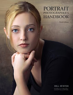
Today's post comes from the book Portrait Photographer's Handbook by Bill Hurter. It is available from Amazon.com and other fine retailers.

The art of good portraiture is found in the photographer’s ability to idealize a subject. This demands that the photographer know practical methods of correcting the subject’s physical flaws and irregularities.

It’s important to understand that people don’t see themselves the way they actually appear. Subconsciously, they shorten their noses, imagine they have more hair than they really do, and in short, pretend they are better looking than they really are. A good portrait photographer knows this and acts on it the instant a subject arrives for a session. As a matter of procedure, the photographer analyzes the face and body and makes mental notes as to how best to light, pose, and compose the subject to produce a flattering likeness.

CORRECTING SPECIFIC PROBLEMS
This section deals with methods to correct specific physical traits you will encounter with everyday people. Be tactful about making any corrective suggestions.

Overweight Subjects. Have an overweight subject dress in dark clothing, which will make him or her appear ten to fifteen pounds slimmer. Use a pose that has the subject turned at a 45-degree angle to the camera. Never photograph a larger person head-on—unless you are trying to accentuate their size.

Use a low-key lighting pattern and use short lighting so that most of the subject is in shadow. The higher lighting ratio that produces low-key lighting will make your subject appear slimmer. Use a dark-colored background and if possible, merging the tone of the background with the subject’s clothes. To do this, minimize or eliminate the background light and any kickers you might otherwise use to highlight the shadow-side edge of the subject.

Standing poses are more flattering. Seated, excess weight accumulates around the waistline. A dark vignette at the bottom of the portrait is another trick to minimize the appearance of extra weight.

If the overweight person has excess skin under their chin, keep the light off the neck, or use a gobo, a lightblocking card placed between light and subject, to keep light off this area.
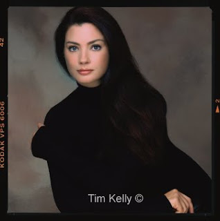

Sometimes great portraiture is not about minimizing flaws, but maximizing great features. Here, Tim Kelly eliminated just about everything about this girl except her nearly perfectly shaped face. He used black everywhere to defocus attention, photographing her in a black sweater in a black chair. Tim had her lean forward in the chair, so you can’t even relate to the type of pose in use. These are all intentional techniques to focus your attention on her face.

Thin or Underweight Subjects. A thin person is much easier to photograph than an overweight person. Have the person wear light- colored clothing and use a high-key lighting ratio and light-colored background. When posing a thin person, have him or her face the camera more to provide more width. A seven-eighths angle is ideal for people on the thin side.

If the person is extremely thin, do not allow him or her to wear sleeveless shirts or blouses. For a man, a light-colored sports coat will help fill him out; for a woman, fluffy dresses or blouses will disguise thin arms.

For a thin face, use broad lighting and a lighting ratio in the 2:1 or 3:1 range. Since the side of the face turned toward the camera is highlighted, it will appear wider than if short lighting is used. The general rule is, the broader the person’s face, the more of it should be kept in shadow; the more narrow the face, the more of it should be highlighted—the basic differences between broad and short lighting.

Slender subjects can be photographed head-on with no angle to the shoulder axis. A very broad, highlight area and the pose enhance this girl’s natural beauty. Photograph by Tony Corbell.

Elderly Subjects. The older the subject, the more wrinkles he or she will have. It is best to use some type of diffusion, but do not soften the image to the point that none of the wrinkles are visible. Men, especially, should not be overly softened as their wrinkles are often considered “character lines.”

Use a frontal type of lighting so that there are no deep shadows in the wrinkles and deep furrows of the face. Use a softer, diffused type of lighting, such as umbrella light. Soft lighting will de-emphasize wrinkles.

A smaller image size is also called for in photographing elderly people. Even when making a head-and-shoulders portrait, the image size should be about 10–15 percent smaller, so that the signs of age are not as noticeable.
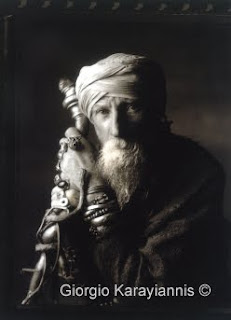
This wonderful portrait by Giorgio Karayiannis says more in what it omits than what is visible. Giorgio used a very strong lighting ratio to omit large portions of the image—a technique that is often used to minimize the visible areas of a large person. The light, a square softbox, was moved back from the subject to increase its specularity. With no fill-in, much of the portrait is black. The deep blacks and dark areas lend mystery to the portrait.

Eyeglasses. The best way to photograph eyeglasses is to use blanks (frames without lenses), obtained from the sitter’s optometrist. If the portrait is scheduled far enough in advance, arrangements can usually be made with the optometrist for a set of loaner frames. If blanks are not available, have the person slide his glasses down on his or her nose slightly. This changes the angle of incidence and helps to eliminate unwanted reflections.

When photographing a subject wearing eyeglasses, the key light should be diffused so that the frames do not cast a shadow that darkens the eyes. Place the key light even with or just higher than the subject’s head height, then move it out to the side so that its reflection is not visible in the eyeglasses as seen from the camera. This produces a split or 45-degree lighting pattern. The fill light should also be adjusted laterally away from the camera until its reflection disappears. If you cannot eliminate the fill light’s reflection, try bouncing the fill light off the ceiling or the back wall of the studio.

When your subject is wearing thick glasses, it is not unusual for the eyes to be darker than the rest of the face. This is because the thickness of the glass reduces the intensity of light being transmitted to the eyes. If this happens, there is nothing you can do about it during the shooting session, but the area can be dodged digitally or during printing to restore the same print density as in the rest of the face.

If your subject wears “photo-gray” or any other type of self-adjusting, light-sensitive lenses, have him keep his glasses in his pocket until you are ready to shoot. This will keep the lenses from getting dark prematurely from the shooting lights. Of course, once the light strikes them they will darken, so you might want to encourage your subject to remove his or her glasses for the portrait.

One Eye Smaller than the Other. Most people have one eye smaller than the other. This should be one of the first things you observe about your subject. If you want both eyes to look the same size in the portrait, pose the subject in a seven-eighths to three-quarters view, and seat the person so that the smaller eye is closest to the camera. Because objects farther from the camera look smaller, and nearer objects look larger, both eyes should appear to be about the same size.

Baldness. If your subject is bald, lower the camera height so less of the top of his head is visible. Use a gobo between the main light and the subject to shield the bald part of his head from light. Another trick is to feather the main light so that the light falls off rapidly on the top and back of his head. The darker in tone the bald area is, the less noticeable it will be. Do not use a hair light, and employ only minimal background light. If possible, try to blend the tone of the background with the top of your subject’s head.
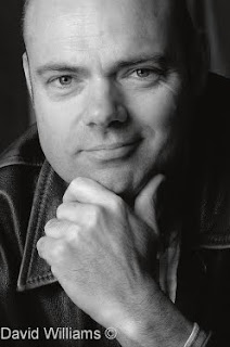
Baldness, or a pronounced receding hairline, can sometimes be handled by judicious cropping—as in the case of this portrait by David Williams. Notice how the hand is brought into the composition as a major element and how its strong posing helps to add character and flavor to the portrait.

Double Chins. To reduce the view of the area beneath the chin, raise the camera height so that area is less prominent. Tilt the chin upward and raise the main light so that much of the area under the chin is in shadow.

Wide Faces. To slim a wide face, pose the person in a three-quarters view, and use short lighting so that most of the face is in shadow. The wider the face, the higher the lighting ratio should be. If the face is extremely wide, even a 5:1 ratio would be suitable.

Thin Faces. To widen a thin face, the solution is to highlight as much of the face as possible. This means using broad lighting, where the side of the face most visible to the camera is highlighted. You should use a frontal pose, such as a seven-eighths view, and keep the lighting ratio on the low side—in the 2:1 to 3:1 range. Kickers and hair lights will add depth and dimension to the portrait, and further widen a thin face. A smiling pose will also widen the cheek and mouth area.

Broad Foreheads. To diminish a wide or high forehead, lower the camera height and tilt the person’s chin upward slightly. Remember, the closer the camera is to the subject, the more noticeable these corrective measures will be. If you find that by lowering the camera and raising the chin, the forehead is only marginally smaller, move the camera in closer and observe the effect again—but watch out for other distortions.

Deep-Set Eyes and Protruding Eyes. To correct deep-set eyes, keep the main light low to fill the eye sockets with light. Keep the lighting ratio low so there is as much fill light as possible to lighten the eyes. Raising the chin will also help diminish the look of deep-set eyes. To correct protruding eyes, raise the main light and have the person look down so that more of the eyelid is showing.

Large Ears. To scale down large ears, the best thing to do is to hide the far ear by placing the person in a three-quarters view, making sure that the far ear is out of view or in shadow (either by using a gobo to block the light from the ear or by feathering the main light). If the subject’s ears are very large, examine the person in a profile pose. A profile pose will totally eliminate the problem.

Very Dark Skin Tones. Unusually dark skin tones must be compensated for in exposure if you are to obtain a full tonal range in the portrait. For the darkest skin tones, open up a full f-stop over the indicated incident meter reading. For moderately dark subjects, like deeply suntanned people, open up one-half stop over the indicated exposure.

Uneven Mouths. If your subject has an uneven mouth (one side higher than the other, for example) or a crooked smile, turn his or her head so that the higher side of the mouth is closest to the camera, or tilt the subject’s head so that the line of the mouth is more or less even.

Long Noses and Pug Noses. To reduce the appearance of a long nose, lower the camera and tilt the chin upward slightly. Lower the key light so that, if you have to shoot from much below nose height, there are no deep shadows under the nose. You should use a frontal pose, either a full-face or seven-eighths view, to disguise the length of your subject’s nose.

For a pug nose or short nose, raise the camera height to give a longer line to the nose. Have the subject look downward slightly and try to place a specular highlight along the ridge of the nose. The highlight tends to lengthen a short nose.
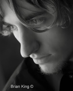
This is the type of portrait one might not attempt with a teenage subject a few years ago because the retouching might have been extensive. Now with the many retouching techniques available in Photoshop, it is easy to smooth the entire complexion in a matter of minutes. Photo by Brian King.

Long Necks and Short Necks. While a long neck can be considered sophisticated, it can also appear unnatural—especially in a head-and-shoulders portrait. By raising the camera height, lowering the chin, keeping the neck partially in shadow, and pulling up the shirt or coat-collar, you will shorten an overly long neck. If you see the subject’s neck as graceful and elegant, back up and make a three-quarter- or full-length portrait and emphasize the graceful line of the neck in the composition.

For short or stubby necks, place light from the key light on the neck. This is accomplished by lowering the key light, or feathering it downward. Increase the fill light on the neck so there is more light on the shadow side of the neck. Lowering the camera height and suggesting a V-neck collar will also lengthen the appearance of a short neck.

Wide Mouths and Narrow Mouths. To reduce an overly wide mouth, photograph the person in three-quarters view and with no smile. For a narrow or small mouth, photograph the person in a more frontal pose and have him or her smile broadly.

Long Chins and Stubby Chins. Choose a higher camera angle and turn the face to the side to correct a long chin. For a stubby chin, use a lower camera angle and photograph the person in a frontal pose.

Oily Skin. Excessively oily skin looks shiny in a portrait. If you combine oily skin with sharp, undiffused lighting, the effect will be unappealing. Always keep a powder puff and a tin of face powder on hand to pat down oily areas. The areas to watch are the frontal planes of the face—the center of the forehead and chin, and the cheekbones. The appearance of oily skin can also be minimized by using a diffused main light, such as umbrella or softbox lighting.

Dry Skin. Excessively dry skin looks dull and lifeless in a portrait. To give dry skin dimension, use a sharp, undiffused main light. If the skin still looks dull and without texture, have the person use a little hand lotion or body oil on their face to create small specular highlights in the skin. Don’t overdo it with the lotion or oil, or you will have the reverse problem—oily skin.

Skin Defects. Facial imperfections like scars and discoloration are best disguised by placing them in shadow, using a short lighting setup and a strong lighting ratio. Many of these issues can now also be addressed using digital retouching. Always get clearance from the subject before removing such features; they may have acclimated to them and not want them removed.

BE DISCRIMINATING
Here’s a problem you may not have thought of: what if the person is proud of the trait you consider a difficulty? Or what should you do when you encounter more than one problem?

The first question is best settled in a brief conversation with your subject. You can comment on his or her features by saying something like, “You have large eyes, and the line of your nose is quite elegant.” If the person is at all self-conscious about either one of these traits, he or she will usually say something like, “Oh, my nose is too long, I wish I could change it.” Then you will know that the person is unhappy with his nose, but happy with his eyes, and you’ll know how to proceed.

The second question is a little more difficult. It takes experience before you can discern which of the problems is the more serious one, and most in need of correction. Generally, by handholding the camera and moving into the corrective positions (i.e., a higher or lower camera angle) you can see how the physical characteristics are altered. By experimenting with various lighting, poses, and camera angles, you should be able to come up with the best posing strategy. Another good trick is to show them a few frames on the camera’s LCD. If they are at all selfconscious,
they will comment on their looks.

More than good lighting, posing, and composition techniques, the successful portrait photographer knows how to deal with the irregularities of the human face. All of the great portrait photographers know that their success lies in being able to make ordinary people look absolutely extraordinary.

BUY THIS BOOK FROM AMAZON

Really Large Groups


Today's post comes from the book The Best of Family Portrait Photography by Bill Hurter. It is available from Amazon.com and other fine retailers.

Once a group exceeds nine people, it is no longer a small group. The complexities of posing and lighting expand and, if you’re not careful to stay in charge, chaos will reign. It is always best to have a game plan in mind with big groups.

Posing bigger groups requires you to use standing poses, often combined with sitting and kneeling poses. Those subjects who are standing should be turned at least 20 degrees off center so that their shoulders are not parallel to the film plane. The exception is with small children, who gain visual prominence when they are square to the camera.


With standing poses, care must be taken to disguise wide hips and torsos, which can sometimes be accomplished simply by using other people in the group. Always create space between the arms and torso simply by placing a hand on a hip or, in the case of men, placing a hand in a pocket (thumb out).

In really large groups, the task of clothing coordination can be a nightmare. It is often best to divide the group into subgroups—family units, for instance—and have them coordinate with each other. For example, a family in khaki pants and yellow sweaters could be positioned next to a family in blue jeans and red sweaters.

For really big groups, it is a good idea to have the subjects stand close together—touching. This minimizes the space between people and allows you to get a larger head size for each person. One directive you must give to the group is that they must be able to see the camera with both eyes. This will ensure that you see all of their faces and that none will be hiding behind the person in front of them.

With big groups, fight the tendency to “line ‘em up and shoot ” This is, after all, a portrait and not a team photo. You can incorporate all types of design elements into even the largest groups.

Naturalness Counts. It is important with medium to large-size family groups that the poses you put your subjects in appear to be natural and comfortable. Even experienced group photographers working with assistants will take ten minutes or so to set up a group of twenty or more. Therefore, it is imperative that your subjects be posed comfortably. Natural poses, ones that your subjects might fall into without prompting, are best and can be held indefinitely.


It is important that the group remains alert and in tune with your efforts. With large groups, it is important to stay in charge of the posing. The loudest voice—the one that people are listening to—should be yours, although by no means should you be yelling. Instead, be assertive and positive and act in control.

With natural poses, have your antennae up for errant thumbs and hands that will pop up. Always do a perimeter search around each subject to make sure there is nothing unexpected in the posing.

Posing Levels. Two true experts at posing the mid-size to large group are Robert and Suzanne Love. I have witnessed them build groups made up of photographers attending one of their workshops and each person, without exception, was amazed when they saw how easy the Loves’ technique is and how attractive the arrangement turned out. The basic principle in the Loves’ technique is the use of different posing levels and the combinations of those levels used adjacent to one another. Here’s a brief look at the system.

Level 1, Standing. Each standing subject has his or her weight on their back foot and is posed at a 45- degree angle to the camera, lowering the rear shoulder to diminish overall body size.

Level 2, Tall Kneel. Generally a masculine pose, not unlike a football players’ team pose, this pose calls for the man to get down on one knee with his other leg bent at 90 degrees. The elbow of the arm on the same side as the knee that is up should rest on the knee.

Level 3, Short Kneel. This is the same pose as above but both knees are on the ground and the person’s weight is back on their calves. This pose is good for either men or women, but with women in dresses, they are usually turned at a 45-degree angle.

Level 4, Sitting. The man sits on his buttocks with the leg that is toward the camera curled under the leg that’s away from the camera. The elbow rests across his raised knee. For a woman wearing slacks, this is appropriate. However, a more graceful seated pose is achieved when she lays on her hip and rolls slightly toward the camera. Her legs then flow out to the side with the ankles crossed. Her top hand can rest on her lower thigh or in front of her. If she can bring her top knee over to touch the ground, her body produces a beautiful curved line.

Level 5, Lying Down. The subjects can lay on their sides with their hands resting on the sides of their faces, or can lay on their stomachs with their arms folded in front of them. This really works better for an individual pose, rather than a group, but it offers another level if needed.


By intermixing the levels without defining rows, you can pose ten to twenty people quite easily and informally. Each face is at a different level and no face is directly below or above another, providing good visual interest. And while the group is really quite highly structured, it doesn’t appear that way.

Stepladders. A stepladder is a must for large groups and, in fact, should be a permanent tool in your wedding and portrait arsenal. Stepladders give you the high angle that lets you fit lots of people together in a tight group, like a bouquet of flowers. Ladders also give you a means to correct low shooting angles, which distort perspective. The tendency is to overuse them, so use a stepladder when you need to or when you want to offer variety in your groups.

A stepladder is the answer to the refrain, “Boy, I sure wish I could get up on that balcony for this shot.” But a few words of caution: have your assistant or someone strong hold on to the ladder in case the ground gives or you lean the wrong way. Safety first.

In less dramatic ways, a stepladder lets you raise the camera height just slightly so that you can keep the group plane parallel to the film plane for better depth of-field control.

Linking Shapes. The bigger the group, the more you must depend on your basic elements of group portrait design—circles, triangles, inverted triangles, diagonals, and diamond shapes. You must also really work to highlight and accentuate lines, real and implied, throughout the group. If you lined people up in a row, you would have a very uninteresting “team photo,” a
concept that is the antithesis of fine family portraiture.


The overlapping circles around these shapes define each pattern as unique, even though both shapes use the same person centrally. In a portrait like this, each subset should be turned in toward the center to unify the composition, or turned away from center to create a bookend effect.

The best way to previsualize this effect is to form subgroups as you start grouping people. For example, how about a family of three here (perhaps forming an inverted triangle), three sisters over on the right (perhaps forming a flowing diagonal line), a brother, a sister and their two kids (perhaps in a diamond shape with the littlest one standing between her mom and dad). Then combine the subsets, linking the line of an arm with the line of a dress. Leave a little space between these subgroups, so that the design shapes you’ve formed don’t become too compressed. Let the subgroups flow from one to the next and then analyze the group as a whole to see what you’ve created.

Remember that arms and hands help complete the composition by creating motion and dynamic lines that can and should lead up into the subjects’ faces. Hands and arms can “finish” lines started by the basic shape of the group.

Be aware of intersecting lines that flow through the design. As mentioned earlier, the diagonal is by far the most compelling visual line in compositions and can be used repeatedly without fear of overuse. Diagram concepts courtesy of Norman Phillips.

Just because you might form a triangle or a diamond shape with one subset in a group does not mean that one of the people in that group cannot be used as an integral part of another group. You might find, for example, that the person in the middle of a group of seven unites two diamond shapes. The overlapping circles around these shapes (see diagram above) define each pattern as unique, even though both shapes use the same person. In a portrait like this, each subset could be turned slightly toward the center to unify the composition or turned away from the center to give a bookend effect.

Be aware of intersecting lines that flow through the design. As mentioned earlier, the diagonal is by far the most compelling visual line and can be used repeatedly without fear of overuse. The curving diagonal is even more pleasing and can be mixed with sharper diagonals within the composition.


BUY THIS BOOK FROM AMAZON

The Hands

Today's post comes from the book The Best of Portrait Photography, 2nd Edition by Bill Hurter. It is available at Amazon.com and from other fine retailers.


At the heart of any great portrait photographer’s body of work is a complete and thorough understanding of the traditional rules of posing. While it has become fashionable to break these, the true hallmark of finesse is knowing which rules to break and when.

In any discussion of subject posing, the two critical elements are that the pose appear natural and that the person’s features be undistorted. If the pose is natural and the features look normal, then you have achieved your goal and the portrait will be pleasing to you and the subject. While every rule of posing could not possibly be followed in every portrait, these rules exist to provide a framework for portraying the human form naturally, attractively, and without distortion.


The Hands
Posing hands properly can be very difficult because, in most portraits, they are closer to the camera than the subject’s head. Thus, they appear larger. One thing that will give hands a more natural perspective is to use a longer-than-normal lens. Although holding the focus of both hands and face is more difficult with a longer focal length, the size relationship between them will appear more natural. Additionally, if the hands are slightly out of focus, it is not as crucial as when the eyes or face are soft.


One basic rule is never to photograph a subject’s hands pointing straight into the camera lens. This distorts the size and shape of the hands. Always have the hands at an angle to the lens. Another basic is to photograph the outer edge of the hand whenever possible. This gives a natural, flowing line to the hand and eliminates the distortion that occurs when the hand is photographed from the top or head-on.


The following suggestions give you a few additional elements to keep in mind as you pose your subjects’ hands.

1. Always try to “break” the wrist. This means raising the wrist slightly so there is a smooth bend and gently curving line where the wrist and hand join.

2. Always try to photograph the fingers with a slight separation in between them. This gives the fingers form and definition. When the fingers are close together, they look like a two-dimensional blob.

3. When photographing a man’s closed hand, give him something small (like a pen cap), to wrap his fingers around. This gives roundness and dimension to the hand so that it doesn’t become a clenched fist.

4. As generalizations go, it is important that the hands of a woman have grace, and the hands of a man have strength.


Hands in Group Portraits. Hands can be a problem in small groups. Despite their small size, they attract attention to themselves, particularly against dark clothing. They can be especially problematic in seated groups, where at first glance you might think there are more hands than there should be.

One rule of thumb is to either show all of the hand or none of it. Don’t allow half a hand or a few fingers to show. Hide as many hands as you can behind flowers, hats, or other people. For men, have them put their hands in their pockets or “hitch” their thumb outside the pocket, which forms a nice triangle shape in the bent arm and gives recognition to the viewer that the hand is in pocket. For women, try to hide their hands in their laps or with others in the group.

Be aware of these potentially distracting elements and look for them as part of your visual inspection of the frame before you make the exposure.


Hands in Standing Poses. When the subject is standing for a three-quarter- or full-length portrait, the hands become a real problem. If you are photographing a man, folding the arms across his chest produces a good, strong pose. Remember, however, to have the man turn his hands slightly, so the edge of the hand is more prominent than the top. In such a pose, have him lightly grasp his biceps—but not too hard or it will look like he is cold and trying to keep warm. Also, remember to instruct the man to bring his folded arms out from his body a little bit. This slims down the arms, which would otherwise be flattened against his body and appear larger. Remember to separate the fingers slightly.

With a standing woman, one hand on a hip and the other at her side is a good standard pose. Don’t let the free hand dangle, but rather have her twist the hand so that the edge shows to the camera. Always create a break in the wrist for a more dynamic line.


*excerpted from The Best of Portrait Photography, 2nd Edition.

BUY THIS BOOK FROM AMAZON

Rembrandt Lighting

Today's post comes from the book Portrait Photographer's Handbook, 3rd Edition by Bill Hurter. This book is available from Amazon.com and other fine retailers.

There are five basic portrait lighting setups (Paramount, Rembrandt, Loop, Profile and Split). As you progress through them from Paramount to split lighting, each progressively makes the face slimmer. Each also progressively brings out more texture in the face because the light is more to one side. Here, we discuss Rembrandt lighting.

Rembrandt lighting (also called 45-degree lighting) is characterized by a small, triangular highlight on the shadowed cheek of the subject. The lighting takes its name from the famous Dutch painter who popularized this dramatic style of lighting. This type of lighting is often considered a masculine style and is commonly used with a weak fill light to accentuate the shadow-side highlight.


The key light is moved lower and farther to the side than in loop and Paramount lighting. In fact, the key light almost comes from the subject’s side, depending on how far the head is turned away from the camera.

To create the beautiful Rembrandt lighting pattern seen here, the photographer simply positioned his senior model in the light to create the dramatic shadow. Most of today’s portrait photographers seem to favor a strong natural light.


The fill light is used in the same manner as it is for loop lighting. The hair light, however, is often used a little closer to the subject for more brilliant highlights in the hair. The background light is in the standard position.

In Rembrandt lighting, kickers are often used to delineate the sides of the subject’s face and to add brilliant highlights. Be careful when setting such lights not to allow them to shine directly into the camera lens; this will cause flare. The best way to check is to place your hand between the subject and the camera on the axis of the kicker. If your hand casts a shadow when it is placed in front of the lens, the kicker is shining directly into the lens and should be adjusted.


*excerpted from the book Portrait Photographer's Handbook, 3rd Ed.


Composition


Today's post comes from the book Portrait Photographers Handook, 3rd Edition by Bill Hurter. It is available from Amazon.com and other retailers.

Composition in portraiture is no more than proper subject placement within the frame. There are several schools of thought on proper subject placement, and no one school is the only answer. Several formulas are given here to help you best determine where to place the subject in the picture area.

THE RULE OF THIRDS
Many photographers don’t know where to place the subject within the frame. As a result, they usually opt for putting the person in the center of the picture. Unfortunately, this is actually the most static type of portrait composition you can produce. The easiest way to improve your compositions is to use the rule of thirds. Examine the diagram shown below (left). The rectangular viewing area is cut into nine separate squares by four lines. Where any two lines intersect is an area of dynamic visual interest. The intersecting points are ideal spots to position your main point of interest. The main point of interest in your portrait can also be effectively placed anywhere along one of the dividing lines. In head-and-shoulders portraits, the eyes are the center of interest. Therefore, it is a good idea if they rest on a dividing line or at an intersection of two lines. In a three quarter-or full-length portrait, the face is the center of interest. Thus, the face should be positioned to fall on an intersection or on a dividing line. In most vertical portraits, the head or eyes are twothirds from the bottom of the print. This is also true in most horizontal compositions, unless the subject is seated or reclining. In that case, they may be at the bottom onethird line.


The rule of thirds (left) and the golden mean (right) are two ways of achieving dynamic compositions in portrait photography. In each case, the center of interest, the face or eyes, should be placed on or near an intersection of two lines within the picture rectangle.


THE GOLDEN MEAN
A compositional principle similar to the rule of thirds is the golden mean, a concept first expressed by the ancient Greeks. Simply, the golden mean represents the point where the main center of interest should lie and it is an ideal compositional type for portraits. The golden mean is found by drawing a diagonal from one corner of the frame to the other. Then, draw a line from one or both of the remaining corners so that it intersects the first line perpendicularly. By doing this you can determine the proportions of the golden mean for both horizontal and vertical photographs.


DIRECTION
Sometimes you will find that if you place the main point of interest on a dividing line or at an intersecting point, there is too much space on one side of the subject and not enough on the other. Obviously, you would then frame the subject so that he or she is closer to the center of the frame. It is important, however, that the person not be placed dead center, but to one side of the center line. Whatever direction the subject is facing in the photograph, there should be slightly more room in front of the person (on the side of the frame toward which he is facing). For instance, if the person is looking to the right as you look at the scene through the viewfinder, then there should be more space to the right side of the subject than to the left of the subject in the frame. This gives the image a sense of visual direction. Even if the composition is such that you want to position the person close to the center of the frame, there should still be slightly more space on the side toward which the subject is turned. This also applies when the subject is looking directly at the camera. He should not be centered in the frame; there should be slightly more room on one side to enhance the composition.

LINES
To effectively master the fundamentals of composition, the photographer must be able to recognize real and implied lines within the photograph. A real line is one that is obvious—a horizon, for example. An implied line is one that is not as obvious; the curve of the wrist or the bend of an arm is an implied line. Real lines should not intersect the photograph in halves. This actually splits the composition into two halves. It is better to locate real lines at a point one-third into the photograph. This weights the photo in a way that is more appealing to the eye. Lines, real or implied, that meet the edge of the photograph should lead the eye into the scene and not out of it—and they should lead toward the subject. A good example of this is the country road that is widest in the foreground and narrows to a point where the subject is walking. These lines lead the eye straight to the subject. Implied lines, such as those of the arms and legs of the subject, should not contradict the direction or emphasis of the composition, but should modify it. These lines should present gentle, not dramatic, changes in direction. Again, they should also lead to the main point of interest—either the eyes or the face.


Excerpted from the book "Portrait Photographer's Handook, 3rd Edition" by Bill Hurter.