Tips for Photographing Babies

Today's post comes from the book Boutique Baby Photography: The Digital Photographer's Guide to Success in Maternity and Baby Portraiture by Mimika Cooney. It is available from Amazon.com and other fine retailers.

Clothing Choices. Babies are best photographed in their birthday suits—just plain naked. Most clothing swallows up a newborn and disguises what’s so cute about their tiny shape. The parents’ own clothing choices should be simple and neutral. You want to highlight their relationship and special bond with their new baby, not their outfits. Plain black long-sleeved shirts with jeans work very well.

Newborns are best photographed naked.


Moms just love seeing Daddy shirtless holding his little baby bundle—and there really is something special and heartwarming about seeing a dad’s strength in contrast with the delicateness of a newborn baby. So off with the shirts, Dads! Even if the father is not completely comfortable with his shape, you can use lighting to artistically hide the areas he doesn’t want highlighted (usually the arms and tummy).


Moms love shirtless dads—and portraits like these let you tell a story by contrasting the delicate with the strong. Using dramatic lighting you can artistically hide any areas that Dad isn’t comfortable having seen.

Accidents Will Happen! With most newborns, we’re tempting fate with those cute curled-up naked baby portraits. I always tell parents, “It’s not if but when.” Don’t panic; just be prepared for pee and poo accidents, keeping clean-up supplies at the ready. In my studio, we have an easily wipeable floor, loads of antibacterial wipes, paper towels, and hand sanitizer. Very often, the baby will warn you that they need to go by crying and wriggling. If they do, place a clean diaper loosely under their buttocks until they settle. It’s also advisable for the adults to bring an extra set of clothing; the probability is very high that someone is going to get wet!

With babies, accidents are a matter of when, not if.

What to Do When Baby Cries. Sometimes even adults wake up on the wrong side of the bed, so it is completely understandable that a child might cry during a photo session. If that happens, it’s best to pause the photography and give the little one a hug and cuddle to make them feel secure. The bright flashing lights, strange noises, and unfamiliarity can cause uncertainty. Crying may also be a sign that the child has passed their patience threshold. In that case, there is no use in forcing the matter; just wrap up the session quickly. They may even be unwell or coming down with a cold. If that is the case, reschedule the session for when they are feeling better. However, if it really is just a case of nerves, then a really talented photographer should be able to offer distractions to both the mom and the child and re-focus them when they feel at ease again.

Usually, persistent crying is baby’s sign that they are tired or about to fill up their diaper. If you can bear through the howling, swaddle them and rock them until they nod off. A great tip I got from the baby-whisperer Tracy Hogg is to use techniques in threes. For example, pat the baby’s back while “shooshing” loudly enough that the baby can hear it over their own crying, also while rocking. I like to use a sound machine that mimics womb sounds to offer that familiar heart-pumping the baby got used to in Mom’s tummy. Remember that, just days ago, the baby was tightly curled up in the womb, so all the flailing about they now find themselves able to do makes them feel insecure.

Naked newborns will cry.

Always have an assuring hand on the baby’s back or head to offer that feeling of warmth and security. Also, have Mom feed the baby in between poses; a full belly helps them sleep. Another great tip is to place a heating pad, gently warmed in the microwave, under a blanket and lay the baby on their side or tummy.

Posing Hands

Today's post comes from the book Doug Box's Guide to Posing For Portrait Photographers by Doug Box. It is available from Amazon.com and other fine retailers.

You’ve heard it said that you can tell a lot about a person by looking at their hands. Likewise, you can tell a lot about the portrait subject by looking at his or her hands. Fortunately or unfortunately, you can also gauge the photographer’s skill at posing by considering the hand pose of the subject.

When posing the client, you should take care to avoid pointing the hands straight on to the camera to prevent them from appearing distorted. The hands are best viewed at an angle to the camera, and, when possible, care should be taken to photograph the side of the hand, which gracefully continues the line of the arm when the hand is bent upward at the wrist.

Avoid having the client curl their fingers into a fist. Rather, present the hand with the fingers somewhat outstretched and with a slight space between all of the fingers.


Notice the effect that the hand pose has on the overall mood of the portrait. In the image on the left, the hands are tucked under her arms. The image has a closed off look. In the center image, the subject’s left hand appears attractive. The wrist is bent upward, there is space between the fingers, and the hand has a graceful appearance. However, with the woman’s right hand hidden from view, the pose seems unfinished. In the final image, the woman’s hands seem to show warmth and grace and add to the pleasant mood of the image.

In this image series, we start with the hand in an undesirable position. The back of the hand is straight on to the camera and, with the fingers curled inward, the hand looks like a fist. The second image shows an improved hand position, but the third and forth images are more pleasing still.

The above images show several ways in which the subject’s hand can be posed resting on her face. In the first image, the back of the hand shows, creating a fist-like appearance. The second image is better, but her hand obscures too much of her face. In the third image, the subject’s right hand was placed on her far cheek, and we have a full view of the left side of her face. Her left hand is wrapped around her elbow. To improve the pose, the woman extended her left index finger; this draws the viewer’s gaze to her face or, more specifically, to her eyes. We see the edge of the hand, and if we follow the lines of her arms with our gaze, we can see that the pose helps to lead our eyes through the frame. Since the eye is drawn to areas of sharp contrast, we hid a portion of her left hand from view. It does not appear “missing”; rather, with less of her skin showing, the prominence of the hand has been visually diminished.

This image pair shows two views of the woman’s hands. In the top photo, there is a slight space between the fingers; this creates separation, providing a defined view of the hand. Unfortunately, the angle of the hands to the camera makes the hands appear too prominent. Posing the hands as if the woman was pulling the chair out, with her hands on the sides of the chair back, provides a more elegant, graceful view.

The photos above illustrate two more hand posing options. The image on the left shows too much of the back of the hands. The right-hand photo presents a more desirable, graceful view.

In general, women’s hands should appear graceful, and men’s hands are posed to show strength. When posing men’s hands, it is common to slightly curl the fingers. Be careful to ensure that the fingers are not tightly curled into the palm; again, in this position, the hands look too much like fists. In posing men’s hands, it is also important to show the side of the hand rather than the back of the hand, as the more streamlined view is more attractive.

Controlling The Shadows

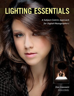
Today's post comes from the book Lighting Essentials: A Subject-Centric Approach for Digital Photographers by Don Giannatti. It is available from Amazon.com and other fine retailers.

I am sometimes amazed how many online discussions there are about the evils of shadows. Shadows are a natural result of light, so I’m not sure that killing all shadows is the best way to light everything. Sure, there are some cases when a shot requires nearly or completely nonexistent shadows, but for the most part, we define the light by showing the shadow—even a very faint one. Shadows tell us the direction of the light just as certainly as the highlights do. Shadows define and sculpt, create contrast, provide modeling of the subject, and can be used to add an air of mystery to a photograph. Shadows are very important to photography, so we need to be able to control them and their relation to the highlights also produced by the light that created them.

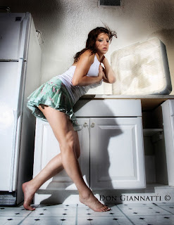
This image of Briana was photographed at a motel on Anna Maria Island. It was raining like heck and we couldn’t leave the little laundry room to wait for our ride to the airport, so we decided to make photographs. I placed one speedlight behind the fan (it was spinning; the strobe froze the blades) and one on a stand behind her to camera left, putting the shadow of her legs on the laundry sink. A third light was placed high and focused on her face. Each light was set to the same output, and their careful placement meant that she didn’t have a lot of leeway in her movement. The shadows are a big part of the feel of the final image, giving it a whimsical look that wouldn’t have been present with flat or one-sided lighting.

CONTROLLING THE SHADOWS
I love shadows. They give an image dimension and depth, mystery and grace. Shadows can be fairly faint and still help establish a background, the angle of light, or separation of the subject from the other elements in the picture. Conversely, they can be quite strong and add a hard “edge” to the image. Subject-centric lighting means knowing how to create the types of shadows
you need and place them to portray your subject in the way you have envisioned.

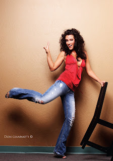
This shot of Richelle and the chair is made more interesting by the shadow on the wall. Shadows are not the enemy of photography, they are part of what we do.

The Angle of the Shadows. Shadows are created by a light source, so they fall away from whatever object blocked that light (creating the shadow) at the same angle as the light hit the obstruction. For example, if the light is coming in toward the subject at a 30 degree angle, the resulting shadow will also be at a 30 degree angle. Shadow is, after all, just the light interrupted. The Quality of the Shadows. Light sources that are large in relation to the subject (or, more to the point, the obstruction) produce soft-edged shadows. Light sources that are small relative to the subject yield sharp-edged shadows.

The Exposure of the Shadows. Shadows can be very light or very dark. One way to control this is by adding a light source on the shadow side of the subject. This light will “open” the shadow area—meaning that it will bring it closer to the exposure level of the main light side of the subject.

Many times, fill cards (reflectors) are used for this purpose. To do this, the card is placed on the shadow side of the subject and angled toward the face. Essentially, the card works like a mirror; light striking it from an angle (the angle of incidence) is reflected at an equal and opposite angle (the angle of reflectance). So when I put a fill card up next to a face, I make sure it is at the correct angle to receive as much light as possible from the main light and direct it onto the shadow side of the face, rendering the shadows brighter.

Alternately, you could add a second light source—or a third—to open up the shadows. There are boundless ways to have the subject be rendered by the light, and it is sometimes one’s personal style that determines what approach will be used.

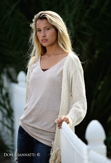
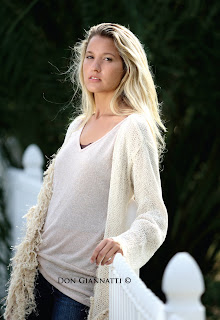
On the whole, this image was exposed correctly; I like the way her hair is rendering and the white fence looks white. Unfortunately, it is not a good exposure for her face. To use the lighting as-is, I would have had to open up another 2/3 stop or so to compensate—but that would have changed the exposure of the whole shot.


Instead, I provided fill light on her face from a large white fill card in front of her. By controlling this, I made sure the face presented correctly (returning more light to the camera). Because the fill card only affected her face and the front of her shirt, the exposure for the rest of the scene remained unchanged—preserving what I liked about the previous image.