Flawless Indoor Portraits With Flash

Today's post comes from the book Studio Lighting Unplugged: Small Flash Techniques for Digital Photographers by Rod & Robin Deutschmann. It is available from Amazon.com and other fine retailers.

There is nothing as intimidating as photographing a living subject. So far, our journey has been nonthreatening to our egos (the wall in front of you has yet to complain about a bad photo).

When you photograph people, they are going to want to see the image—and they may give you feedback about your work. This may make you uncomfortable at first.

You may want to invest in a “shooting” stool. This gives your model a chance to rest between shots and keeps them at a comfortable height for the photograph.

Ask someone who loves you very much to help with the fol -lowing experiments and let them know that you are simply trying to better yourself as a studio photographer. Smile a lot, be positive, and when you do get an image perfect, make sure to let your subject know it had everything to do with their winning smile and not just the lighting you created.

Exercise: Freezing Motion
• Work in a room that you are very familiar with, one that you have already had photographic success in.
• Ask your model to stand or sit several feet from you.
• Start with an aperture of f/5.6.
• Set the camera’s ISO to 200
• Set the camera’s shutter speed to its flash sync speed.
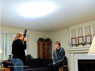
• Point the flash toward the ceiling.
• Turn the power of the flash to full (1/1).
• Take a test image and examine it.
• Adjust the power setting of the flash until your model is lit perfectly.
• Examine the image closely. Check out the focus and look at the colors. Adjust the white balance if needed. Do what you can to improve the shot. Make it perfect, then move onto another room and do it again. Devoting just an hour of your time to this exercise will yield some great benefits— confidence and pride in your abilities.
• Now, move the camera a bit when you shoot. Try to create motion blur. You’ll find it’s impossible to get a blurry photo when shooting with a flash in the studio. Imagine never again having to worry about your subject (or you) moving when you take a photograph indoors.


Off the Wall
The light on your portrait subject looks great when it is bounced off the ceiling, but what if you could bounce it off of something farther away, like a distant wall? What effects could you achieve with an even larger light source, coming from a different angle? Let’s check it out


Notice how the shadows from a bounced flash are much more flattering on your subject and background.


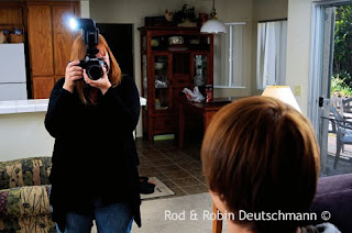
By bouncing the flash off a nearby wall, you are both enlarging and scattering your light source. This creates a very pleasing quality of light. Notice the difference between this image and the previous one where the light was bounced from the ceiling. Look closely at the differences between the shadows, how they fall, and the difference in the level of detail that can be perceived in the shadow areas.


Exercise: Off-the-Wall Lighting
• Set the same aperture, shutter speed, and ISO setting you used in the previous exercise.
• Rotate and spin the flash head toward a wall. Ensure the flash is pointed directly at the wall, at a full 90 degrees.
• Take a shot and review the results. Adjust your flash settings and take another photograph. Repeat the process until you are happy with the lighting on your subject. Don’t be surprised if you have to increase the power from the flash dramatically. As the distance needed to illuminate your subject increases, so does your need for power.

Working In A Client's Home

Today's post comes from the book Family Photography: The Digital Photographer's Guide to Building a Business on Relationships by Christie Mumm. It is available from Amazon.com and other fine retailers.


The high ISO capabilities of today’s DSLRs have made shooting in clients’ homes much more feasible. I love the excitement of heading out to a client’s home and knowing it will be an utterly unique shooting location. There are always special areas to photograph the family. An added bonus is that their images will be even more significant because they represent their lives in such a personal way.


Evaluating the Light. Some special considerations with shooting in clients’ homes may include the lack of control you will have over lighting quality and color, working with pets, and learning to be comfortable asking clients to move furniture for the portraits. Many clients will have an idea of where in their home they would like to have portraits taken; sometimes, however, these
locations will not be the best for lighting. As I noted earlier in this chapter, lighting is much more important than the background. Try to prepare your client in advance of their session by letting them know that you will be asking to see all the rooms in the house to determine the best light. This will avoid the potential embarrassment if certain rooms are not tidy and ready for photography.


It is also a good idea to speak with clients in advance about the direction their windows face. This can help you plan the appropriate time of day to hold their session. If the home has many large windows facing due west, I would not recommend shooting there late in the day. At that time, the light will be harsh and hard to control. A morning or early afternoon session would be a better idea. Naturally, the opposite is true for east-facing windows. North-facing windows are great all day long in the northern hemisphere; southfacing windows are, accordingly, good all day for the southern hemisphere.


Locations to Try. Portraits of kids in their own bedrooms can be very fun. Most children love to show off their stuff and will enjoy the personal attention they get. Backyards can be nice—especially if the yard has some sort of play structure (trampolines are particularly fun for kids and grownups alike). I also love to take portraits of families flopped down on Mom and Dad’s bed—cuddling, reading, having a tickle fight, etc. Big, comfy beds are also great for baby and maternity portraits—so encourage your clients to allow you to shoot in their bedrooms if the lighting allows. Other good places can be bathrooms (tubs and showers make clean, simple backdrops) and kitchens, which usually have beautiful light and nice floors.

Lighting is more important than the background—but here the coordinating cool tones of the wall and the parents’ clothes make the warm skin tones the focus of the image.

Creating A Photojournalistic Atmosphere

Today's post comes from the book Engagement Portraiture: Master Techniques for Digital Photographers by Tracy Dorr. It is available from Amazon.com and other fine retailers.

To be truly photojournalistic, your portrait subjects need to be totally at ease and unaware of your presence. Since engagement sessions are scheduled and consist of only the three of you, there is little opportunity for this to occur naturally. They are only with you for a half an hour to an hour and they know that you are shooting their engagement photo, so of course they are more than aware of you and your camera. If the subjects are properly distracted, however, they may momentarily forget all about you, creating a truly photojournalistic moment. So what can you do to encourage a photojournalistic atmosphere?


When you begin the session, select a few poses that allow the couple to loosen up and get comfortable. That will create the open atmosphere needed for them to improvise. Be sure to comment to them that you want them to do whatever comes naturally. They should not feel constrained to a pose—you want them to ad-lib as much as they would like. Offer up examples such as, “Feel free to pick up your fiancĂ©e or move to a new location. You don’t need my permission or instruction to try anything that comes to mind.” By allowing them to dictate what pose comes next or be creative in how they interact, you will inspire natural moments—and totally photojournalistic moments will be born out of those.


You will also benefit from welcoming any and all distractions that occur. If a dog runs through your shot or a huge gust of wind blows, don’t put down your camera and wait for the distraction to pass! Utilize that moment to its fullest extent—be ready to capture the couple’s reaction to whatever distracts them and see how that encourages them to relate to each other. Those moments will be totally unscripted and demand that their attention be withdrawn from you for at least a few moments.

The Characteristics of Light

Today's post comes from the book Jeff Smith's Studio Flash Photography: Techniques for Digital Portrait Photographers by Jeff Smith. It is available from Amazon.com and other fine retailers.

Educators often talk about the quality of light that is produced by a light or light and modifier. I always thought this was confusing, as the term “quality” can also be used to refer to something that is a high quality—or better than others. Light has no quality, only quantity (the intensity or amount of light), but it does have characteristics—and it is these characteristics that are being referred to when a photographer says that a certain light or modifier was used to create a “quality” of light that was well suited to a subject.

In the studio, I have used everything from a spotlight to a cheap umbrella to light my clients’ portraits. Working outdoors, I have used soft light from the open sky as well as direct sunlight to produce the look I wanted. No single light source had a better quality than another. They all worked beautifully for the portrait I wanted to create. However, each source did have different characteristics.

When you conceptualize your portrait, you’ll need to decide whether you want a hard or soft lighting effect. Once you’ve made that decision, you’ll need to choose a main light source that produces light with the characteristics you are after. Let’s take a closer look at soft light and hard light so you can learn to identify and create the right lighting for the kind of portrait you want to shoot.

Soft/Diffused Light. Light is called “soft” or “diffuse” when there is a gradual transition from the highlight area of the image to the darkest shadow. In portraiture, soft light can diminish the appearance of harsh lines and wrinkles. It also produces less shine on the subject’s face than hard light will. The majority of traditional portraits are made with soft light. It is the most flattering light for portraiture and is more forgiving of poorly placed light sources. When I was a new photographer, I thought I should use the softest light possible. I was wrong. With a main light source that is too soft, the light lacks directionality and contrast, and the final image looks flat. It lacks the “pop” that you want in professional images.

Soft lighting is the most flattering option for most portraits. As you can see in this trio of images from a single session (left and facing page), it can be used to create an array of great, salable images.

There are many modifiers available that will allow you to create the degree of softness you desire in your portrait. For studio and indoor location portraiture, most photographers use softboxes as a main light source. There are a wide variety of softboxes available on the market—from extra small to extra large or long but narrow. They are also available in various shapes. Some softboxes have a single layer of diffusion, and others have double diffusion. There are many variables that affect the characteristics of the light. Let’s take a look at how changing some of the variables will affect the look you’re after.

In general, a larger light source provides softer light than a smaller source. However, moving a large source farther from the subject makes it smaller relative to the subject. Therefore, when a large softbox is used close to the subject, it will emit a much softer light than it will when it is moved to 10 feet. (This is due to a shift in its size relative to the subject.) Therefore, if you are new to the profession and can afford only one softbox, you should realize that changing the light-to-subject distance will change the effect of the light on your subject.

The light-to-subject distance affects the look of the lighting in the image. The closer the light is placed to the subject, the softer the light.

There are other ways that you can manipulate your softbox to make its light a little softer or harder. If you are using a softbox with the flash head facing the subject, the light will be harder than it would be if you aimed the flash head at the back of the box, as the light would bounce off of the back of the box before passing through the diffusion panel. Also, directing the light through a single diffusion panel would produce a less diffuse light than you could create by adding the second diffusion panel that most softboxes come with. Also, with everything else being equal, a softbox with a silver interior will produce a light that is harder than a softbox with a white interior.

If the light from your softbox is too hard, you can create a softer lighting effect by using just the light from the edge of the softbox, rather than the harder, more direct beam of light emitted by the full front panel of the modifier. This technique is called feathering. I tend to select softboxes that produce more contrast than I typically want and feather the light to soften it. Feathering is a great technique that allows you to create workable light from sources that would not otherwise be usable.

I like to use a softbox with a silver lining and a thinner front diffusion panel (thicker material diffuses the light more, making it softer). This fits my style of photography and my clients’ tastes. The majority of my clients are high school seniors, and they like portraits that have more contrast and a higher color saturation. If you are using a softbox like mine but want more contrast, you can glue mylar or aluminum foil to the interior of the box. If your light is too contrasty for your tastes, you can add an inner diffusion material or replace the outer diffuser with a thicker fabric.

Hard/Directional Light. Hard light is characterized by hard, sharp shadows and high contrast. There is a quick transition from highlight to shadow. As I mentioned earlier, soft light is the choice of most portrait photographers. However, hard light, when carefully controlled, can be used to create dramatic portraits. The Hollywood photographers used hard light to create their classic, high-contrast black & white portraits.

Like modifiers designed to diffuse light, light attachments that create harder, more directional light have subtle variation in design and functionality, but all produce harder light than a softbox. A flash unit fitted with a parabolic (metal) reflector is the tool of choice as a main light source for most traditional portraits. These reflectors come in a variety of shapes and sizes as well as different interior finishes. There are a great number of accessories that can be attached to the parabolic reflectors to allow enhanced control over the light (snoots, grids, etc.). You can also modify your parabolics by changing the finish of the interior or putting diffusion material over the end of the reflector.

The effects produced by window light will vary depending on the direction the window faces, the time of day, and the type of glass in the window. Window treatments can further modify the light that strikes your subject.

When used correctly, parabolic reflectors will help you re-create that old Hollywood look. The best part of parabolic light is the amount of control it offers. When you can add light precisely where you want it, you can create a dramatic portrait.

A hard light setup and final image.
Shooting Up, Down, and Across

Today's post comes from the book Christopher Grey's Lighting Techniques for Beauty and Glamour Photography by Christopher Grey. It is available from Amazon.com and other fine retailers.
Shooting down or shooting up are angles many of us don’t use. Why not? They’re dramatic or fun, depending on how they’re approached. They’re also difficult because you may have to angle yourself in an uncomfortable position to get what you want. Depending on her perspective to the camera, your model may have to do the same. Here are a few tips.

SHOOTING UP
The most important detail when shooting from any position is to carefully place the main light relative to your angle to the subject. In other words, if you light her so she looks great when you’re standing at full height, the setup will probably make her look awful when you drop to your knees and raise the camera. Set the light so it looks good from your shooting position, with the model in at least a basic pose, for better results. I can hear many of you questioning my sanity and asking why I would point out something so basic, but I’ve seen too many subjects lit badly when photographed from these angles that I felt I needed to address the issue.

Shooting up is more difficult than shooting down or across. The perspective problems you may encounter when the camera is so close to the model that the lower half of the image (the area closest to the lens) looks larger than the upper half might be difficult to deal with (see below).


Angling the model so that she leans slightly toward you and moving back a bit may be all you need to get an excellent image. In the first image, the light, a bare-tubed strobe, was placed at a typical height for her position. When she looked down at the camera, however, it was completely in the wrong position, creating deep shadows that hid her eyes and the underside of her cheeks and chin. Not very attractive. See imagebelow.


Angling the model toward the camera meant the main light needed to be lowered to get an attractive nose shadow. Consequently, the light stand holding the cookie (the flag with a quarter-moon pattern cut into it) had to be raised to get it to the same position.

The final image was augmented with an additional fill card at camera right. It filled in the shadows and added detail to her clothing. Net result? A beautiful image of a beautiful woman. See image below.


SHOOTING DOWN
Shooting down, at least from a perspective standpoint, is easier than shooting up. The same attention to the angle of light must be paid, though, or you may end up with lighting scenarios that are not flattering.

To create the image below, I used a 2x3-foot softbox for the main light (the only light necessary because the model was ringed with white cloth). It was set to the camera-left side of the set and angled it so it would produce an effect that would resemble butterfly lighting if the model had been upright to the camera. Two black flags, each 12x30 inches, were separately mounted to
accessory arms on light stands, cutting the light to the top of the pillow and the right side of the model’s shirt and body. The gobos were set at slightly different angles and close to the light, to avoid sharp shadows and deeper underexposure. This added a bit of visual interest that a typical viewer just can’t put a finger on.


I removed the gobos and moved in a three-stair stepstool to the side of the air mattress that kept my model comfortable. It’s difficult to position yourself directly over a model without building some sort of scaffold, something most of us (myself included) don’t have sitting around. The easiest way to simulate the effect is to get on a short ladder and lean over the subject.

Hold the camera in the landscape position (horizontally) and lean in as far as possible. You can rotate the image to the vertical position in postproduction. If the light is positioned correctly and you’re in the right place, you’ll be amazed how natural it looks, even though you might have been a foot or two off center. See the image below.


SHOOTING ACROSS
When you’re shooting across a reclining model, you’re subject to the same “rules” that apply when you’re shooting up or down, with one exception. Certainly, the main light must be placed in a situation that will render attractive light. That’s a given (or it should be). In any such situation, and regardless of the depth of field you may have dialed in, be sure to focus on the eye nearest the camera. Doing so will put the primary point of interest exactly where an eventual viewer expects it. This is especially true when using a telephoto lens wide open or with a large aperture. See below.

Tips for Photographing Babies

Today's post comes from the book Boutique Baby Photography: The Digital Photographer's Guide to Success in Maternity and Baby Portraiture by Mimika Cooney. It is available from Amazon.com and other fine retailers.

Clothing Choices. Babies are best photographed in their birthday suits—just plain naked. Most clothing swallows up a newborn and disguises what’s so cute about their tiny shape. The parents’ own clothing choices should be simple and neutral. You want to highlight their relationship and special bond with their new baby, not their outfits. Plain black long-sleeved shirts with jeans work very well.

Newborns are best photographed naked.


Moms just love seeing Daddy shirtless holding his little baby bundle—and there really is something special and heartwarming about seeing a dad’s strength in contrast with the delicateness of a newborn baby. So off with the shirts, Dads! Even if the father is not completely comfortable with his shape, you can use lighting to artistically hide the areas he doesn’t want highlighted (usually the arms and tummy).


Moms love shirtless dads—and portraits like these let you tell a story by contrasting the delicate with the strong. Using dramatic lighting you can artistically hide any areas that Dad isn’t comfortable having seen.

Accidents Will Happen! With most newborns, we’re tempting fate with those cute curled-up naked baby portraits. I always tell parents, “It’s not if but when.” Don’t panic; just be prepared for pee and poo accidents, keeping clean-up supplies at the ready. In my studio, we have an easily wipeable floor, loads of antibacterial wipes, paper towels, and hand sanitizer. Very often, the baby will warn you that they need to go by crying and wriggling. If they do, place a clean diaper loosely under their buttocks until they settle. It’s also advisable for the adults to bring an extra set of clothing; the probability is very high that someone is going to get wet!

With babies, accidents are a matter of when, not if.

What to Do When Baby Cries. Sometimes even adults wake up on the wrong side of the bed, so it is completely understandable that a child might cry during a photo session. If that happens, it’s best to pause the photography and give the little one a hug and cuddle to make them feel secure. The bright flashing lights, strange noises, and unfamiliarity can cause uncertainty. Crying may also be a sign that the child has passed their patience threshold. In that case, there is no use in forcing the matter; just wrap up the session quickly. They may even be unwell or coming down with a cold. If that is the case, reschedule the session for when they are feeling better. However, if it really is just a case of nerves, then a really talented photographer should be able to offer distractions to both the mom and the child and re-focus them when they feel at ease again.

Usually, persistent crying is baby’s sign that they are tired or about to fill up their diaper. If you can bear through the howling, swaddle them and rock them until they nod off. A great tip I got from the baby-whisperer Tracy Hogg is to use techniques in threes. For example, pat the baby’s back while “shooshing” loudly enough that the baby can hear it over their own crying, also while rocking. I like to use a sound machine that mimics womb sounds to offer that familiar heart-pumping the baby got used to in Mom’s tummy. Remember that, just days ago, the baby was tightly curled up in the womb, so all the flailing about they now find themselves able to do makes them feel insecure.

Naked newborns will cry.

Always have an assuring hand on the baby’s back or head to offer that feeling of warmth and security. Also, have Mom feed the baby in between poses; a full belly helps them sleep. Another great tip is to place a heating pad, gently warmed in the microwave, under a blanket and lay the baby on their side or tummy.

Posing Hands

Today's post comes from the book Doug Box's Guide to Posing For Portrait Photographers by Doug Box. It is available from Amazon.com and other fine retailers.

You’ve heard it said that you can tell a lot about a person by looking at their hands. Likewise, you can tell a lot about the portrait subject by looking at his or her hands. Fortunately or unfortunately, you can also gauge the photographer’s skill at posing by considering the hand pose of the subject.

When posing the client, you should take care to avoid pointing the hands straight on to the camera to prevent them from appearing distorted. The hands are best viewed at an angle to the camera, and, when possible, care should be taken to photograph the side of the hand, which gracefully continues the line of the arm when the hand is bent upward at the wrist.

Avoid having the client curl their fingers into a fist. Rather, present the hand with the fingers somewhat outstretched and with a slight space between all of the fingers.


Notice the effect that the hand pose has on the overall mood of the portrait. In the image on the left, the hands are tucked under her arms. The image has a closed off look. In the center image, the subject’s left hand appears attractive. The wrist is bent upward, there is space between the fingers, and the hand has a graceful appearance. However, with the woman’s right hand hidden from view, the pose seems unfinished. In the final image, the woman’s hands seem to show warmth and grace and add to the pleasant mood of the image.

In this image series, we start with the hand in an undesirable position. The back of the hand is straight on to the camera and, with the fingers curled inward, the hand looks like a fist. The second image shows an improved hand position, but the third and forth images are more pleasing still.

The above images show several ways in which the subject’s hand can be posed resting on her face. In the first image, the back of the hand shows, creating a fist-like appearance. The second image is better, but her hand obscures too much of her face. In the third image, the subject’s right hand was placed on her far cheek, and we have a full view of the left side of her face. Her left hand is wrapped around her elbow. To improve the pose, the woman extended her left index finger; this draws the viewer’s gaze to her face or, more specifically, to her eyes. We see the edge of the hand, and if we follow the lines of her arms with our gaze, we can see that the pose helps to lead our eyes through the frame. Since the eye is drawn to areas of sharp contrast, we hid a portion of her left hand from view. It does not appear “missing”; rather, with less of her skin showing, the prominence of the hand has been visually diminished.

This image pair shows two views of the woman’s hands. In the top photo, there is a slight space between the fingers; this creates separation, providing a defined view of the hand. Unfortunately, the angle of the hands to the camera makes the hands appear too prominent. Posing the hands as if the woman was pulling the chair out, with her hands on the sides of the chair back, provides a more elegant, graceful view.

The photos above illustrate two more hand posing options. The image on the left shows too much of the back of the hands. The right-hand photo presents a more desirable, graceful view.

In general, women’s hands should appear graceful, and men’s hands are posed to show strength. When posing men’s hands, it is common to slightly curl the fingers. Be careful to ensure that the fingers are not tightly curled into the palm; again, in this position, the hands look too much like fists. In posing men’s hands, it is also important to show the side of the hand rather than the back of the hand, as the more streamlined view is more attractive.