Photographing Women

Today's post comes from the book Lighting and Posing Techniques for Photographing Women by Norman Phillips. In this book Phillips profiles 15 of the leading professional photographers working today to find out what techniques they use when photographing women. This book is available from Amazon.com and other fine retailers.

Klarke is essentially a photojournalist, and her style is innovative and contemporary. The images in this chapter challenge many of the norms, but Klarke makes no apologies if her images shock the purists. It is all about capturing the moment. Her assignments are wide ranging; Klarke shoots corporate, PR, travel, fashion, and wedding images.


The first image is the result of cross processing color film. The provocative pose shows a lot of attitude. Posing the subject in profile and having her turn her head toward the camera will always provide interesting expressions with a little encouragement. To complete the pose, the subject positioned her fingers on the far side of her hat. The use of a black background made for a striking image.


A 48-inch softbox was placed slightly to the left of the camera for a flat lighting effect. Two large reflectors, one each side of the subject, provided additional definition and modeling. See diagram above.


In the photo above, the subject rested her elbows on a railing to create a relaxed composition. Klarke allowed her model to be comfortable and did not tweak the position of her arms and hand, so the resulting portrait has a casual look.

Note that the subject was turned slightly away from the camera, with the lens positioned slightly above her forehead. The angle of view caused her to raise her eyes to the camera with a quizzical expression.

Strong sunlight from camera left was the primarylight source for this image. Flash was used to camera right to eliminate deep eye sockets and harsh shadows. The flat lighting, which is used often in glamour portraits, eliminated almost all the shadows and skin imperfections.


In this photo, Klarke had her subject shake her hair around to provide a natural and spontaneous pose and one that is likely to be attractive for the younger subject or fashion-conscious client. It is very effective when the subject has long, cascading hair. This subject had hair just long enough to make it work. We see this technique used on TV advertising hair products.


The main light was a small softbox placed to camera left and a little higher than her head. A domed reflector was placed below the subject’s face. A background light was used to create a slight haloed effect. See diagram above.


The above photo is another image that has the glamour treatment. The relatively static pose has impact due to the use of the red metallic dress. The subject’s head was slightly tipped to our right, breaking the vertical line of her torso. The position of her arms is one we frequently see, with matching lines created by the arms. The impression could be dramatically changed with her head tipped a little to our left. Another change that would create a different impression would be to have her extend her elbow toward her right knee.

A standard high-key background was used and a light was placed at each side of the camera to create the flat, glamour-style lighting.This next is a provocative image with sex appeal. The subject is attired in black lingerie, challenging us to respond to her presentation. For those interested in boudoir and glamour photography this is a good starting pose. The placement of her hand on her right hip is suggestive, and the raised knee created an attractive, boldly feminine impression. The raised knee also reduced the view of the black top, which provided another feminine element to the composition.


The lighting was mainly from a window to our right and her face was lit with a tungsten spot from a low angle to our left. See diagram below. The high-key set elements, black garments, and black props produced a dynamic fashion image with a glamour edge.


In the next photo, the subject was positioned in a casual leaning pose against a window, which created a high-key background and also eliminated a lot of detail in her hair. The front of the image was illuminated with a little flash and a reflector. The facial rendering is different from any we have so far seen and is in some ways reminiscent of what we see in everyday lighting situations.


Teenaged subjects often prefer a passive, almost disinterested expression as shown here. To bring another type of client to our studio it is a good idea to show some different impressions such as this, a portrait not unlike those we see in the windows of hair and beauty salons.

The pose shown below is almost a conventional three-quarter face. However, it was shot from a lower angle than we would expect to see. This caused the subject to look a little downward at the camera, thereby evoking an interesting expression. The slight tilt of her head to our right is what makes this portrait work so well.


The subject was photographed against a high-key background. The primary light for the image came from a skylight. Fill flash was used from the left, and an array of silver reflectors was used to open up all the shadow areas for a flat-lighting glamour style look.

In these images Klarke has challenged our conventional concepts in both posing and lighting and shown that there is a lighting style for all purposes and needs, providing we want to explore different techniques.

AVAILABLE FROM AMAZON

*excerpted from the book Lighting and Posing Techniques for Photographing Women

Hollywood-Style Glamour Lighting

Today's post comes from the book Professional Portrait Lighting by Michelle Perkins. In this book, Perkins profiles 11 of today's most successful professional photographers. This post is an excerpt from her profile of photographer Christopher Grey. This book is available from Amazon.com and other fine retailers.


“Being able to call up a technique that your client may not even have thought about can produce a positive difference in your bottom line,” says Grey. The Hollywood portrait look of the late 1930s to mid-1940s is one such style.

To emulate this classic lighting, your accessory list will include grid spots, barndoors, snoots, cutters, and flags. These will be used only with direct lights, just as traditional hot lights were used in the past. Although they might be bounced off a fill card or bookend, they won’t be modified by umbrellas or soft boxes. “This is the key to success,” says Grey.

Direct lighting is one of the critical elements when creating classic Hollywood portraits.

For the image below, the key light was tightly barndoored to almost exclusively light the subject’s face. Since the key was set high to get the deep shadows of her eyes, and because it was placed close to her, the light fell off rapidly. The first of the two backlights was aimed more at her shoulder than her hair and produced the hot spot on her shoulder. It was set 1/2 stop over the key light. The second was aimed at her hip and was set at 11/2 stops over the key
light, because it was aimed at black cloth. Grey also set a small fill card just above the camera to catch some of the backlight and open the shadows.


For the images below, an 18-inch dish, with the strobe set at its lowest power output, was the key. At about five feet from the model, it metered at f/8. Grey placed a hair light on each side. The camera-left hair light was fitted with vertical barndoors, throwing light down her side. The other hair light was a six-inch dish with a 30-degree grid spot.


Making small adjustments to this lighting setup and the position of the model allowed Grey to create the range of looks seen above.


The background was comprised of medium-gray seamless paper and a red flat, which appears dark gray when rendered in black & white. To light this, Grey placed a six-inch dish with a 20-degree grid spot on the floor almost directly behind the model. This was aimed at what Grey calls a “reverse cookie” (shards of broken mirror mounted haphazardly on a piece of plywood) to reflect a pattern onto both surfaces.


With his model in place, Grey tweaked the lights slightly and brought the camera-left hair light closer to camera and lowered it to widen the highlight and light the side of her nose. “Originally, I had placed the key just to the right of camera,” says Grey, “but I decided to move it over the camera instead. This little move gave me broad light (below, first) to butterfly (below, second). When she turned to profile, the slight move of the camera-left side light produced a perfect closed loop highlight (above).”


*excerpted from the book Professional Portrait Lighting

Really Large Groups


Today's post comes from the book The Best of Family Portrait Photography by Bill Hurter. It is available from Amazon.com and other fine retailers.

Once a group exceeds nine people, it is no longer a small group. The complexities of posing and lighting expand and, if you’re not careful to stay in charge, chaos will reign. It is always best to have a game plan in mind with big groups.

Posing bigger groups requires you to use standing poses, often combined with sitting and kneeling poses. Those subjects who are standing should be turned at least 20 degrees off center so that their shoulders are not parallel to the film plane. The exception is with small children, who gain visual prominence when they are square to the camera.


With standing poses, care must be taken to disguise wide hips and torsos, which can sometimes be accomplished simply by using other people in the group. Always create space between the arms and torso simply by placing a hand on a hip or, in the case of men, placing a hand in a pocket (thumb out).

In really large groups, the task of clothing coordination can be a nightmare. It is often best to divide the group into subgroups—family units, for instance—and have them coordinate with each other. For example, a family in khaki pants and yellow sweaters could be positioned next to a family in blue jeans and red sweaters.

For really big groups, it is a good idea to have the subjects stand close together—touching. This minimizes the space between people and allows you to get a larger head size for each person. One directive you must give to the group is that they must be able to see the camera with both eyes. This will ensure that you see all of their faces and that none will be hiding behind the person in front of them.

With big groups, fight the tendency to “line ‘em up and shoot ” This is, after all, a portrait and not a team photo. You can incorporate all types of design elements into even the largest groups.

Naturalness Counts. It is important with medium to large-size family groups that the poses you put your subjects in appear to be natural and comfortable. Even experienced group photographers working with assistants will take ten minutes or so to set up a group of twenty or more. Therefore, it is imperative that your subjects be posed comfortably. Natural poses, ones that your subjects might fall into without prompting, are best and can be held indefinitely.


It is important that the group remains alert and in tune with your efforts. With large groups, it is important to stay in charge of the posing. The loudest voice—the one that people are listening to—should be yours, although by no means should you be yelling. Instead, be assertive and positive and act in control.

With natural poses, have your antennae up for errant thumbs and hands that will pop up. Always do a perimeter search around each subject to make sure there is nothing unexpected in the posing.

Posing Levels. Two true experts at posing the mid-size to large group are Robert and Suzanne Love. I have witnessed them build groups made up of photographers attending one of their workshops and each person, without exception, was amazed when they saw how easy the Loves’ technique is and how attractive the arrangement turned out. The basic principle in the Loves’ technique is the use of different posing levels and the combinations of those levels used adjacent to one another. Here’s a brief look at the system.

Level 1, Standing. Each standing subject has his or her weight on their back foot and is posed at a 45- degree angle to the camera, lowering the rear shoulder to diminish overall body size.

Level 2, Tall Kneel. Generally a masculine pose, not unlike a football players’ team pose, this pose calls for the man to get down on one knee with his other leg bent at 90 degrees. The elbow of the arm on the same side as the knee that is up should rest on the knee.

Level 3, Short Kneel. This is the same pose as above but both knees are on the ground and the person’s weight is back on their calves. This pose is good for either men or women, but with women in dresses, they are usually turned at a 45-degree angle.

Level 4, Sitting. The man sits on his buttocks with the leg that is toward the camera curled under the leg that’s away from the camera. The elbow rests across his raised knee. For a woman wearing slacks, this is appropriate. However, a more graceful seated pose is achieved when she lays on her hip and rolls slightly toward the camera. Her legs then flow out to the side with the ankles crossed. Her top hand can rest on her lower thigh or in front of her. If she can bring her top knee over to touch the ground, her body produces a beautiful curved line.

Level 5, Lying Down. The subjects can lay on their sides with their hands resting on the sides of their faces, or can lay on their stomachs with their arms folded in front of them. This really works better for an individual pose, rather than a group, but it offers another level if needed.


By intermixing the levels without defining rows, you can pose ten to twenty people quite easily and informally. Each face is at a different level and no face is directly below or above another, providing good visual interest. And while the group is really quite highly structured, it doesn’t appear that way.

Stepladders. A stepladder is a must for large groups and, in fact, should be a permanent tool in your wedding and portrait arsenal. Stepladders give you the high angle that lets you fit lots of people together in a tight group, like a bouquet of flowers. Ladders also give you a means to correct low shooting angles, which distort perspective. The tendency is to overuse them, so use a stepladder when you need to or when you want to offer variety in your groups.

A stepladder is the answer to the refrain, “Boy, I sure wish I could get up on that balcony for this shot.” But a few words of caution: have your assistant or someone strong hold on to the ladder in case the ground gives or you lean the wrong way. Safety first.

In less dramatic ways, a stepladder lets you raise the camera height just slightly so that you can keep the group plane parallel to the film plane for better depth of-field control.

Linking Shapes. The bigger the group, the more you must depend on your basic elements of group portrait design—circles, triangles, inverted triangles, diagonals, and diamond shapes. You must also really work to highlight and accentuate lines, real and implied, throughout the group. If you lined people up in a row, you would have a very uninteresting “team photo,” a
concept that is the antithesis of fine family portraiture.


The overlapping circles around these shapes define each pattern as unique, even though both shapes use the same person centrally. In a portrait like this, each subset should be turned in toward the center to unify the composition, or turned away from center to create a bookend effect.

The best way to previsualize this effect is to form subgroups as you start grouping people. For example, how about a family of three here (perhaps forming an inverted triangle), three sisters over on the right (perhaps forming a flowing diagonal line), a brother, a sister and their two kids (perhaps in a diamond shape with the littlest one standing between her mom and dad). Then combine the subsets, linking the line of an arm with the line of a dress. Leave a little space between these subgroups, so that the design shapes you’ve formed don’t become too compressed. Let the subgroups flow from one to the next and then analyze the group as a whole to see what you’ve created.

Remember that arms and hands help complete the composition by creating motion and dynamic lines that can and should lead up into the subjects’ faces. Hands and arms can “finish” lines started by the basic shape of the group.

Be aware of intersecting lines that flow through the design. As mentioned earlier, the diagonal is by far the most compelling visual line in compositions and can be used repeatedly without fear of overuse. Diagram concepts courtesy of Norman Phillips.

Just because you might form a triangle or a diamond shape with one subset in a group does not mean that one of the people in that group cannot be used as an integral part of another group. You might find, for example, that the person in the middle of a group of seven unites two diamond shapes. The overlapping circles around these shapes (see diagram above) define each pattern as unique, even though both shapes use the same person. In a portrait like this, each subset could be turned slightly toward the center to unify the composition or turned away from the center to give a bookend effect.

Be aware of intersecting lines that flow through the design. As mentioned earlier, the diagonal is by far the most compelling visual line and can be used repeatedly without fear of overuse. The curving diagonal is even more pleasing and can be mixed with sharper diagonals within the composition.


BUY THIS BOOK FROM AMAZON

Light Modifiers

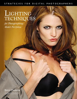
Today's post comes from the book Lighting Techniques for Photographing Model Portfolios by Billy Pegram. It is available from Amazon.com and other fine retailers.

Some light modifiers can be used with any light source, from sunlight to studio strobe. These are all handy devices to have around. Best of all, they tend to be inexpensive—and many can even be improvised with a quick trip to the hardware store. Reflectors, gobos, and scrims fall into this category. Other light modifiers, like softboxes and umbrellas, are designed specifically for use on studio lights. These can range widely in price, but are invaluable for exercising complete creative control.

Reflectors
A reflector is any object used to bounce light—it could be a wall, a white tshirt, a mirror, or a commercially purchased kit. This is an easy and effective way to control light. Unlike using flash for fill light, reflectors give you visual confirmation of where the light is. With reflectors, you can also set up and fine-tune your results more quickly than with flash. Additionally, you are not limited to the flash-sync speed of your camera.

Collapsible reflectors, available in a wide variety of finishes, are a very popular (and portable) type of reflector.

Surface. Reflectors range widely in size, color, and design. Typically, photographic reflectors have either a matte white, silver foil, or gold foil surface. The metallic surfaces provide more light intensity and contrast in the bounced light than the matte white surface. Gold reflectors also add a warm coloration to the bounced light.Mirrors are another type of reflector to experiment with. Because they return almost all of the light that strikes them, they can actually be used outdoors to turn backlight into front light.

Design. Round fabric reflectors on collapsible metal frames (often called disc reflectors) are a very popular design option, especially for location photography. They are easy to transport and simple to position—an assistant can simply hold the reflector in position, then adjust it according to your instructions. (Note:When I shoot on location, I typically bring a piece of white cardboard to use as a reflector, along with a Westcott disc reflector that is silver on one side and gold on the other.) For studio photography, large, white opaque reflectors (often called flats) are often moved into position on rollers or casters. Once in place, studio lights can be bounced into them to create a large, soft source of light.

For Fill. Reflectors are most commonly used to provide fill light, picking up some of the main light and wrapping it around onto the shadow side of the face to make the shadows less intense. To use a reflector for fill, place it slightly in front of the model’s face. Direct the reflected beam of light gradually toward the subject’s face until you get the desired results. Be careful when doing this; the reflected light can actually be quite intense if you shine it right in the model’s eyes. You must also avoid creating unwanted shadows of the nose on the opposite cheek. This is best accomplished by positioning the reflector to fill in the whole mask of the face.

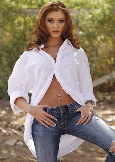
Practical Example: Reflected Fill on Location. Let’s look at the different effect you can create using a variety of reflectors for fill when shooting on location. The image below shows the subject with no reflected fill.


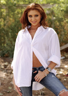
In the next image , the assistant is holding a white card. The white board reflects the same color of light that is striking it and reflects back to the model a soft light that is usually easy on her eyes. This eliminates some of the squinting associated with shooting in bright sunlight. Even if the reflected light is not intense enough to increase the light value much in the shadow area, the reflector still creates pleasing catch lights in the eyes. The disadvantage of using a white board is that it is rigid and doesn’t reflect a great deal of light back to the subject compared to a silver reflector. However, its dual function as a gobo outweighs the disadvantages. Additionally, since it is rigid, it can easily be leaned against a tree or a stand while the assistant is busy or holding another reflector.


A white board is used to add soft fill light.


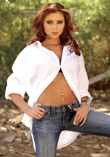
Like the white board, a silver reflector bounces light without changing the color balance (images below). However, because the surface of the reflector is metallic, it is highly reflective. This means that, used at the same distance to the subject as a white reflector, the light from a silver reflector will be more intense. To reduce the intensity of the fill, the reflector can be placed at a greater distance from the subject. The physical flexibility of the discs makes them versatile in kicking light to a specified area. They can be used to increase light levels in the shadow areas but also to create beautiful highlights on the hair, a piece of jewelry, or even a shoulder (to help separate the model from the background).

A silver reflector.


Below, a gold disc reflector reflects warm and romantic light back to the subject. The gold color can also compensate for some of the blue cast that is prevalent in a heavily shadowed area. Although I personally would not have chosen this image (because of the hand positions), it was the model’s favorite image from this series. To finish it, the image was cleaned up in Photoshop and the edges were darkened slightly to direct the viewer’s eyes to the model’s face.

A gold reflector adds warm-colored fill light.


Practical Example: Natural Reflectors. This image was taken with the late afternoon sun reflecting off a building and onto the model at an industrial park. The gray background was another building in the complex. Because I used a long lens, a 300mm Nikkor, and shot with the aperture wide open, the building in the background went out of focus just enough to look like the horizon line on a beach. Keep your eyes open for great natural reflectors in your environment—and when you see them, note the time of day to shoot there. These can be simple, beautiful light sources.

Natural reflectors, like the late-day light reflected off a building, can be very flattering light sources.


*excerpted from the book Lighting Techniques for Photographing Model Portfolios

BUY THIS BOOK FROM AMAZON