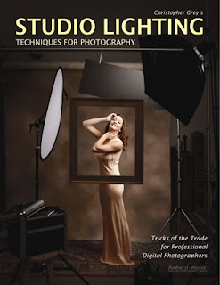
Today's post comes from the book Christopher Grey's Studio Lighting Techniques for Photography. This book is available from Amazon.com and other fine retailers.
One of our jobs as successful photographers is to identify and exploit trends, which frequently make themselves known through commercial advertising. Like many advertising shooters, I have a love/hate relationship with art directors, those ad agency folks who dream up the ads in the first place.While I hate it when they make what I might think are dumb creative decisions during a shoot, I love them because they are paid to dream up attention-getting visuals for typically mundane subjects (and for paying me handsomely to produce the images). Art directors are often responsible for trends, because when they see a successful image from another agency, they tend to use it as a point of departure. When enough art directors do this, a trend is born through “trickle-down creative,” eventually making its way through the entire industry as clients begin asking for the “look.”
I’ve been seeing more and more national advertisements shot with simulated sunlight—beautiful images with clearly defined shadows and small, specular highlights. Is this a trend? Probably. I think we’ll see this style continue for quite a while. Is it cool? Absolutely.
There are several ways to simulate sunlight, and simply going outside is not a viable option because you have no control over the situation. It’s simply impractical.
HMIs were created for the motion picture and video industries. They are continuous sources like traditional hot lights and are pricey to rent (usually only from cinema supply houses) and very expensive to buy. However, they produce a very convincing “sunlight.” Larger HMIs can illuminate entire city blocks.
If you use hot lights, you should use something with a focusable fresnel spot in order to keep the shadows sharp. Pay attention to the crispness of the shadow and also to the amount of fill you might need.
Far and away, the most practical lights are studio strobes. If you simply attach a small reflector, however, you may not get an authentic look, especially when lighting someone in a larger area. Light modified with a reflector will not spread out in all directions as sunlight does, nor will it create a correct shadow shape. I think it’s a good idea to tilt the strobe head to the 11:00 position, relative to the subject, so that the subject receives the full blast of the tube without any additional reflection from the strobe unit itself.
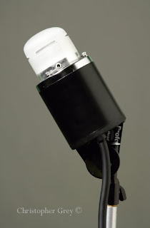
Deeper shadows can be achieved by adding a subtractive fill device, like a black bookend, to the shadow side of the image. There is a slight loss of bounced light against the background, which would not be as noticeable if the background were a darker color.
The next shot (left) would have appeared flat without the addition of a narrow strip light between the subject and the background. The strip light was angled carefully to avoid any spill onto the model or the towels. It was powered at 1/2 stop over the main light, as measured at the top of the frame, and allowed to fall off to give the image vertical depth, perhaps like a skylight. If I’d wished to keep it even, I’d have set the strip light vertically at camera left and feathered it evenly across the background.
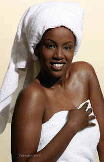
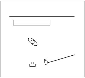
The barebulb strobe, placed above and just slightly to camera right, threw beautiful, even light on the model. The crisp shadow shows plenty of detail because the bulb sprayed light in all directions and it bounced around the room. The texture of the towels looks great because the small source created a small, sharp shadow on each fabric loop (image above and diagram below).
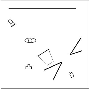
If you need to give the illusion of sunlight as an accent, take advantage of the barebulb’s ability to produce distinct shadows and mimic the shape of a window and direct light through it. I used a pair of black bookends to create this shape. The black absorbed a lot of the extra light before it could bounce around the room and possibly affect the exposure of the main light. The window light was powered to 1 stop over the main light, a medium softbox. Even though that light was so much brighter than the main light, it brightened the dark wall, just not enough to overexpose it.
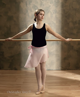
I wanted to give the image above a look of stage light, which is often perceived as a little hot, so I powered both the hair light and the background accent light to 2/3 stop brighter than the main light (image above and diagram below).
Creating a window with panes is really easy. The image shown on the facing page, shot for a magazine cover, uses an additional technique that you might find interesting. The basic window shape was made as before, by sectioning off a piece of the studio with black bookends. After moving two light stands into position behind the bookends (so their shadows wouldn’t show), I used clamps to attach a small wooden plank between them. Leaning a wider plank vertically against the crossbeam completed the illusion.
The main light, a 3x4-foot medium softbox, was aimed at the model at the same angle as the simulated sun. Another softbox was placed at camera left, very close and powered 2 stops less than the main light—just enough to open up the shadows. The modeling lamps for the main light and the window light were turned off, but the modeling lamp for the side light was left on. My shutter speed was 1.5 seconds. The strobes fired at the start of the handheld exposure, and the additional open shutter time created the warm fill and slight motion blur (diagram above and image below).
BUY THIS BOOK FROM AMAZON
Making the Most Out of One Light
Today's post comes from the book Portrait Lighting for Digital Photographers: The Basics and Beyond by Stephen Dantzig. It is available from Amazon.com and other fine retailers.
We are going to turn one strobe into a hair/rim, main, and fill light in this lesson. We know that light falls off quickly but that the exposure stays more consistent when the light is farther away from your subject. We are going to exploit these facts to make this lighting scheme work.
The first thing we are going to do is place our model about eight feet from the backdrop and position a strobe with a 40 degree grid right by the backdrop, pointed toward the model. The 40 degree grid will narrow the beam of light to keep it within a controlled area—we don’t want a lot of uncontrolled light blasting back toward the camera, but we do want enough spread to effectively bounce light off of the reflector.
Next, we are going to place a large silver card 2 feet in front of our model. The light from the gridspot travels 2 feet past the model to strike the reflector (traveling a total of 10 feet), then bounces off the reflector and travels 2 feet more. The falloff from that point won’t be too great because the light hitting the reflector is only traveling 2 feet to reach Flora. The spotlight is now the hair light, and the reflector is the main light. We actually want the light to fall off somewhat because we want the hair/rim light to be a bit “hotter” than our main light. The exposure at the back of Flora’s hood was f/11 and 7/10. The exposure at her cheek (from the reflected light) was f/8 and 3/10.
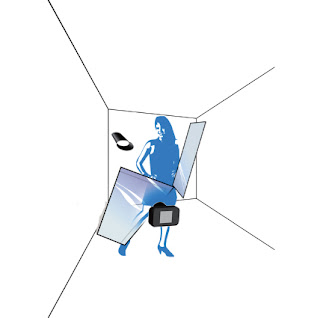
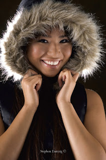
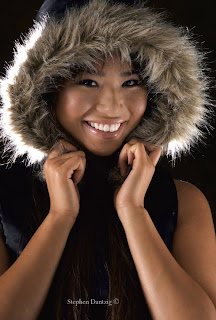
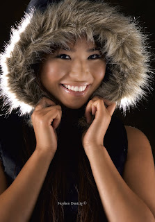
Here are a diagram of the setup used to create the shot and the image after some basic retouching and a simple Curves adjustment layer for color correction.
We completed the setup by adding a second reflector opposite the main light (the first reflector) to catch and bounce any light that passed our model. Here’s how it worked: The light from the gridspot directly lit Flora’s hair and acted as a hair light. The light that passed her hit the first large reflector, which was positioned to catch the overflow and light her face. The angle of the reflector ensured that some light would pass Flora and hit a second reflector. The light off of the second reflector provided a soft fill.
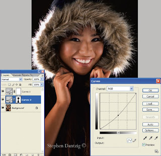
Flora’s arms and hood were still a little too bright for me, so I added a second Curves adjustment layer to darken the image.
I wanted Flora’s skin to glow in this image, and I discovered a really cool skin softening technique! It comes to us from Dave Cross at www.photoshopuser.com. He got it from David Ziser—so from David, to Dave, to me, to you! The best part is that this effect is adjustable. I wrote an action for this because I might be using it a lot from now on! Here it is:
1. Duplicate your main retouched layer.
2. Change the blending mode to Overlay.
3. Apply the High Pass filter (hidden in the “Other” filter section). I kept the default of 10 pixels.
4. Inverse the effect by hitting ctrl/cmd + I.
5. Lower the opacity of this layer to what you like (I use 40% as a starting point); you can always adjust it later.
6. Apply a layer mask.
7. Select the Brush tool and set the foreground color to black.
8. Stop recording if you are recording an action.
9. Paint in the details in the eyes, eyelids, mouth, and hair.
10. Check/adjust the opacity of the filtered layer.
We are almost finished with the image, but I want to add a little more emphasis to Flora’s face. A third Curves adjustment layer will do the trick!
BUY THIS BOOK FROM AMAZON
We are going to turn one strobe into a hair/rim, main, and fill light in this lesson. We know that light falls off quickly but that the exposure stays more consistent when the light is farther away from your subject. We are going to exploit these facts to make this lighting scheme work.
The first thing we are going to do is place our model about eight feet from the backdrop and position a strobe with a 40 degree grid right by the backdrop, pointed toward the model. The 40 degree grid will narrow the beam of light to keep it within a controlled area—we don’t want a lot of uncontrolled light blasting back toward the camera, but we do want enough spread to effectively bounce light off of the reflector.
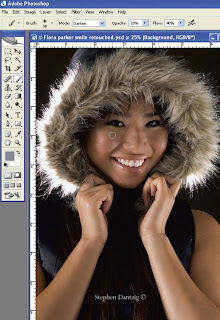
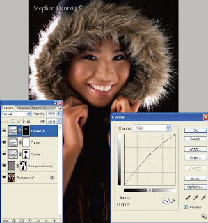
The highlights from the reflectors were brighter than I expected, so I used the Brush tool in Photoshop to tone down some of the hot spots. I set my brush opacity to about 20% and the brush flow to about 40%and set the blending mode to Darken. I used a sample of the darker tones around the hot spots to select my paint color (use the Eyedropper tool and alt/click the spot that you want to sample). The image shown on the left is a screen capture of the photograph after the hot spots were toned down, but it shows the brush settings and an approximate place that I would sample for one paint color. I then simply make as many passes with the Brush tool as I want, with each stroke adding a little more paint
Next, we are going to place a large silver card 2 feet in front of our model. The light from the gridspot travels 2 feet past the model to strike the reflector (traveling a total of 10 feet), then bounces off the reflector and travels 2 feet more. The falloff from that point won’t be too great because the light hitting the reflector is only traveling 2 feet to reach Flora. The spotlight is now the hair light, and the reflector is the main light. We actually want the light to fall off somewhat because we want the hair/rim light to be a bit “hotter” than our main light. The exposure at the back of Flora’s hood was f/11 and 7/10. The exposure at her cheek (from the reflected light) was f/8 and 3/10.
Here are a diagram of the setup used to create the shot and the image after some basic retouching and a simple Curves adjustment layer for color correction.
We completed the setup by adding a second reflector opposite the main light (the first reflector) to catch and bounce any light that passed our model. Here’s how it worked: The light from the gridspot directly lit Flora’s hair and acted as a hair light. The light that passed her hit the first large reflector, which was positioned to catch the overflow and light her face. The angle of the reflector ensured that some light would pass Flora and hit a second reflector. The light off of the second reflector provided a soft fill.
Flora’s arms and hood were still a little too bright for me, so I added a second Curves adjustment layer to darken the image.
I simply added a new Curves adjustment layer and pulled the center point of the curve down a little. The screen capture shows that the adjustment layer comes with a mask. I selected black paint and painted over the mask to let the original tones of Flora’s face and hair show through.
The second Curves adjustment layer darkens the areas around Flora’s face and draws your eye to her pretty smile.
I wanted Flora’s skin to glow in this image, and I discovered a really cool skin softening technique! It comes to us from Dave Cross at www.photoshopuser.com. He got it from David Ziser—so from David, to Dave, to me, to you! The best part is that this effect is adjustable. I wrote an action for this because I might be using it a lot from now on! Here it is:
1. Duplicate your main retouched layer.
2. Change the blending mode to Overlay.
3. Apply the High Pass filter (hidden in the “Other” filter section). I kept the default of 10 pixels.
4. Inverse the effect by hitting ctrl/cmd + I.
5. Lower the opacity of this layer to what you like (I use 40% as a starting point); you can always adjust it later.
6. Apply a layer mask.
7. Select the Brush tool and set the foreground color to black.
8. Stop recording if you are recording an action.
9. Paint in the details in the eyes, eyelids, mouth, and hair.
10. Check/adjust the opacity of the filtered layer.
We are almost finished with the image, but I want to add a little more emphasis to Flora’s face. A third Curves adjustment layer will do the trick!
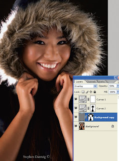
The screen capture shows the layers after running the softening action. Notice that I set the opacity of the softened layer to 50%.
The softening effect produces a nice smooth finish to Flora’s skin that helps create a more glamorous feel to the image.
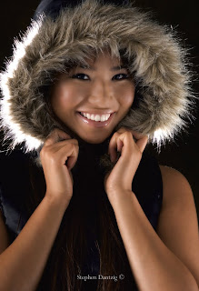
I added a final Curves adjustment layer, this time pulling up on the center dot to lighten the overall image. I used the Paint Bucket tool with black paint and clicked on the layer mask. This filled the mask with black and hid the effect I had just created. I then switched the foreground color to white, selected the Brush tool, and painted over Flora’s face at a low opacity to slowly lighten the area until I had what I wanted.
We created a fun and glamorous look for Flora with one light, two reflectors, and some basic Photoshop techniques. You can too!
BUY THIS BOOK FROM AMAZON
Subscribe to:
Posts (Atom)