Posing- The Head and the Face

Today's post comes from the book Jeff Smith's guide to Head and Shoulders Portrait Photography. It is available from Amazon.com and other fine retailers.

One of the biggest misconceptions about head and shoulders portraits is that very little posing is needed to create a beautiful, salable portrait. In fact, you must select a pose that coordinates with the lighting, background, and clothing to produce a look that will fulfill the client’s needs and desires. On top of that, your posing must hide (or at least lessen) the obvious flaws that your client wouldn’t want to see. Before we get into corrective posing, however, we’ll review the basic components that go into a flattering pose.

Posing is a study of the human form that never ends, because it is a study that is always changing. From my experience, the photographers who have the hardest time creating poses that meet clients’ expectations are the young photographers and the older, “well seasoned” photographers. Both tend to pose a client to meet their own expectations and not the client’s. If you pose clients in this way, they will never be as happy as they could be, and you will never profit as much as you could by learning to pose for the client and not yourself.

The Head and Face
The Face Turned Toward the Main Light. I work with a lighting ratio that is approximately 2:1 or 3:1 without diffusion, and 4:1 with diffusion. This means that if the face is turned away from the main light, the shadow on the side of the nose will increase, making the
nose appear larger.

If, instead, you turn the face toward the main-light source, whether in the studio or outdoors, you light the mask of the face without increasing shadowing in areas of the face where it shouldn’t be. An added bonus is that turning the head also stretches out the neck and reduces the appearance of a double chin, if the subject has one. (Note: Decreasing the lighting ratio also reduces unflattering shadows, but it produces a flat look in the portrait. I call this “mall lighting,” because the inexperienced photographers employed by most national and mall photography studios tend to use this very flat lighting to avoid shadows if the face isn’t posed properly.)

Lower the Chin, Lose the Catchlights. Lowering the chin produces a more attractive angle of the face, but also requires lowering the main light to compensate. If you don’t, you’ll lose the catchlights—the single most important aspect of a portrait (from a lighting standpoint). I suggest you elevate the main light to a point where it is obviously too high (with no apparent catchlight) and then slowly lower it until the proper lighting effect is achieved. This forces you to adjust the light with each pose.

The Position of the Eyes. There are two ways to control the position of the eyes in a portrait. First, you can change the pose of the eyes by turning the subject’s face. Second, you can have the subject change the direction of their eyes to look higher, lower, or to one side of the camera.

Typically, the center of the eye is positioned toward the corner of the eye opening. This enlarges the appearance of the eye and gives the eye more impact. This is achieved by turning the face toward the main light while the eyes come back to the camera. This works well for all shapes of eyes, except for people with bulging eyes. When this is done on bulging eyes, too much of the white will show and draw attention to the problem.

The center of the eye is positioned toward the corner of the eye opening to enlarge itsappearance and give the eye more impact.

The point at which you ask the subject to focus their gaze in respect to the position of the camera’s lens also, in essence, poses the eye. As I’ve already mentioned, the subject should always be looking at someone, not something. To do this, I put my face where I want their eyes to be. There is a certain spark that the eyes have when they look into someone else’s eyes that they don’t have when they are looking at a spot on the wall or a camera lens.

Usually, I position my face directly over the camera. This puts the eyes in a slightly upward position, increasing the appearance of the catchlights. If the camera position is too high to make this possible, I position my face on the main-light side of the camera, never beneath it and never to the shadow side of it. Both would decrease the catchlights.

When the subject looks toward the lens, they seem to make eye contact with the viewer.

With my face directly to the side of the camera, the eyes appear to be looking directly into the lens, even though the subject is actually looking at me. When looking from the side of the camera, a common mistake that my new photographers make is getting their face too far from the camera. This makes the eyes of the subject appear to be looking off-camera—which is fine if that is the intention and not a mistake.

Subjects looking off camera have a more reflective appearance.

When the eyes of the subject look into the lens (or very close to it), the portrait seems to make eye contact with the viewer. This type of portrait typically sells better than portraits that have the subject looking off-camera in a more reflective pose. Reflective posing does, however, work in a storytelling portrait—a bride glancing out a window as if waiting for her groom, a senior glancing over the top of a book and thinking of the future, new parents looking down at their baby and thinking of how many diapers they are going to have to change before that kid is potty trained. Well, maybe not that last one—but you get the picture.

If the eyes are to look away from the camera, there a few rules that need to be followed. They are really simple rules, but ones that I see broken often. First, the eyes should follow the same line as that of the nose. It looks ridiculous to have the eyes looking in a different direction than the nose is pointing. This goes for poses with the subject looking just off-camera, as well as for complete profiles. Second, as you turn the face away from the camera, there comes a point where the bridge of the nose starts to obscure the eye farthest from the camera. At this point, you have gone too far. Either you go into a complete profile, that so many photographers leave school doing so badly. I have seen everything from young ladies who look completely awkward, to guys who look like they were just involved in a car crash that broke their neck.


The Tilt of the Head. How I wish that every college teaching photography would just avoid this one subject. I have never seen one aspect of photography that so many photographers leave school doing so badly. I have seen everything from young ladies who look completely awkward, to guys who look like they were just involved in a car crash that broke their neck.

Which direction and how far to tilt the head must be decided on an individual basis.

The Traditional Rules. While many college students will accept that there are different ways to light, pose, and photograph a subject, a lot of them are convinced that there is only one way to tilt the head of each gender—and it’s precisely the way their teacher told them! I have had some truly talented photographers work for me, and that is the one obstacle I have had to overcome with almost every one of them.


The only difference between these two portraits is the tilt of the subject’s head—but what a difference it makes!


Which of the above photographs do you like better? If you are like all the people I showed these photographs to, you would say the one on the right. Well, there goes the classic theory of posing shot right in the keister! According to that theory, a woman is always supposed to tilt her head toward her higher shoulder. In this case, tilting the head toward the higher shoulder made her look as though she just sat on a very sharp object and is waiting until we take the picture to get the heck off of it. By tilting the head into what traditionalists consider a “man’s” pose, we made her look confident, beautiful, and nothing like a man.

The Real Rule. Now that I have had a little fun, I can continue. The real rule of tilting the head is that there is no rule. You don’t always do anything in photography. If you are photographing a woman, you don’t tilt toward the high shoulder and you don’t tilt toward the low shoulder, you tilt toward the shoulder that looks good.


Long Hair. When photographing a woman with long hair, I look to the hair and not the gender to decide the direction the head will be tilted and the direction in which the body will be placed. Long hair is beautiful, and there must be an empty space to put it. A woman’s hair is usually thicker on one side of her head than the other. The tilt will go to the fuller side of the hair and the pose will create a void on the same side for it to drape into. This means she will sometimes be tilting toward the lower shoulder.


For the Guys. Guys typically aren’t gender benders when it comes to posing; they usually do look better tilting the head toward the lower shoulder or not tilting at all. Again, the pose and the circumstance dictate the direction the head is tilted or whether it is tilted at all.

The easiest way to learn about the head tilt is to first pose the body. Then, turn the face to achieve the perfect lighting and look. Then stop. If the person looks great (as about 80 percent of clients do), take the image. If the subject is very uncomfortable and starts tilting their head in an awkward direction, correct it. It’s that simple.

A variety of poses can be used to obscure the neck and the under-chin area.

The Neck. The neck really isn’t posed and it really isn’t part of the face, but there are a few points that should be shared about this area. First of all, the neck is the first to show weight gain and age. In many clients, as you turn the face toward the light, the little cord-like tendons pop out, making the subject look like Jim Carrey doing his FireMarshall Bob routine on In Living Color (if you don’t happen to be familiar with the character, then trust me—it’s not an appealing or flattering look). The best way to handle the neck area is to cover it up with clothing. If this isn’t possible, use a pose that obscures this area from view. (These same neck-hiding poses—several are seen on the previous page—will also conceal a double chin, which can be very helpful.)

BUY THIS BOOK FROM AMAZON

Window Lighting

Today's post comes from the book Monte Zucker's Portrait Photography Handbook. This book is available from Amazon.com and other fine retailers.

One of the most popular choices for indoor lighting is window light. It’s available for a good part of the day and it’s cheap. When you’ve got indirect sunlight through the window, it’s also easy to work with. Even with direct sunlight, a simple translucent scrim, such as the Westcott 1707, can make it useable for portraiture. The key to successful window lighting is that you want to achieve the same lighting patterns as you would when creating a studio portrait.

When you know what you’re doing, window light can create a dramatic impact.

Sometimes it works to show the window itself in your image. This can be a distraction, though, so you should use the setup judiciously.


DIRECTION OF THE WINDOW
When photographers first began creating daylight portraits, they favored north light as their main light source. That’s because a north-facing window gets no direct sunlight and is usable most of the day. Of course, if you live in the southern hemisphere, you need to go to a window with a southern exposure.

To create a fullface view, the camera is next to the wall with the window.

To create a two-thirds view, the camera moves further out into the room.

For a profile, move the camera even further into the room. For all these views, the subject never moves; the camera is simply repositioned. The background has been muted, however, by positioning the camera.


COMMON PITFALLS
Height of the Light Source. There are several pitfalls with using window light. One of them is the height of the light source. As we discussed in a previous chapter, good portrait lighting should come from above the eye level of the subject. You might think that this would not be a problem with light coming through a window, but quite often the light is not coming from the sky. Often, it’s bouncing off a building or off the sidewalk outside. This means the light will be coming up from below the subject. That’s not good at all; the more powerful light will miss your subject’s face and concentrate on the lower part of their body.

When you see this happening, you need to seat your subject so that the predominant amount of light is hitting their face with a slight fall-off toward the lower part of their body. Alternately, you can cover the bottom of the window and hope that the light coming in over top of that obstruction will be more appropriate. Better yet, find a different window.

Window Treatments. Another thing to be aware of is window treatments that cover the top of the opening and force most of the light to come in from below. If you’re standing your subject near a window like this, the strongest light will be on the bottom of that person, missing the face. Not good! To correct that problem, you would need to seat your subject so that the strongest light illuminates their face.

Showing the Window. Many photographers who use window light show the window in all of their photographs. For the most part, I find the windows to be a distraction. Certainly, you wouldn’t want to get your portrait lights in a photograph, would you? I can see including the window in a portrait from time to time, but not in every image.

DISTANCE OF WINDOW TO SUBJECT
If you keep your subjects a short distance from the window, you’ll find that the light wraps around them more beautifully and with much less contrast than when they’re very close to the window. Therefore, I’ve found it best to work a few feet from the window. With digital cameras, it’s easy to increase your ISO setting to 600, 800, or 1000 without degrading the photograph,
so the drop in light intensity shouldn’t be a big problem.


CAMERA AND SUBJECT POSITIONS

One of the biggest problems photographers have with window lighting is knowing where to stand when setting up for the portrait, and how to change from one facial view to another during the session. Here’s the secret: When photographing with a light source that you cannot move, you have to position your subject’s face to attain the proper lighting first, then adjust your camera position to get the desired view of the face. In other words, when you can’t move the light, move the camera.


Position the Subject. Many photographers have trouble finding the right pattern on their subjects’ faces. Often, this is because they are not standing in the right place. To really see what you’re doing and to “set” the light pattern, you need to be standing against the wall—right next to the window. Your subjects should be standing a few feet away from the window and around the middle or slightly closer to the far end of the opening. Then, turn the face toward the window—but not directly into the window.When you do that you get flat lighting and lose all dimension to the face. Once you see the desired pattern, keep the subject’s face in place and pose the body to support the face.

Position the Camera. Once the proper pose is achieved—that’s it; you cannot turn the subject to achieve full-face, two-thirds, and profile views. Instead, you will move the camera from one position to another. For a full-face picture by a window, the camera will need to be located right against the wall by the window. That’s the only place that you can position yourself and still get a proper light pattern. For a two-thirds view, move away from the wall toward the center of the room. For a profile, move still further into the room. Because the subject and the window remain stationary, the lighting on the subject’s face will be consistent.

USING A REFLECTOR WITH WINDOW LIGHT
When placing a reflector to enhance the window light you have two choices—just as you do when using a reflector in the studio. If the light pattern is already there and all you want to do is to open up the shadows, then the reflector goes on the shadowed side of the face. If, however, there is light only on one side of the face, there is no light in the eyes, and there is no appropriate lighting pattern, then the reflector should be placed on the highlight side of the face; it is what will create the lighting pattern for you.

CAMERA AND SUBJECT POSITIONS
One of the biggest problems photographers have with window lighting is knowing where to stand when setting up for the portrait, and how to change no appropriate lighting pattern, then the reflector should be placed on the highlight side of the face; it is what will create the lighting pattern for you.

In some cases, a reflector can be be paired with window light to be used as the main light.

Reflector for Fill Light. The most common use for a reflector is to open up the shadows in a portrait, allowing you to render detail throughout the image.When used for this purpose, the reflector should remain forward of the face, not beside the it. When it is in front of the face, it can pick up the light from the window and push it around to open up the shadows. When it is beside the face, on the other hand, it tends to act like a second main light source, bringing in noticeable light from the side opposite the main light.

Reflector for Main Light. Another use for a reflector is when the window lights only half of the face. In this case, what you need is an appropriate main light. To accomplish this, the reflector should be placed on the highlight side of the face and, initially, turned toward the window. Then, slowly turn the reflector until it bounces the light onto the shadow side of the face and creates the desired lighting pattern.

BUY THIS BOOK FROM AMAZON

Composition and Design

Today's post comes from the book The Best of Family Portrait Photography by Bill Hurter. It is available from Amazon.com and other fine retailers.

LINES AND SHAPES
As you will see, designing successful family portraits depends on your sensibility of the intangible: those implied lines and shapes in a composition.

Lines. A line is an artistic element used to create visual motion within the portrait. It may be implied by the arrangement of the family members, or inferred, by grouping various elements within the scene. The photographer must be able to recognize real and implied lines within the photograph.

A real line is one that is obvious—a horizon line, for example. An implied line is one that is not as obvious; the curve of the wrist or the bend of an arm is an implied line. Real lines should not
cut the photograph into halves. It is better to locate these at one-third points within the photograph.

Implied lines, like the arms and legs of the group, should not contradict the direction or emphasis of the composition, just modify it. These lines should provide gentle, not dramatic changes in direction, and again, they should lead to the main point of interest.

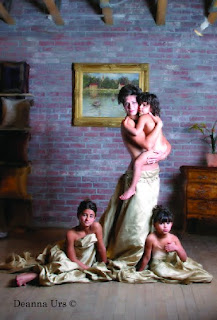
Beautiful design doesn’t happen by accident. In this wonderful portrait by Deanna Urs, you will find a statuesque pyramid shape composed of the entire group and a lovely S curve created by the mother’s pose. Deanna used rich fabrics to drape her subjects, lending a timeless atmosphere to the portrait. The beautiful flowing lines of the people offset all of the square lines and edges found in the background props.

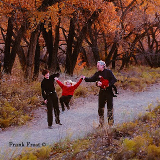
Lines that meet the edge of the photograph—real or implied—should lead the eye into the scene and not out of it, and they should lead toward the subject. A good example of this is the country road that is widest in the foreground and narrows to a point where the subjects are walking. These lines lead the eye straight to the subjects. By the way, the point at which the road in this
example narrows to a point on the horizon is known as the vanishing point.

Shapes. Shapes are groupings of like elements: diamond shapes, circles, pyramids, etc. Usually, it is a collection of faces that forms this type of pattern. Shapes are used to produce pleasing designs within the composition that guide the eye through the picture.

Pleasing Compositional Forms. The S-shaped composition is perhaps the most pleasing of all. The center of interest will fall on either a third line or a golden mean, but the remainder of the composition forms a gently sloping S shape that leads the eye through the photograph and to the main point of interest. The Z shape is a close relative to the S-shaped design.

The pyramid is the one of the most pleasing shapes to the eye and is often used in photographing large groups. The simple shape brings order to chaos. This image by Tibor Imely displays perfect color coordination and beautiful lighting created by the twilight. When the sun has set below the horizon, its rays continue to light the overhead sky and clouds, creating the softest most beautiful light of the day. Tibor uses no fill light when working at this location, which he frequents often because of the light and pleasant sea-oats background.

Another pleasing form of composition is the L shape or inverted L shape, which is observed when the group’s form resembles the letter L or an inverted letter L. This type of composition is ideal for reclining or seated subjects. These compositional forms may encompass line alone or line and shape to accomplish the pattern.

Amidst this beautifully posed image you will find a delightful S curve meandering through the composition, almost unnoticeably. Within the posing you will find various triangles and overlapping triangles that are a result of expert group posing. This image is by Robert and Suzanne Love

Direction. Regardless of which direction the subjects are facing in the photograph, there should be slightly more room in front of the group on the side toward which they are facing.

For instance, if the family is looking to the right as you look at the scene through the viewfinder, then there should be more space to the right side of the subjects than to the left of the group in the frame. This gives the image a visual sense of direction.

Even if the composition of the image is such that you want to position the family group very close to the center of the frame, there should still be slightly more space on the side toward which the group is turned.

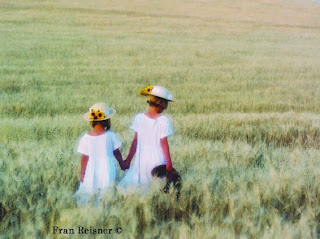
In this beautiful portrait by Fran Reisner, the sisters are positioned to the left of center, moving into the frame, creating a strong sense of direction. They are positioned at one of the points of interest according to the rule of thirds. The field of wheat, with its horizontal lines from foreground to horizon, contrasts the strong vertical shapes of the young girls

At first, such an arrangement may seem to be a foreign concept, but the more you learn to recognize these elements, the more they will become an integral part of your group compositions.

As in any artistic venture, the goal of the family portrait photographer is to provide visual direction and movement in the image, guiding the viewer’s eye through the composition in an interesting way. The opposite of this is a static image, where no motion or direction is found and the viewer simply “recognizes” rather than enjoys all of the elements in the photo.

SUBJECT TONE
The eye is always drawn to the lightest part of a photograph. The rule of thumb is that light tones advance visually, and dark tones retreat. Therefore, elements in the picture that are lighter in tone than the subject will be distracting. Bright areas, particularly at the edges of the photograph, should be darkened either in printing, in the computer, or in-camera (by masking or vignetting) so that the viewer’s eye is not drawn away from the subject.

This portrait by Frank Frost combines the warm tones of autumn with the stark black and red outfits of the family. The strong diagonal line runs through the composition, giving it a dynamic quality and a sense of direction. The tones throughout the image coordinate and unify the photograph.

There are some portraits where the subject is the darkest part of the scene, such as in a high-key portrait with a white background. This is the same basic principle at work; the eye travels to the region of greatest contrast. Regardless of whether the main subject is light or dark, it should dominate the rest of the photograph either by brightness or by contrast.

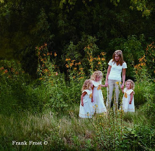
It’s amazing how nature sometimes cooperates with a photographer. Here, the Black-eyed Susans in the background seem to provide a well conceived frame around the family. The daughters’ ribbons match exactly the color of the flowers. The photographer, Frank Frost, carefully burned in areas of tone that might compete with the family so that your focus is drawn to them. Also notice the strong triangle shape created by the composition, offset on a rule-of-thirds line to create a dynamic composition.

Whether an area is in focus or out of focus has a lot to do with determining the amount of visual emphasis it will receive. A light-colored background that is lighter than the group, but distinctly out of focus, will not necessarily detract from the family. It may, in fact, enhance and frame the group, keeping the viewer’s eye centered on the subjects.

The same is true of foreground areas. Although it is a good idea to make them darker than your subject, sometimes you can’t. If the foreground is out of focus, however, it will detract less from the group, which, hopefully, is sharp.

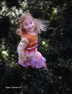
This photograph by Stacy Bratton shows you why parents hire professional photographers to create portraits of their children. This is such an innovative image, made even more effective by shallow depth of field and a relatively slow shutter speed that blurs the child’s hair. And the expression is priceless. Everything about the image is original and fresh.

A technique that is becoming popular is to diffuse an area of the photograph you want to minimize or use to focus attention on your main center of interest. This is usually done in Photoshop by selecting the area and “feathering” it so that the diffusion effect diminishes the closer you get to the edge of the selection.

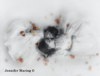
Tension and balance are the two most effective ways to achieve visual interest in a photograph. Here, in Jennifer Maring’s beautiful portrait of sisters, you can see both states at work. The balance and tension are derived from the same area, the forms of the two sisters, which loosely resembles the infinity sign or numeral 8, a highly symmetrical symbol. The imbalance or tension comes from the same place—all of the deviations that make the two matching forms different; for example one girl is bigger than the other, one’s dress is less perfectly shaped than the other, and so on.

Expert family portrait photographers insist on tight control over wardrobe for a big family photograph. Instead of dictating one “uniform” for the entire family, they will define complementary color schemes. For example, where multiple families are displayed, each will be in a different outfit—khaki and red, or denim and white. Other families within the group will have different coordinating outfits—khaki and yellow, or denim shirts and khaki pants. The result is uniformity and diversity.

TENSION AND BALANCE
Once you begin to recognize real and implied lines and to incorporate shapes and curves into your family portraits, you need to become aware of the concepts of tension and balance. Tension, or visual contrast, is a state of imbalance in a photograph—a big sky and a small subject, for example, is a situation having visual tension.

Although tension does not have to be “resolved” in an image, it works in tandem with the concept of balance. As you examine the photographs in this book and read the captions, you will hear these terms referred to often. For example, a group of four on one side of an image and two subjects on the other side of the frame produce visual tension. They contrast each other because they are different sizes and not necessarily symmetrical. But the photograph may be in a state of perfect visual balance by virtue of what falls between these two groups, or for some other reason. For instance, using the same example, these two different groups could be resolved visually if the larger group is wearing dark clothes and the smaller group is wearing brighter clothes. The eye then sees the two groups as more or less equal—one group demands attention by virtue of its size, the other gains attention by virtue of its brightness.

These strategies are subjective to a large extent, but there is no question that the eye/brain reacts favorably to both balance and visual tension and they are active ingredients in great photography.

BUY THIS BOOK ON AMAZON