The Double Main Light

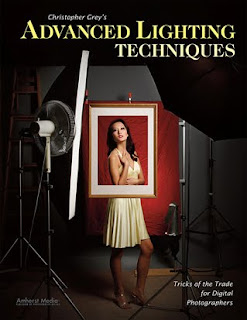
Today's post comes from the book Christopher Grey's Advanced Lighting Techniques: Tricks of the Trade for Digital Photographers. It is available from Amazon.com and other fine retailers.

I’ve written about using a double key light approach several times, both in my Master Lighting Guide for Portrait Photographers and in my columns for shootsmarter.com and prophotoresource.com. It’s such a cool technique that I imagine I’ll write about it again in the future, as I keep finding uses for it and new ways to work with it. If you play with it just once, I’m sure you’ll be impressed by the level of its coolness and will find many applications for it in your own work.

The principle is simple: Use a large softbox (the bigger the better; in this case, I opted to use a 4x6-foot unit), along with another light fitted with a gridded parabolic reflector or beauty bowl (image below). The softbox will provide an underexposed but overall soft light, and the reflector will give the most important part of the image a correct and proper exposure.
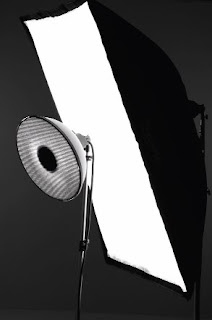

To prepare for the first series, I began with a grid-spotted beauty bowl and set both lights approximately 6 feet from where my model would be standing. I placed the softbox behind the beauty bowl, keeping both lights at roughly the same angle. This meant that the softbox (as measured at the height of the strobe unit) would be higher than the beauty bowl when the beauty bowl was centered against it. Think of it as a straight line between both strobe units, because we want the same angle to the light so that we can avoid any possibility of conflicting shadows.

This setup takes a little extra time because both sources must be measured separately, then together. While my model was in makeup, I found the hottest area from the gridspot and measured it with my flashmeter, tweaking the power output from the pack until I had a perfect f/11.

I wanted the softbox light to be two stops under the other light. I turned the beauty bowl light off and sparked up the softbox, changing the power output until it was a perfect f/5.6—two stops less than the other light.

When I switched the other light back on and again metered at the hot spot, I found that the extra light increased the exposure by 1/3 stop (the effects of light are additive), which meant my camera’s effective aperture would be f/13.

Finally, I placed a strip light on a boom, centered directly over the model’s space but about 2 feet behind it to avoid having light spill onto the top of her nose. This light was powered up 1/3 stop brighter than the double main light.

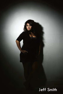
Once you have the position of the lights figured out, it’s a simple matter to make adjustments if you change the position of the gridspot or the softbox: simply turn off whichever light you didn’t move and change the power of the other until you get to the same, original, f-stop. I had to do that for this first shot (image below) because the 25 degree grid threw a light that was too broad at its distance from the subject and the actual effect of the double main light was diminished. I found I had to move the beauty bowl in about halfway, to about 3 feet from the model, in order to get the effect I was looking for—a combination of the two lights that would show both underexposure and perfect exposure on the same subject and location.
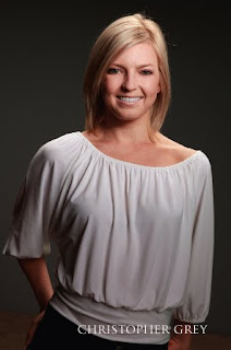

Notice how the gridspot forms a gentle circle of soft light that seems to dissolve in from the slightly darker light below. This is the beauty of the double main light setup. You can spotlight your subject but still maintain a great deal of detail in the remainder of her form.

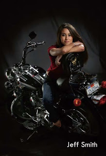
Of course, you can use regular parabolic reflectors, too. For the next shot (below), I removed the beauty bowl and replaced it with a parabolic reflector and a 20 degree grid. I had to re-meter and re-power the parabolic as its light is more concentrated than that of a beauty bowl. When I had achieved my target reading of f/11, my model and I were good to go, and we continued with the shoot. Notice that the background is slightly darker here because the reflector is more narrow. You’ll also note that the circle of light is more tightly defined and the shadows are harder because the light source is smaller.
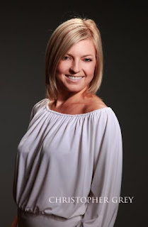

When your subject wears white or light-colored clothing, you can drop the exposure from the softbox even more than two stops and still retain detail. If your strobes don’t allow linear power changes (and are accurate when making adjustments up or down), you’ll have to turn off the gridspot each time you re-meter the softbox. The exposure from the softbox, for this shot (image below), was dropped an additional full stop to an effective f/4. You will still have to re-meter the two lights together to get a working f-stop because the sum output of the two lights will change.
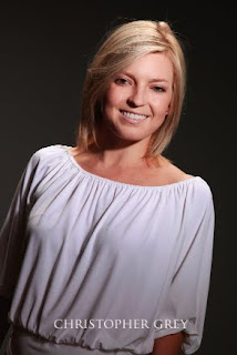

I switched to a 10 degree grid for the next shot (image below) to show what a narrow gridspot would look like. It’s a look that I personally like very much, and I often use it for senior portraits because my clients like the unusual look as well. I also bumped the power from the softbox down an additional stop, making it four stops below the parabolic. I could tell from my camera’s LCD that the exposure on the background was becoming dangerously dark and would soon be ineffective for this series. The solution was to move all of the lights farther from the background (ahh! the Inverse Square Law at work!). By moving everything farther from the background, the amount of exposure reduction due to falloff was reduced and background detail was maintained. The ratio and spacing of the three lights to the model remained the same.

This double main light technique is something you’ll never see the “fast photo” outlets attempt. They use preset lighting scenarios that, to my eye, look like junk. They are simple, foolproof, and without a spark of creativity. Play and practice with techniques like the double key and you’ll produce results that those practitioners can only dream about.

Please note that your results, based on your equipment, shooting style, etc., will, and should, be different from mine. The amount of reflectivity from the walls of your studio, the size of your studio, and other factors will make a difference in your results. However, the premise is sound and will work beautifully. Your assignment is to make it work for you.

BUY THIS BOOK FROM AMAZON

Working With One Light

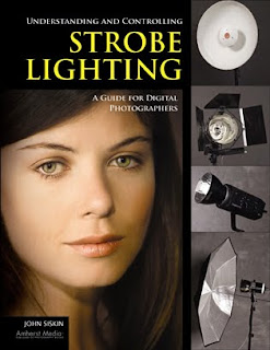
Today's post comes from the book Understanding and Controlling Strobe Lighting: A Guide for Digital Photographers by John Siskin. It is available from Amazon.com and other fine retailers.

There are several reasons to work with one light. One of the most important is so that you can understand how one light source works. If you understand the way one light works—how the size and position of the light affect the subject—it will be easier to add other lights to your shots. Other reasons for working with a single light are the ease, speed, and flexibility of your lighting setup. When I work, I want to be able to start with a powerful character light and move to a soft light without interrupting the flow of the shoot. I can do that with one light and a few simple tools!

JUST AN UMBRELLA
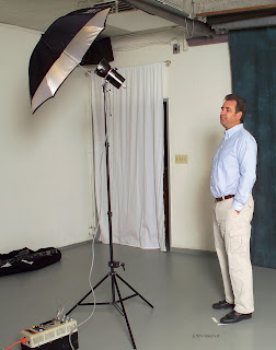
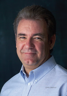
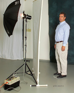
For the first shot in this exercise, I used a Norman LH2400 strobe head with just 250 watt-seconds of power, plus a 42-inch ribless umbrella. My aperture was set at f/11.3. Though umbrellas often create more even lighting, the effect here is a little harsh because the light is directional and there is no light filling in the shadows. (If you shoot in a small studio space with white walls, the bounced light will fill in the shadows.)

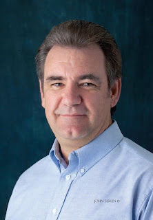
This image was made with a single umbrella. The light works, but it could be better.

For this shot, I placed one light on a stand and positioned it above the subject and to one side. It was a quick and easy setup.

Using a setup like this is great for creating character shots, as texture and shape are well defined. The closer the light is to the subject, the less defined the character lines will be.

ADD A REFLECTOR
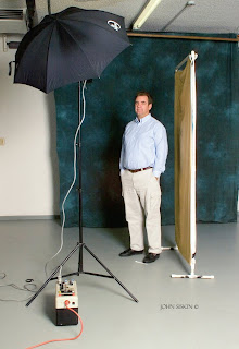
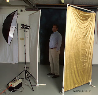
I added a large reflector panel to the first shot to create the two images below. I shot two frames—one with a silver reflector and the other with a gold one. Once again, this is a very fast and easy change. Much of the character of the first image is retained, but I’ve opened up the shadows. People often set up a portrait with the lights and reflectors at distances of more than 5 feet from the subject. This will greatly reduce the smoothness of the light in the image.

MAKE A LARGER LIGHT SOURCE
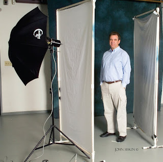
To create the next image, I added a light panel covered with white cotton broadcloth between the umbrella and the subject. This created a soft light the size of the panel. Compare the resulting image to the first shot in this chapter: you can see that the diffused light has yielded softer highlights and there is a smoother transition from highlight to shadow. This light is more flattering, as the wrinkles are not as well defined.

Silver reflector.

Gold reflector. Note that the gold reflector warmed up the shadows.

I added a reflector to the original setup to open up the shadows.

To create this shot, I positioned a light panel between the umbrella and the subject.

Here I used the umbrella/light panel combination. I use this setup a lot.

Adding a silver reflector allowed me to fill in the shadows on the right side of the frame, building light that is even softer than that produced by the umbrella alone. The result is similar to the image above, but there is more fill.

Here is the setup.

The light panel sucked up some light in this rendition of the subject, so I added more light to achieve a similar aperture.

BRING BACK THE REFLECTOR
For the next image, I added a silver reflector, just like I did in the second image. It was placed opposite the diffuser, creating two walls of light. The result is similar to the previous image, but there is more fill. The character lines are softer. That makes many people happy. Because I haven’t changed the light source, there was no change in the exposure. Remember, you can opt to use a gold or white reflector to vary the color of the reflected light if you choose.


For this shot, I positioned the reflector to pick up more light from the umbrella than from the panel.

The light on the subject’s face is very even in this shot. The silver reflector added some highlights, and there isn’t anything filling in from the subject’s left side.

You can position the reflector so it gets more light directly from the umbrella, rather than just through the light panel. This makes the reflector brighter compared to the side of the shot with the light panel and gives you a very soft, even light, like a tent. This will change your exposure a little because you are going to have to adjust the reflector and the light with the umbrella. I use this when I need a quick setup for a shot.

BUY THIS BOOK FROM AMAZON
Corrective Lighting- Keep It Simple

Today's post comes from the book Corrective Lighting, Posing & Retouching for Digital Portrait Photographers, 3rd Ed by Jeff Smith. It is available from Amazon.com and other fine retailers.

Lighting a portrait is a simple process that photographers have complicated over the years. This has happened for two reasons. First we are gadget freaks. We think, “Why should I use one light when I have three?” Second, most teachers of professional lighting techniques are sponsored by (a nice way of saying their fees are paid by) equipment companies. These companies have all that equipment to sell, so the question becomes, “Why use one light, when we want to sell three and we can charge more for the big one than the little ones?”

This leads many photographers down the path of “crapping up” a simple thing. If I sent most photographers into a white room with one large window, they would be able to take a properly lit image. However, if I gave these same photographers a flash unit with a softbox attached, many of them would look lost. Yet, isn’t it the same thing? If you put the softbox where the window was and placed the subject in the same position in relation to it, wouldn’t it appear the same?

The second problem of sponsored learning is the “bigger is better” approach to main lights, which is completely wrong—at least from the perspective of correcting flaws. These monster sources of main light are the most forgiving to improper placement, but they are the least controllable. It is like the different between a rifle or shotgun, a bow and arrow or a grenade. They all might get the job done, but one is more precise than the other. (Of course, the other is more forgiving if you’re a lazy shooter who doesn’t like to take the time to aim!)

Smaller main light sources give you better control over which areas of your subject are lit and which remain more in shadow.

Huge main light sources illuminate everything on the subject—they ruin the shadowing that we need to conceal our clients’ problems. With a four- to six-foot main light source, a subject will be evenly lit from head to toe. It will light her less-than-flat stomach, her large thighs, her “cankles” (ankles that never really slim down, so the calf appears to be connected directly to the foot), and her size twelve extra-wide feet. What a lovely sight.

To have control over your light, the light source must be smaller. You want light only where the client’s face and body can handle light being put. Small light sources allow you to place light exactly where you want it (and, therefore, draw the viewer’s eyes to the desired areas). If you have a huge light box and really don’t want to buy another (or don’t have room for a second light box), make or buy a reducer. Simply cut a small hole in the middle of a thick piece of black fabric and you have created a smaller main light source! Some companies like Photo-Flex have reducers available that are custom designed to their light boxes, but the fabric works just as well. (Note: Grids/louvers can also be used to narrow the beam of light, but they don’t allow you to feather the light [softening it by using the light rays from just the edge of the light box].)

Huge main lights aren’t the only way we can overcomplicate our lighting. When I first started in this profession I went to a week-long class and studied with a man who was literally a legend. He showed the class his unique style of lighting and discussed the ratios of lighting he used when photographing. He explained that he used a 3:1 lighting ratio when not diffusing an image and a 4:1 lighting ratio when diffusing. (Note: For all you young photographers, this was in the days of film, when fine grain, medium-format film gave us too much detail for the average client’s face.)

I came away from this week of learning an enlightened photographer—right up until I started using these lighting ratios in my studio. The models used for the demonstrations were white with a suntan, but in my studio I worked with many Hispanic and East Indian people that had every shade of skin from olive to chocolate brown. While these lighting ratios worked well for my suntanned clients, the ratio was much too high for someone with darker skin.

Using reflected fill is one way to simplify your lighting and improve your control.

Another light went off; “Wouldn’t dark skin reflect less light in the shadow areas than light skin? Do you know how many shades of skin there are between suntan white and chocolate brown?” Taking what I had been taught, I would have had to test and come up with a working lighting ratio for every shade of skin and then categories what range of skin tone worked with each lighting ratio. What started off a simple way to understand lighting in a classroom setting turned into a complicated nightmare in the everyday workings of my photography business.

Unfortunately many theories are just like this one—good for the exact context in which they were demonstrated, but not very practical in everyday in business. I needed to find a simpler, more practical way to deal with this issue, and it dawned on me that I didn’t need to use flash to fill the shadows. Using flash to fill the shadow, you are always guessing at the amount of fill. With a reflector, the fill is always proportionate to the output of the main light. (You do, however, have to work in a studio area that has subdued lighting, with little or no ambient light from windows or overhead lights.)

Therefore, the first step to un-“crapping up” my lighting was to change from fill flash to filling in the shadows with a reflector. This allows me to fill the shadow on the face and leave certain parts of the body unfilled. Reflectors have different surfaces, everything from plain white to highly reflective silver, so you can use the material that gives you the best working distance and look (white will be placed the closest and provide the softest quality of lighting, etc.). The best part of using a reflector to fill the shadow is that what you see is what you get.

SHADOW, NOT LIGHT
Because of our photographic training, we often think that corrective lighting will do the most to hide flaws. Well, it doesn’t! In fact, our “training” in how to light a portrait is the biggest problem. When we start to learn about lighting, we learn that light is our “paintbrush.” Corrective techniques, however, rely on shadow, not light.

It is shadow that gives a portrait dimension, and it is shadow that lets you disguise your clients’ flaws.

Any student photographer with two lights and a meter can create a decent portrait—just put the main light at a 45-degree angle to the subject and place the other light behind the camera. Set the lights so the main light is two stops brighter than the light behind the camera, stick a diffusion filter on the lens, and there you have it—I have just taught everyone with any knowledge of photography to create a realistic portrait with the appearance of a third dimension. This is the lighting setup mall studios use because it is easy to learn, easy to use and, for most of the buying public, acceptable for a cheap portrait. Unfortunately, this is also the lighting setup that many professional studios use. While clients will accept this type of portrait if they are getting it cheap, they are not going to pay a professional studio’s price for something they could get at the mall for much less. Professionals need to deliver more than an “acceptable” portrait. This is where shadow comes in.

Shooting in a dark area ensures that no light is bounced off the walls or items in the room, so I can put light and shadow exactly where I want it and not have it diminished by the surroundings.

It’s obvious that not much would exist in an image without light, but it is the darkness that draws the viewer’s eye to the light. It is shadow that gives a portrait dimension, and it is shadow that lets you disguise your clients’ flaws—flaws they aren’t paying to see (or, perhaps better, flaws they won’t pay for if they do see them).

Corrective lighting is about control of light, but even more importantly, it is about control of shadow. In a basic lighting setup like I described earlier, control is impossible. Combine a large main light and a fill light with the white walls of most studios and you have light bouncing around off of everything. The three pitfalls of the average lighting setup are:

1. Using a main light modifier that is too large and uncontrollable. Because of our love of light, we reason that bigger is better. In fact, the larger your light source/modifier, the less control you have. If you use umbrellas and want to control your light better, throw them away and buy a small softbox with louvers.

2. Using fill flash instead of reflector fill. The fewer lights you can use in your camera room, the more control over the lighting you will have. When you use fill flash, you get fill everywhere and have no control of the shadow formation in specific areas.

3. Using light-colored camera rooms. These add to the lack of control in the shadow areas. In corrective lighting, I want light to fall only and precisely where I put it. That can’t happen with white or cream-colored walls and floors. These lightcolored surfaces themselves become a source of fill light, just like using a white reflector.

You must start thinking in terms of directing the viewer’s gaze to the areas where you want it to go (these are the areas you will light) and keeping the viewer’s gaze away from the areas you don’t want them to see (by leaving those areas in shadow).

At times, you will have to control the light and shadow very carefully, because hiding one problem in shadow will make another problem more noticeable. A good example would be when photographing a young lady with a heavy face. Your first instinct would be to have a portion of her face in shadow to reduce its apparent width. But what if she has a large nose and the shadow on the side of the nose makes it appear larger? The same is true for the hair, which might be dull and have dark roots showing in blonde hair. To make the hair look shinier, you would light it—but to hide the roots you would need to leave it in shadow. Using smaller lighting sources and pinpoint fill, you can deal with these multiple problems that require two types of lighting.

BUY THIS BOOK FROM AMAZON
Creating Your Own Environment

Today's post comes from the book Multiple Flash Photography: Off Camera Flash Techniques for Digital Photographers by Rod and Robin Deutschmann. It is available from Amazon.com and other fine retailers.

Adding light offers a multitude of options. While in the field, the photographer can manipulate his scene, creating an environment that is unique to the message he wants to convey. This type of control was once thought only to be found indoors—but for the multiple flash photographer, the world now becomes his studio.


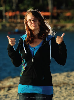
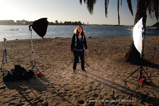
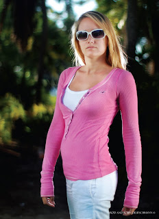
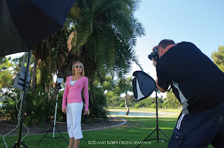
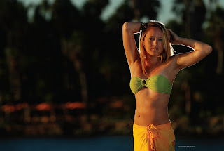
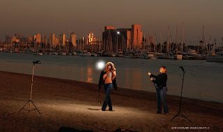
Using three modified flashes on light stands, we produced enough light to illuminate our model, creating an environment filled with rich color and tones. The key is to set the base lighting in your camera first, then add flashes where additional light is needed. Here, we placed two large, diffused lights on either side of our model, with a third behind her for backlighting.


We can virtually create any environment we desire—including a darkened background to help isolate our model and make her stand out. Here, we placed a large softbox and an umbrella on either side of our model. The softened light looks natural and the additional softboxed flash behind our model’s head added a pop of backlighting to her hair.


You don’t necessarily have to wait for the sun to start setting to take advantage of “great lighting.” As multiple flash photographers, great lighting is only a camera bag away.


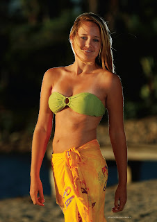
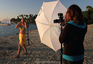
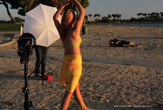
To achieve our setting sunlight environment, we used three flashes connected by a TriFlash shoe on one light stand and modified with an umbrella, creating a very large light source. Strategic placement of this light source gave us the setting-sun environment we were looking for. Once we added a fourth flash behind our model for backlighting, we were set to go.


The world does not have to look the way it does. Making your background appear darker than it is can add drama to your images.


Once our base light was achieved in-camera, creating the moody environment, we began adding lights to illuminate our model out of the darkness.


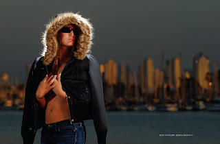
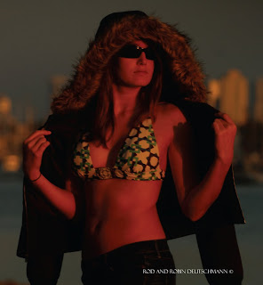
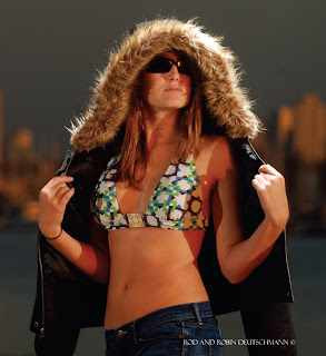
For this image, we used three unmodified flashes on light stands to create a dusky environment. A fourth flash was added as top lighting to highlight the model’s fur hood.


BUY THIS BOOK FROM AMAZON