Key Light and Fill Light for Portraits

Today's post comes from the book Simple Lighting Techniques for Portrait Photographers by Bill Hurter. It is available at Amazon.com and other fine retailers.

Key Light
The function of the key is to shape the subject. It should draw attention to the front plane (the “mask”) of the face. Where you place the key light will determine how the subject is rendered. You can create smoothness on the subject’s face by placing the light near the camera and close to the camera/subject axis, or you can emphasize texture and shape by skimming the light across the subject from the side.

The key light should be a high-intensity light. If using diffusion, such as an umbrella or softbox, the assembly should be supported on a sturdy stand or boom arm to prevent it from tipping over. If undiffused, the key light should have barn doors affixed to control the light and prevent lens flare.
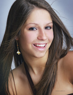

Here is an example of a really big key light. Charles Maring often uses a 7-foot Profoto reflector as a single key light with no fill. In the close-up of the senior’s eyes (below), you can see the differentiated interior of the round reflector, with varying degrees of reflectivity mirrored in her eyes. A single strobe fired into this reflector created this amazingly soft wraparound lighting. The exposure was at f/16 to keep all the girl’s hair in focus.


In most cases, the key light is placed above and to the side of the face so that it illuminates both eye sockets and creates a shadow on the side of the nose. The nose shadow should not cross over onto the cheek, nor should it go down into the lip area.

When the face is turned for posing, the key light must also be moved to maintain the lighting pattern. For example, the light will be positioned at approximately a 45-degree angle to the camera when photographing the full face of a subject. However, when the subject turns to show the camera a two-thirds facial view, the key light will need to shift with the camera to maintain the same lighting pattern as in the first shot.
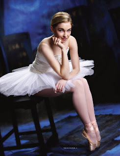

In this beautiful portrait by Tim Schooler, the large key light, a soft box, was placed to camera right. Because the light was so diffused, Tim did not use a fill light or reflector. Instead, he positioned the light to optimize its coverage from the subject’s feet to her hair. In addition, he used a fairly strong hair light (a strip light) above the model to amply light her hair. The size and proximity of the subject to the key light make for elegant and very soft lighting.

Normally, you will want to position the main light close to your subject without it appearing in the frame. A good working distance for your key light, depending on your room dimensions, is eight to twelve feet. Sometimes, however, you will not be able to get the skin to “pop,” regardless of how many slight adjustments you make to the key light. This probably means that your light is too close to the subject. Move the light back or feather it.

To get an accurate exposure reading, position a handheld exposure meter directly in front of the subject’s face and point it toward the light source. Make a few exposures and verify the exposure on the camera’s LCD. If your system allows you to check a histogram of the exposure, check it to make sure you have a full range of highlight and shadow detail.

Fill Light.
Just as the key light defines the lighting, the fill light augments it, controlling the lightness or darkness of the shadows created by the key light. Because it does not create visible shadows, the fill light is defined as a secondary light source.

The fill light should always be diffused. If it is equipped with a simple diffuser, a piece of frosted plastic or acetate in a screen or frame that mounts over the parabolic reflector, it should also have barn doors attached. If using a more diffused light source, such as an umbrella or softbox, be sure that you are not “spilling” light into unwanted areas of the scene, such as the background. As with all lights, these units can be feathered, aiming the core of light away from the subject and just using the edge of the beam of light.


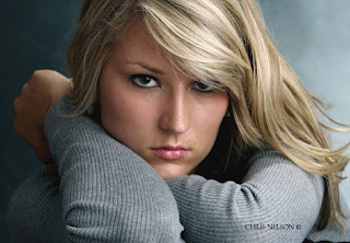
Chris Nelson photographed this young lady with a softbox as a main light. He used a silvered reflector for fill, a strip light for the hair light, and a background light. The softbox and strip light were set to the same output level; the background light was set to a stop less. The camera angle was about a foot over the subject using a telephoto lens. He used a fan on low to give her hair some fill and lift. Chris says of this pose, “Never use it unless your subject has long sleeves on, and don’t use it if the arms are abnormally large or well developed.”

The best place for the fill source is as close as possible to the camera-to-subject axis. All lights, no matter where they are or how big, create shadows. By placing the fill light as near the camera as possible, all the shadows that are created by that light are cast behind the subject and are less visible to the camera.

When placing the fill light, keep a watch out for unwanted highlights. If the fill light is too close to the subject, it often produces its own set of specular highlights, which show up in the shadow area of the face and make the skin appear oily. If this is the case, move the camera and light back slightly, or move the fill light laterally away from the camera slightly. You might also try feathering the fill light in toward the camera a bit. This method of limiting the fill light is preferable to closing down the barn doors or lowering its intensity.

The fill light can also create multiple catchlights in the subject’s eyes. These are small specular highlights in the iris. The effect of two catchlights (one from the key light, one from the fill light) is to give the subject a vacant stare or directionless gaze. This second set of catchlights is usually removed in retouching.
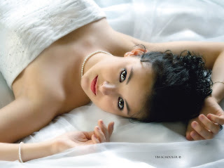

In this beautiful glamour portrait by Tim Schooler, the key light comes from behind the subject a little to camera right. You can determine this because the right side of her face and nose are highlighted. The fill light, which is close to the same intensity as the key light, comes fromcamera left and fills the shadow side of the model’s face. Additional fill is achieved by the white crepe material, which is reflecting light everywhere within the scene. You will notice that even though the lights are fairly even in intensity, the key light still provides direction and bias.

In simplified lighting patterns, the source of the fill light may not be a light at all but a reflector that bounces light back onto the subject. This means of fill-in has become quite popular in all forms of photography. The reflectors available today are capable of reflecting any percentage of light back on to the subject, from close to complete reflectance with various mirrored or Mylar-covered reflectors to a very small percentage of light with other types. Reflectors can also be adjusted almost infinitely just by finessing the angle at which they are reflecting the fill light.
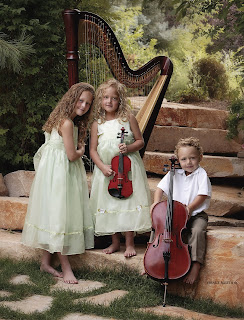

Master photographer Drake Buseth often uses the outdoors as his studio. Even so, a key light and fill light are still called for. Here, a large softbox was used over the lens as the key light and a large reflector was angled up from beneath the camera as a fill-in source. The effect produces a gentle lighting ratio.


THE PERFECT FILL
If it were a perfect world, fill light would be shadowless, large, and even—encompassing every part of the subject from top to bottom and left to right. The fill light would be soft and forgiving and variable. And it would complement any type of key lighting introduced.

Just such an effect can be created using strobe heads in wide-angle reflectors bounced into a white or neutral gray wall, or a flat behind the camera (the surface must be neutral to ensure no color cast is introduced). Usually, the first two lights are placed to either side of the camera, then the third is placed over the camera and aimed high off the flat or the wall/ceiling intersection.

These lights are placed close to the wall and ceiling, creating a wall of soft light. These fill lights are then balanced to produce an identical output across the subject. The key light, which may be placed to the side or above the subject, will be equal to or more intense than the fill source, creating a ratio between the fill and key lights.
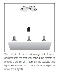
A variation on this setup is to rig a large white flat over and behind the camera. Two or three strobe heads can then be bounced into the flat for the same effect as described above. Some of the light is bounced off the flat and onto the ceiling, providing a very large envelope of soft light.

BUY THIS BOOK FROM AMAZON

Portrait Photography Recipes

Today's post comes from the book Rangefinder's Professional Photography: Techniques From the Pages of Rangefinder Magazine, edited by Bill Hurter. It is available from Amazon.com and other fine retailers. This book compiles the work of almost 100 photographers as featured in Rangefinder magazine's Cookbook features. Essentially, each photographer offers a photograph and explains how they created it. Here are two of the "recipes".


Fernando Escovar: A Retro Fashion Series

I thought it might be a good idea to produce a retro style in my next fashion series, so I started with an old Shure microphone, like the ones you see in movies from the 1950s. I remembered a location at Bellagio in Las Vegas where they have a cool lounge called the Fontana Bar. They also have an old drum set with an ornate “B” on the bass drum.

A model/actress friend of mine, Amanda Swisten, loves anything retro, so I asked if she would do this for me. As a photographer you have to make a lot of phone calls to orchestrate these “mini movies.” The hair and makeup all had to be just right for this project, which ran as a sixteen-page spread and cover for Las Vegas magazine.


After I scouted and secured the location, I made a shot list with the editor to see what outfit looked best for each scene. That exercise took half a day. After making the selections, we had a fitting with Amanda to double-check the clothes.


I am all digital now, sporting Canon’s 1Ds Mark II, and I don’t remember how I ever lived before digital. The other day I was shooting an assignment for a client who wanted film. I kept looking down at the camera body to view the image I had just captured, but I couldn’t because it was a film camera.

With digital, I can quickly check my work when I am building a shot with lights—like the image of Amanda singing in front of the striking red curtains. I wanted to make sure I was getting shadows where I wanted them. I also wanted to keep light on the drum set and not fully on Amanda while shooting 100 ISO at f/8 and 1/125 second; shooting digital allowed me to ensure
these elements.

We made fine adjustments, flagged off the main Profoto strobe with some GatorBoard, and covered the other strobes with amber gels to give off some deeper colors. I only used three heads on this shot with an Acute 2400 pack.

INGREDIENTS
Camera: Canon 1Ds Mark II
Exposure: 100 ISO at f/8,
1/125 second
Light: Profoto strobe,
flagged off with
GatorBoard; other
strobes covered with
amber gels; Acute
2400 pack


Monte Zucker: The Touch
For this image, Monte Zucker wanted to create a high-key portrait outdoors with simple props. In order to do so, the first thing he looked for was a covered area with strong backlighting. The perfect setting was under a covered porch with no light coming in from above. To get the backlighting, he waited for the afternoon sun, then used a Westcott translucent panel directly behind the couple to diffuse the backlight.

The camera was a Canon EOS 10D loaded with a 640MB Delkin memory card. The ISO was adjusted to 200. Monte says, “I used aperture priority with the lens set at f/5.6. The internal exposure meter saw a lot of white behind them and stopped down too much, so the figures were underexposed. I had to override the in-camera meter by a stop and a half to get the correct exposure on their faces.


“Heads were positioned for profiles of both, with my normal lighting pattern for profiles coming thru the Westcott translucent panel. In addition, they were lying on a Westcott Black/White 4x6-foot panel.

“I used a 27-inch silver reflector as a kicker to help brighten the image. The reflector (Westcott’s Monte Illuminator) was tipped upward to catch light coming over the top of the translucent panel. This opened up the shadows slightly without overpowering the main light coming through behind them.”


Very little was done in Photoshop, except to remove a few minor blemishes from their skin. “The couple in the picture were high-school friends. They came to pose for one of my workshops. They got more and more into my photographing them when they saw how much fun we were having. They originally told me that they didn’t like posed photos, but as we took more pictures and they looked at the LCD screen, they got more enthusiastic. They said, ‘These aren’t what we meant when we said we didn’t like posed pictures. These are fun!’ They said they’ve never looked this good in photographs.”

About photography, Monte says, “It’s exciting to see how far you can take it and nail it every time! I believe in it completely and teach it with love and with passion.” —Bob Rose

INGREDIENTS
Camera: Canon EOS 10D
Lens: Canon 28–135mm
f/4 IS Zoom
Memory Card: Delkin
640MB
White Balance: ExpoDisc
Light Control: Westcott
4x6-foot panel,
Translucent panel and
27-inch silver reflector
(Monte Illuminator)

Correcting Flaws With The Scene

Today's post comes from the book Corrective Lighting, Posing & Retouching for Digital Portrait Photographers, 3rd Edition by Jeff Smith. It is available from Amazon.com and other fine retailers.

The scene or setting can often be one of the most effective tools you have for correcting clients’ flaws. As you have seen, letting the body blend into the background can make problem areas like large hips or a balding head much less noticeable. This works well in low-key portraits, but when you start working with high-key settings (or even with a client in light-colored clothing), the problem area is still obvious. But, just as with poses that use the knee, arm, or leg to disguise a problem, elements in the scene can also be used to conceal flaws.


USING THE FOREGROUND
Most scenes give you ways to hide flaws by using the foreground. Although it is often overlooked, making use of the foreground not only gives you the ability to hide a client’s flaws but, from an artistic standpoint, provides a greater ability to create the illusion of depth in your portraits. By using an element in the foreground, the subject in critical focus, and then a background that recedes farther and farther from the subject, you have a built-in sense of depth.

BEFORE:


AFTER:

Foreground elements add depth and allow you to hide anything your client might not want to see.

When correcting a client’s flaws, it is amazing how even a simple foreground element like a plant or a few columns can soften or hide a large hip, tummy bulge, large upper arm, or hairy forearm. Whether you have something as simple as a client sitting backwards in a chair, or an entire set arranged to hide problem areas, it is a very effective way to give clients a version of reality they can live with.

COORDINATING THE FOREGROUND AND BACKGROUND
Learning how to coordinate the style, look, and color of the foreground elements with the other parts of the scene can be a challenge. A plant or tree is often used in the foreground because it is easy. It goes with just about everything and it doesn’t take any time to prepare. Chairs are also a
popular and versatile choice for the foreground element. Either one can be effective. (Indoors and out, you can enhance the feeling of depth by using multiple elements in the foreground, or by adding elements in between the subject and the background.)

OUTDOORS
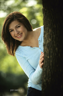
What do you do when you are outside and have a client with a large body size? Well, first, you might find a tree and do the peek-a-boo pose, with the body hidden behind the tree and the face coming out from around the side of the tree. (Although this pose is a classic of corrective posing
technique, it is also a popular pose for young ladies who don’t have weight issues.) You might also photograph a girl lying in tall grass that obscures the outline of her hips and thighs. You could also simply decide to create something other than a full-length portrait.

This is a popular pose for subjects of all shapes and sizes. The tree in the foreground creates a nice sense of depth but also allows you to hide as much of your subject as necessary.

Outdoors, many photographers work at the edge of a clearing or have the subject leaning against a tree or column that has nothing else around it. This provides a scene in which the first element is the subject, then the background elements that recede farther and farther away from the subject. While I do this on occasion, I prefer to use a scene that provides elements in the foreground. This could mean using a tree with lower branches or posing the client in the middle of what most photographers consider the background—so there are foreground elements between the subject and the camera.

BEFORE:


AFTER:

Adding a foreground element can help create an image that is easy on the subject’s ego.

The density of the foreground elements will determine how much of the subject you are going to see. If the foreground is too thick, you will see none of the subject’s body. In this situation, you have to ask yourself why you’re presenting a reduced head size if it doesn’t result in seeing any more of the person. You might be better off just composing the image more tightly (cropping out areas you want to conceal rather than hiding them behind something).

Years ago I was hired to photograph a rodeo queen. She came from a nearby mountain community, so we looked around this area for a place to photograph her. We found an area where the light was great and the field of grass was high—it was perfect . . . or so I thought. The first problem was that it was late spring and we were in an area that was known for having a high rattlesnake population. Not realizing this, we walked through the tall grass without a clue. The second problem was that the grass was so high and so thick that you couldn’t even see an outline of her legs from the thighs down. Since I was very young at the time, though, I was very excited about these photos (and not getting bit by a snake), so I had a 30x40-inch print made for the studio. My wife looked at it when I unveiled it to our staff and she said, “It looks like she’s missing her legs!” In short, I should have cropped it closer and eliminated the foreground that showed nothing but grass.

The density of the foreground elements will determine how much of your subject is visible behind them.

Sometimes we get so caught up in the lighting, the posing, and the beauty of what we are focusing on, we don’t notice the unnecessary elements (like all that grass) and forget that someone else has to live with our creation. My wife was right; although I thought the foreground of grass was beautiful, the client would have preferred to see the subject larger in the frame—not ten feet of grass in the foreground.

IN THE STUDIO
The ability to add foreground elements and use them correctively is one the main reason we use sets, as opposed to just background fabrics, in the studio. Sets also allow us to place elements at different distances from the camera, which creates more depth than is possible with a painted background. I have always said I want at least five points of focus in the average studio portrait. The client is the main point of focus, but even in a head-and-shoulders pose there should be at least four other points of focus at different distances from the camera.

Chairs can be turned to create simple foreground elements.

The railing is used as a foreground element.

We have found many background and foreground elements at the local home store. For example, I purchased a French door on clearance for $10. We have also purchased ladders, steel grates, tin roofing material, and many other interesting foreground and background items at this type of store. You are only limited by your imagination and your time to shop around. When I first opened my studio, like most new photographers, I had all kinds of time but very little money to purchase sets. Now, with over three thousand seniors to photograph each year, my writing, and my family, I have much more money than I do time to look for background items, so I tend to purchase them from set manufacturers.

Whether you purchase them or create your own set elements, you need to look for unique ways to use them. Many photographers struggle with this when using the large, expensive sets that some designers sell. One problem is that they sometimes position the set components flat to the camera—and then wonder why their images didn’t look like those in the brochure. By angling any set toward the camera, you can create a foreground and bring the background to life by adding focal points at different distances. (Note: This idea works with most props, as well. Instead of placing a chair or couch flat to the camera, turning it [bringing one arm closer to the camera than the other] creates depth in the portraits—and a place to hide a seated client’s hips, thighs, and not-so-flat tummy!)


What are these poses hiding through the use of simple obstructions (mostly the subject’s own body)?


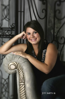
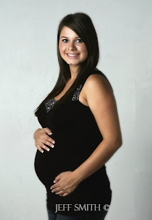
Posing—especially when combined with the use of obstructions—is one of the most powerful tools photographers possess. Look above to see portraits of this mom-to-be. Would you have guessed she was pregnant in any of these images?

Similarly, the average photographer sees an arch at a trade show. He buys it, brings it into his studio, and it remains a single arch for all time. Yet, in addition to being an arch, it is also three individual pieces that can be combined with other set components to create multiple looks. This
gives you the most for your money—and it also provides opportunities to improve your photographs and hide your clients’ flaws.


Always be on the lookout for items to put in front of clients—items that look natural and coordinate with your sets and outdoor scenes. Even the Viper or Harley (popular props at our studio) can produce a foreground to hide clients’ problem areas behind. Just use your imagination!

BUY THIS BOOK FROM AMAZON

Adding Fill Light

Today's post comes from the book Existing Light: Techniques for Wedding and Portrait Photographers by Bill Hurter. It is available from Amazon.com and other fine retailers.

Barebulb Fill.
One of the most frequently used handheld flash units is the barebulb flash, which acts more like a large point source light than a small portable flash. Barebulb units produce a sharp, sparkly light, that is too harsh for almost every type of photography except outdoor portraits. Because the light falloff is less than with other handheld units, however, barebulb is an ideal source of fill light—either for backlit subjects or when a little punch of light is needed on sunlit subjects photographed early in the morning or at sunset when the sun is low in the sky. Barebulb units are predominantly manual flash units, so you must adjust their intensity by changing the flash-to-subject distance or by adjusting the flash output level. But whatever control you choose, the trick is not to overpower the daylight.

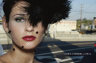
Cherie Steinberg Coté made this wonderful fashion portrait of a bride in a black veil on a downtown Los Angeles bridge. Her main lighting was matrix balanced flash with a Nikon D70 and SB-80 DX flash.

Softbox Fill. Some photographers like to soften their fill-flash. Robert Love, for example, uses a Lumedyne strobe in a 24-inch softbox, which he triggers with a radio remote control. He often uses this at a 45-degree angle to his subjects (particularly for small groups) to create a modeled fill-in. For larger groups, he uses the softbox next to the camera for more even coverage.

To measure and set the light output for a fill-in flash situation, begin by metering the scene. It is best to use a handheld incident meter with the hemisphere pointed at the camera from the subject position. In this hypothetical example, let’s imagine that the metered exposure is 1/15 second at f/8. Now, with a flashmeter, meter the flash only. Your goal is for the output to be one stop less than the ambient exposure, so adjust the flash output or flash-to-subject distance until your flash reading is f/5.6, and set the camera to 1/15 second at f/8. At this point, if shooting digitally, it’s a good idea to take test shot.

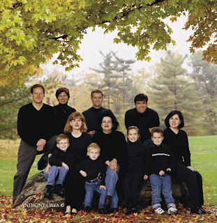
Anthony Cava had this family pose under the tree, which blocked the overhead nature of the open shade. He then used flash-fill to add some sparkle to the faces.

On-Camera Flash Fill.
Other photographers prefer to use on-camera TTL flash. Many of these systems feature a mode that will instantly adjust the flash output to the ambient-light exposure for balanced fill-flash. Many such systems also offer flash-output compensation that allows you to dial in full or fractional-stop output changes for the desired ratio of ambient-to-fill illumination. They are marvelous systems and, more importantly, they are reliable and predictable. Some of these systems also allow you to remove the flash from the camera with a TTL remote cord, increasing the range of effects you can produce.

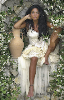
Joe Buissink created this lovely and unique outdoor portrait of a barefoot bride sitting against a flowered wall. Joe used flash fill to get some twinkle in her eyes and added a canvas-effect to the image in post-production.

Flash Key Techniques
While location portraiture often calls for the existing light to function as the key light, there are some cases where the existing light is not ideal for this purpose. In these circumstances, you may wish to overpower the existing light and use flash as your key-light source.

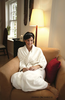
Modern TTL-metered flash is the best way to set the ratio between existing light and bounce flash. Here, Dennis Orchard captured window light, incandescent room light, and bounce flash in a single exposure. The bounce flash was fired simply to open up the shadow side of the girl’s face and it is quite minimal.

When adding flash as the key light, it is important to remember that you are balancing two light sources in one scene. The ambient-light exposure will dictate the exposure on the background and the subjects. The flash exposure affects only the subjects. Essentially, you are “dragging the shutter”—meaning that you are setting the camera to a shutter speed slower than the X-sync
speed (the fastest speed at which you can fire the camera with a strobe attached). The shutter remains open after the flash fires, allowing the ambient light to properly expose the background. Understanding this concept is the essence of flash-fill.

When using the flash-key technique, it is best if the flash can be removed from the camera and positioned above and to one side of the subject. This will more closely imitate nature’s light, which always comes from above and never head-on. Moving the flash to the side will improve the modeling qualities of the light and show more roundness in the face. It is also unwise to override the ambient light exposure by more than two f-stops. This will cause a spotlight
effect and render the background so dark that the portrait may appear to have been shot at night.

Saturating Backgrounds. If the light is dropping or the sky is brilliant in the scene and you want to shoot for optimal color saturation in the background, you can overpower the daylight with flash. Returning to the hypothetical situation where the daylight exposure is 1/15 second at f/8, you would now adjust your flash output so your flashmeter reading is f/11, a stop more powerful than the daylight. Then, you would set your camera to 1/15 second at f/11. The flash is now the key light and the daylight is the fill light. The problem with this is that you will get a separate set of shadows from the flash. This can be acceptable, since there aren’t really any shadows from twilight, but keep it in mind that it is one of the side effects.

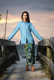
Knowing the effect of backgrounds on exposure meters is crucial for a scene like this. Anthony Cava, a photographer well known for his fine portraits, shot this image as a commercial portrait for a clothing-design catalog. He metered the available light, decided to underexpose his background by almost a full f-stop, and fired an umbrella-mounted studio flash to provide brilliance and facial modeling. The light was positioned above and to the right of the model, creating a “loop” like pattern. No fill was used.


When using this technique to photograph more than one person, remember that electronic flash falls off in intensity rather quickly. As a result, you must be sure to take your meter readings from the center and—to be safe—from either end of the subject area. With a small group of three or four people you can get away with moving the strobe away from the camera to get better modeling—but not with larger groups; the falloff is too great. You can, however, add a second flash of equal intensity and distance on the opposite side of the camera to help widen the light. If using two light sources, be sure to measure both flashes simultaneously for an accurate reading.

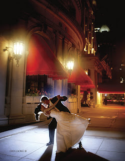
As you look at this photograph by Dan Doke, you might think the hotel’s outdoor lighting was very, very bright to create such sharp-edged shadows. Not so. The tungsten lighting is window dressing. The lighting pattern came from a hot (undiffused) strobe positioned behind the couple on a light stand. A diffused fill strobe at the camera position was used to create frontal detail in the image.